Dark Patterns to Avoid in Popups
Popups can be a clean, high-leverage way to capture leads, collect feedback, or announce a product update. They can also quietly turn into “dark patterns” that
Popups can be a clean, high-leverage way to capture leads, collect feedback, or announce a product update. They can also quietly turn into “dark patterns” that push users into actions they did not intend.
If you run a SaaS site, that tradeoff matters. Dark patterns might bump a short-term metric, but they tend to reduce trust, increase unsubscribes, raise support load, and in the worst case create legal and platform risk. The FTC has explicitly called out dark patterns and how they can manipulate consumer choice in its report “Bringing Dark Patterns to Light”.
This guide covers the most common dark patterns to avoid in popups, plus practical alternatives that still convert.
What counts as a dark pattern in a popup?
In practice, a popup becomes a dark pattern when it:
- Hides or distorts the real choice (misdirection)
- Adds friction to the option you do not want users to pick (obstruction)
- Uses misleading language or UI to produce “consent” that is not informed
- Creates artificial urgency or scarcity
The key test is intent. If a reasonable user would say “I didn’t mean to do that” after interacting with your popup, you are probably in dark-pattern territory.
Why dark patterns backfire for SaaS teams
Dark patterns are not just an ethics discussion. They create measurable product and marketing downsides:
- Lower lead quality: You may get more email captures, but they skew toward annoyed, low-intent contacts who never activate.
- Higher churn and spam complaints: Users who feel tricked are more likely to unsubscribe immediately or mark emails as spam.
- Skewed research signals: If your feedback widget pressures people, your survey results become biased and less useful.
- SEO and UX risk: Intrusive interstitials can harm mobile experience, and Google has long discouraged intrusive interstitials that block content (see Google Search Central guidance.
- Compliance and enforcement risk: Regulators have increasingly focused on deceptive UX patterns, especially around subscriptions and consent.
If you want popups to be a compounding channel, the best strategy is to ship popups that feel optional, clear, and easy to dismiss.
8 dark patterns to avoid in popups (and what to do instead)
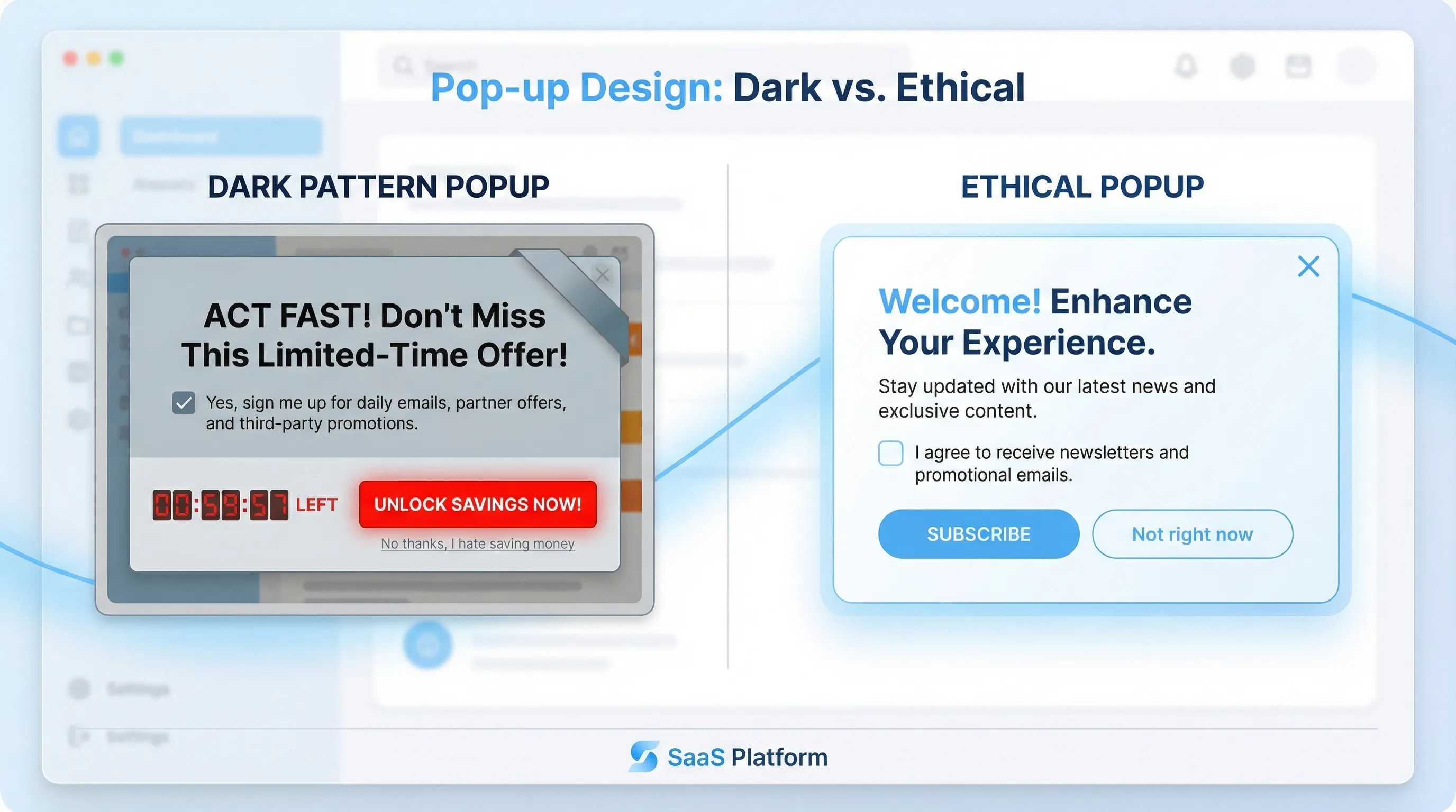
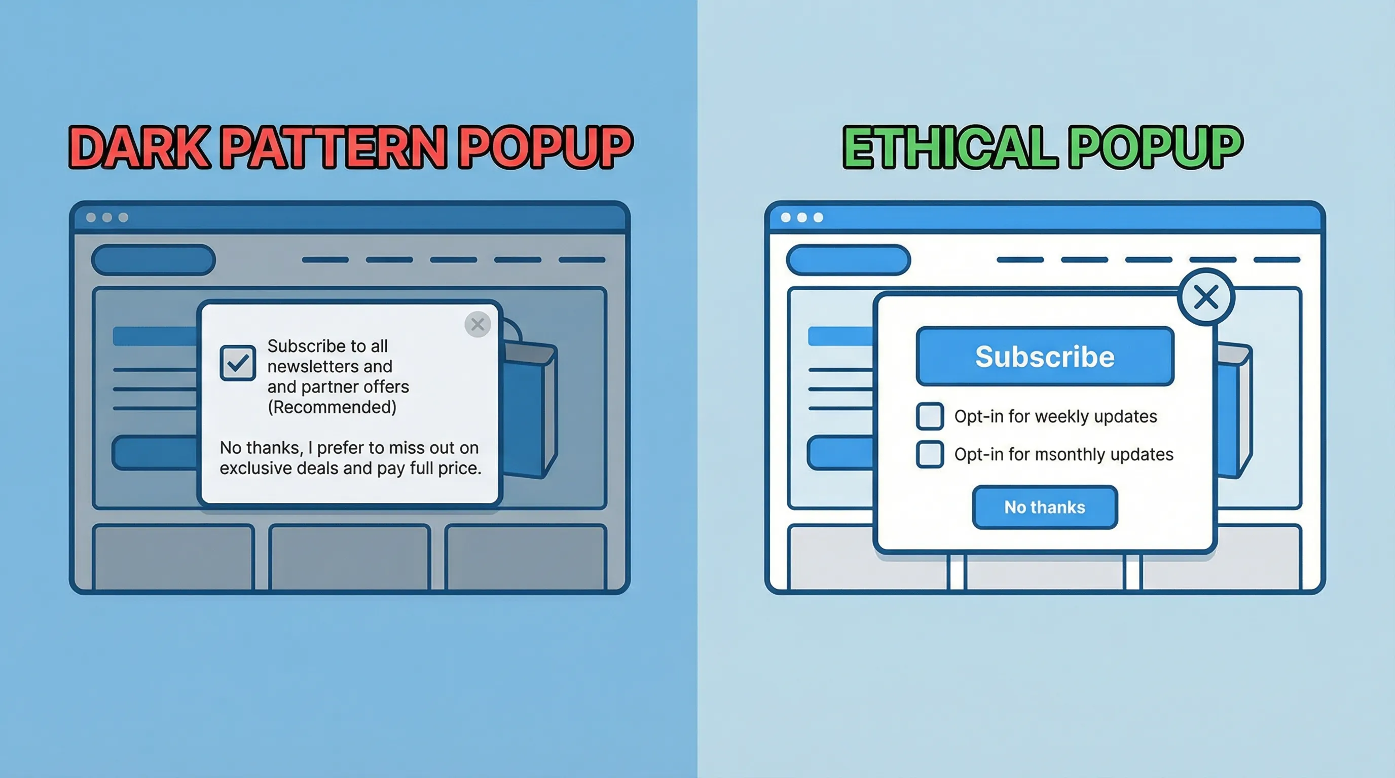
1) Confirmshaming (“No thanks, I hate saving money”)
What it looks like: The secondary option is written to shame the user.
- “No thanks, I prefer to pay full price.”
- “I don’t care about improving my team.”
Why it’s harmful: It creates emotional pressure instead of presenting a legitimate choice. Users learn that your brand uses coercion.
Do this instead:
- Use neutral copy: “Not right now” or “Skip.”
- If you need segmentation, ask a one-click microsurvey: “What are you here for today?”
Practical SaaS example: On a pricing page, a neutral secondary action (“Continue without offer”) often converts better long-term than guilt copy, because it preserves trust for the return visit.
2) Hiding the close button (or making it hard to click)
What it looks like:
- Close icon blends into the background
- Close is tiny on mobile
- Close appears after a delay
- Clicking outside does nothing
Why it’s harmful: It is a forced interaction. Users stop reading your message and start trying to escape it.
Do this instead:
- Make close obvious (especially on mobile)
- Allow Escape key to dismiss
- Avoid full-screen takeovers unless the user initiated the action
If you are trying to prevent “accidental dismiss,” solve that with clearer design and timing, not by removing the exit.
3) “Email wall” dismissal (you must submit to close)
What it looks like: The popup blocks the page and requires an email or phone number to close.
Why it’s harmful: It drives fake entries, disposable emails, and resentment. It also directly conflicts with the “value first” principle.
Do this instead:
- Offer an optional form with a clear benefit
- Use less disruptive placements first (slide-in, floating button, inline)
- Trigger after intent signals (scroll depth, time on page, specific clicks)
If you want a playbook for capturing leads without harming UX, this pairs well with Lead capture that doesn’t feel pushy.
4) Pre-checked consent boxes and bundled consent
What it looks like:
- A checked box that opts the user into marketing by default
- One checkbox that “agrees” to terms and marketing in one step
- Consent language hidden under small print
Why it’s harmful: Users did not actively choose. This is one of the most common sources of consent issues and complaint-driven churn.
Do this instead:
- Use unchecked opt-in by default
- Separate “terms” acceptance from marketing permission
- Keep consent language readable and near the action
For SMS and higher-risk channels, use explicit disclosures and consider double opt-in (see SMS capture popups: compliance and conversion tips).
5) Fake urgency and rolling countdown timers
What it looks like:
- “Offer expires in 10:00” and resets on refresh
- “Only 1 seat left” with no basis
Why it’s harmful: Even if it boosts conversions today, it teaches users that your messaging is unreliable.
Do this instead:
- Use real constraints only (a real end time, a real cohort limit)
- Make the offer logic consistent (do not reset the deadline)
- If urgency is not real, use relevance instead: “Want the annual plan comparison?”
If you do run time-limited coupons, keep them truthful and measurable (related: Time-limited coupons: psychology that drives action).
6) Misdirection with button styling and labels
What it looks like:
- The “Accept” button is bright and large, the “Decline” is tiny text
- The close action is disguised as a link
- Labels do not match outcomes (“Continue” actually means “Subscribe”)
Why it’s harmful: Users feel tricked, and your experiment results become misleading because you are measuring confusion, not persuasion.
Do this instead:
- Make choices visually balanced
- Use labels that describe the outcome: “Subscribe”, “Start trial”, “Talk to sales”
- Ensure the next step matches the button text
7) Subscription traps (easy to start, hard to stop)
What it looks like:
- Popup offers a “free trial” but hides renewal terms
- Unsubscribe is buried or requires extra steps that are not disclosed
Why it’s harmful: It increases refunds, chargebacks, and negative reviews, and it can trigger regulatory attention.
Do this instead:
- If there is auto-renewal, state it clearly
- Keep cancellation and unsubscribe flows predictable
- Use popups to educate, not to conceal terms
Even if your popup is “just lead capture,” it is often the top of a journey that ends in billing. Trust leaks early show up later in churn.
8) Popup spam (no frequency cap, stacked modals)
What it looks like:
- A newsletter popup, then a coupon popup, then a feedback popup
- Same visitor sees the same modal every page view
- Mobile gets hammered because the viewport is smaller
Why it’s harmful: You create “banner blindness” for everything, including messages that actually matter. It also increases rage clicks and reduces session depth.
Do this instead:
- Apply frequency capping (per visitor, per session, per page type)
- Prioritize by intent (pricing intent beats newsletter intent)
- Exclude key flows (checkout, login, critical docs)
If you want a concrete starting point, use a simple global budget and a cooldown window (more detail: Popup frequency capping that protects UX).
Quick reference table: dark patterns vs ethical alternatives
| Dark pattern in popups | How it typically shows up | Safer alternative that still converts | What to measure (beyond popup CTR) |
|---|---|---|---|
| Confirmshaming | Guilt copy on “No” | Neutral “Skip” + optional microsurvey | Activation rate of captured leads, unsubscribe rate |
| Hidden close | Tiny X, delayed close | Visible close + Escape support | Bounce rate, time on page after dismissal |
| Forced submission to dismiss | Email required to continue | Optional form + intent trigger | Form completion quality, disposable email rate |
| Pre-checked consent | Opt-in default on | Explicit opt-in, separate consents | Spam complaints, consent rate vs engagement |
| Fake urgency | Resetting countdown | Real deadlines only, or drop urgency | Refund rate, churn, support tickets |
| Misdirection buttons | Labels do not match | Honest labels, balanced buttons | Downstream conversion to PQL/SQL |
| Subscription trap messaging | Renewal hidden | Clear renewal terms, link to details | Refunds/chargebacks, complaint volume |
| No frequency cap | Repeated or stacked modals | Frequency caps + page exclusions | Session depth, return visits, brand search |
A practical “ethical popup” checklist for SaaS teams
Use this as a pre-launch QA pass for any website popup tool or feedback widget:
- Choice is real: Users can decline without punishment.
- Exit is obvious: Close is visible and works on mobile.
- Copy matches outcome: Buttons describe what will happen.
- Consent is explicit: No pre-checked boxes, no bundled consent.
- Urgency is truthful: Deadlines and limits are real.
- Frequency is capped: Your site has a global exposure budget.
- Accessibility basics: Keyboard navigation works, focus is managed, contrast is readable.
- Performance is protected: The widget does not degrade Core Web Vitals (see Popup load speed without sacrificing design).
Real-world popup examples that avoid dark patterns
Pricing page: replace coercive lead capture with a decision helper
Instead of: “Wait, don’t leave. Enter your email for 20% off.”
Try:
- A one-question microsurvey: “What’s stopping you from starting a trial today?”
- Options like “Need security details”, “Not sure it fits my use case”, “Price is too high”, plus an optional text field
This collects high-signal feedback and lets you route people to the right asset (security page, case study, plan comparison) without pressure.
Docs page: treat feedback as a service, not a trap
Instead of: a modal that blocks the page asking for an email “to get updates.”
Try:
- A small slide-in after meaningful engagement: “Did this page answer your question?” (Yes/No)
- If No, ask “What was missing?” with a short text field
This pattern improves documentation quality and reduces support volume, and it is aligned with user intent.
Onboarding: avoid the “survey hostage situation”
Instead of: forcing a multi-question survey before the user can proceed.
Try:
- A two-step progressive profiling approach: ask one routing question after signup, then ask enrichment later when the user has experienced value (see Progressive profiling: a simple starter guide).
Frequently Asked Questions
Are dark patterns illegal in the US? Dark patterns are not a single statute, but deceptive UX can violate consumer protection laws, and the FTC has explicitly addressed dark patterns and brought enforcement actions tied to deceptive design.
Do ethical popups convert worse? Often no. Ethical popups tend to produce fewer total submissions but higher-quality leads, better downstream activation, and lower unsubscribe and spam rates.
What is the fastest dark-pattern audit for a popup? Ask: “Can the user clearly decline?” and “Can they clearly close?” If either answer is no, fix that before optimizing anything else.
How do intrusive interstitials affect SEO? Google has warned that intrusive interstitials on mobile can harm page experience and visibility. If your popup blocks primary content on landing, use less intrusive patterns and intent-based triggers.
How many times should a visitor see a popup? There is no universal number, but a common safe starting point is a strict cap with a cooldown (for example, once per session or once every several days) and exclusions for high-friction flows.
Build popups that earn attention (not force it)
If you want to collect feedback, share updates, capture leads, or promote offers without resorting to dark patterns, a lightweight widget approach helps. Modalcast is built for on-site engagement with practical guardrails like targeting and frequency caps, so you can run popups that are clear, optional, and measurable.
Explore Modalcast at Modalcast and pair this article with:
