Website Feedback Widget Placement: Best Practices to Convert
Placement is the difference between a feedback widget that quietly improves your product every week, and one that annoys users, tanks conversions, and gets igno
Placement is the difference between a feedback widget that quietly improves your product every week, and one that annoys users, tanks conversions, and gets ignored.
For SaaS teams, “website feedback widget placement” is really about intent: where is the user in their journey, and how much interruption can you afford at that moment?
This guide breaks placement down into practical patterns you can apply on high-impact pages (pricing, onboarding, docs, app), with examples, trigger rules, and testing advice.
Start with a simple placement principle: match interruption to intent
Think of widget placement on a spectrum:
- Low interruption, low intent: passive tab or floating button, always available
- Medium interruption, medium intent: slide-in after engagement, inline prompt in context
- High interruption, high intent: post-action micro-survey, exit-intent save, cancel-flow interception
If you use a high-interruption pattern on low-intent traffic (for example, a modal on a first pageview), you get the worst of both worlds: poor data quality and annoyed visitors.
A practical way to choose placement is to answer two questions:
- What decision is the user making on this page? (Evaluate pricing, troubleshoot, complete setup, upgrade, cancel)
- What “signal” proves they are engaged? (Scroll depth, time on page, returning visit, click on a key element)
When you have a signal, you earn the right to ask.
The 6 placement patterns that work for SaaS sites
Below are the placements you can reuse across most SaaS websites and apps. Each has a “best moment” and a “common failure mode.”
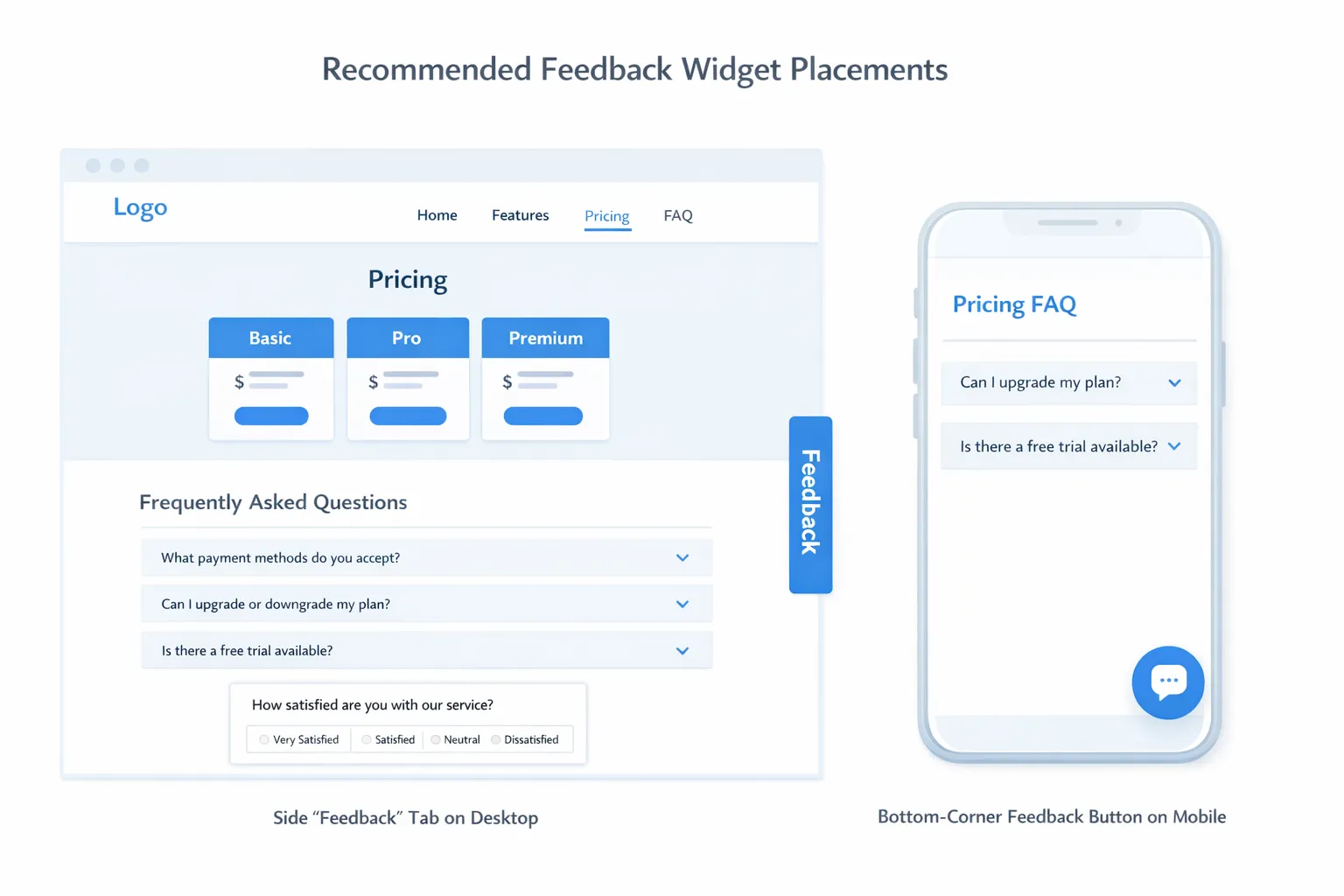
1) Feedback tab on the edge (always-on, lowest friction)
What it is: A small “Feedback” tab anchored to the side of the page.
Best for: Ongoing qualitative feedback without disrupting conversions.
Use it when: You want a baseline feedback channel on marketing pages and in-app.
Common failure mode: The tab becomes invisible because it blends into the UI or competes with chat widgets.
Make it convert better:
- Place it on the right edge on desktop, and avoid blocking core UI in-app
- Use specific microcopy like “Share feedback” or “Report an issue” instead of generic “Feedback”
- Reserve it for open-ended feedback and bug reports, not lead capture
2) Floating action button (FAB) in the lower corner
What it is: A round button or compact pill in the bottom corner that opens a widget.
Best for: Mixed goals (feedback, updates, lead capture) without being pushy.
Use it when: You need one persistent entry point that can work across page types.
Common failure mode: It overlaps cookie banners, chat widgets, or mobile navigation.
Make it convert better:
- Keep it above sticky footers, cookie prompts, and chat launchers
- On mobile, consider bottom-left if bottom-right is crowded (many chat tools live bottom-right)
- Suppress it on flows where it conflicts with critical UI (checkout, editor, onboarding steps)
3) Inline placement inside the page (highest relevance)
What it is: A feedback prompt embedded inside the content (for example, under a pricing section or at the end of a doc article).
Best for: High-quality answers because the question is tied to context.
Use it when: You can place the prompt right after the user consumes the content.
Common failure mode: Inline prompts are added too high on the page, before the user has enough context.
Make it convert better:
- Place it after a meaningful section (end of pricing FAQ, end of doc article, after integration steps)
- Ask one question first, then optionally expand (micro-survey style)
- Keep it visually light so it feels like part of the page, not an ad
4) Slide-in after engagement (good balance for marketing pages)
What it is: A small panel that slides in from the bottom or side after a trigger (scroll, time, click).
Best for: Capturing intent without blocking content.
Use it when: You have a clear trigger event (scroll 60 percent, 45 seconds on page, clicked “Pricing”).
Common failure mode: Slide-ins fire too early, especially on mobile.
Make it convert better:
- Trigger based on engagement, not time alone
- Keep it dismissible and remember dismissals (frequency caps matter)
- Use it for “quick vote” questions like “Did you find what you needed?”
5) Post-action micro-survey (highest response quality)
What it is: A prompt immediately after a user completes an action (created a workspace, installed an integration, upgraded).
Best for: Understanding blockers and improving activation.
Use it when: You can tie the question to a completed step.
Common failure mode: Asking too much right after success, turning a “win moment” into friction.
Make it convert better:
- Ask a single lightweight question (10 seconds max)
- Use structured answers first (scale, multiple choice), then an optional comment
- Separate “feedback” from “support” (route support requests clearly)
6) Exit-intent or abandonment save (use sparingly, but powerful)
What it is: A prompt when the user shows leaving behavior (mouse movement to close tab on desktop) or abandonment signals in-app.
Best for: Pricing objections, trial-to-paid hesitation, cancel prevention.
Use it when: The page has high bounce risk and you have a strong, relevant offer.
Common failure mode: Overuse creates banner blindness and brand damage.
Make it convert better:
- Show only on high-value pages (pricing, checkout, cancel)
- Ask an objection question (“What stopped you today?”) rather than pushing a generic discount
- Avoid intrusive mobile interstitials that block content
For guidance on keeping surveys from hurting conversion rates, pair this placement strategy with a guardrail approach like the one in Collect Feedback Without Killing Conversions.
Best placements by page type (with examples you can copy)
The fastest way to improve results is to treat each page type differently.
| Page type | User intent | Best placement | Trigger that earns attention | Example question (copy-ready) | Primary metric |
|---|---|---|---|---|---|
| Homepage | Exploring | Tab or FAB | None (always available) | “What brought you here today?” | Feedback starts per 1k sessions |
| Pricing | Evaluating | Inline + optional slide-in | Scroll to plans or FAQ | “What’s missing for you to choose a plan?” | Plan CTA click rate (guardrail) + responses |
| Signup | Committing | Post-action | After account created | “What almost stopped you from signing up?” | Signup completion (guardrail) |
| Onboarding | Trying to reach first value | Post-action | After key step completes | “How confident do you feel about the next step?” | Time to first value, step completion |
| In-app dashboard | Working | Tab or FAB | Always available, or after repeated action | “What’s slowing you down right now?” | Issue categories, retention correlation |
| Docs / help center | Troubleshooting | Inline at end + tab | After reading 70 percent | “Did this article solve your problem?” | Self-serve resolution rate |
| Error states (404, failed payment, integration error) | Recovering | Inline or modal | Immediately, but minimal UI | “What were you trying to do?” | Recovery action rate |
| Cancel flow | Churn risk | Inline step in flow | Only when cancel initiated | “What’s the main reason you’re leaving?” | Save rate, churn reasons |
Pricing page: where placement directly affects revenue
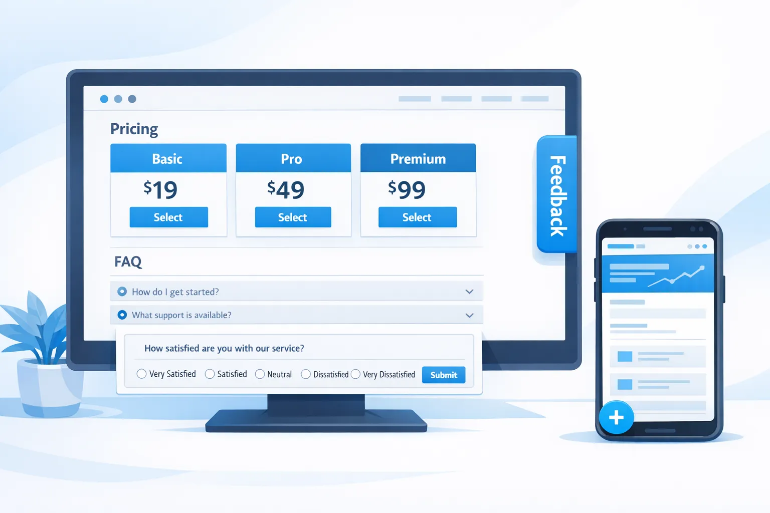
A pricing page is not just a lead gen page, it is an objection page. The best feedback widget placement here is usually inline near the bottom, after users have compared plans and scanned FAQs.
A practical pattern:
- Add an inline micro-survey under your pricing FAQ
- Ask one question tied to conversion: “What’s missing to start today?”
- Offer a second step only if they engage: “Want us to follow up?” (email optional)
If you also want a more proactive prompt, use a slide-in only after a strong intent signal (for example, they viewed pricing for 45 seconds or toggled monthly/annual).
Onboarding and activation: ask after “work,” not before
If you prompt for feedback at the start of onboarding, you collect guesses. If you ask after the user completes a key step, you collect reality.
Good moments:
- After workspace creation
- After first import
- After installing an integration
- After inviting a teammate
Keep it short and actionable. If you want templates for micro-surveys and triggers, see How To Set Up Microsurveys in Your Website or App.
Docs: inline beats popups almost every time
Docs visitors are usually trying to finish a task quickly. A popup often feels like an obstacle.
Better approach:
- Place a 1-click inline prompt at the end: “Did this solve it? Yes/No”
- If “No,” reveal a single follow-up: “What’s missing?”
This placement generates high-quality issue themes you can route back to docs improvements or product fixes.
Placement decision matrix: pick the least intrusive option that still answers the question
Use this table when you are deciding between multiple placements for the same goal.
| Your goal | Recommended placement | Why it works | Avoid when |
|---|---|---|---|
| Always-on feedback channel | Tab or FAB | Low friction, user-controlled | You need page-specific context |
| Objection discovery (pricing) | Inline | Contextual, less disruptive | The page is very short, little scroll depth |
| Improve activation | Post-action micro-survey | Feedback tied to real usage | The action is already high-friction |
| Reduce doc bounce | Inline at end | Doesn’t interrupt reading | Content is below the fold and rarely reached |
| Recover from errors | Inline near error | High relevance, immediate | You need more than one question |
| Save abandoning users | Exit-intent (desktop) | Catches high intent | Mobile-first traffic or weak offer |
Mobile placement and SEO: don’t block the experience
Mobile is where “just one popup” can become a conversion and SEO problem.
Two practical guardrails:
- Prefer tabs, FABs, and inline prompts on mobile instead of full-screen modals.
- Keep primary content accessible. Google has explicitly called out issues with intrusive interstitials on mobile in its guidance on helping users easily access content.
If you must use a modal on mobile, do it only when it is clearly user-initiated (they tapped a button) or tied to a critical flow.
The testing workflow: measure conversions and feedback quality together
“More responses” is not the same as “better outcome.” For SaaS, your placement experiments should track both:
- Outcome metric: signup rate, demo requests, upgrades, activation completion
- Feedback quality metrics: completion rate, useful response rate, top themes stability
- Guardrails: bounce rate, page speed impact, rage clicks (if you track them), dismiss rate
A simple experiment plan:
- Run an A/B test where variant changes only one variable (placement or trigger).
- Use a holdout group if you can, so you can estimate incremental lift rather than just engagement.
- Keep the test long enough to cover weekday and weekend behavior (most SaaS traffic patterns vary).
If you need to reduce fatigue while testing multiple placements, adopt a frequency policy similar to the approach in Popup Frequency Capping That Protects UX.
How to implement these placements with a single widget (without adding complexity)
The operational win is not just choosing a good placement once, it’s being able to iterate.
A lightweight workflow that works well for SaaS teams:
- Use one always-on entry point (tab or FAB) as your baseline feedback channel.
- Add 1 to 2 high-intent placements (pricing inline, post-onboarding micro-survey).
- Review responses weekly, update the question wording monthly.
ModalCast is designed for this style of iteration, collecting feedback, sharing updates, capturing leads, and promoting offers through one widget. If you want a quick implementation path, start with Ship a Feedback Website Tool in 15 Minutes and then refine the UI using Feedback Widget Design Tips That Boost Responses.
Frequently Asked Questions
Where should I place a website feedback widget to increase conversions? Place it where users encounter friction or make a decision: inline on pricing pages near FAQs, post-action in onboarding after key steps, and inline at the end of docs. Use a passive tab or floating button elsewhere so users stay in control.
Do popups hurt conversions? They can, especially when they fire too early or block content on mobile. Popups work best when triggered by clear intent (scroll depth, pricing interaction, cancel initiation) and when they ask one relevant question.
What’s the best feedback widget placement for a pricing page? Inline near the bottom of the page (after plans and FAQs) tends to work well because users have enough context to answer. A secondary slide-in can work if it triggers only after high intent behavior.
How do I choose between a feedback tab and an inline survey? Use a tab when you want an always-available channel with minimal disruption. Use an inline survey when you want higher-quality, context-specific answers tied to a particular page or section.
How often should a feedback widget appear? As a default, keep it user-initiated (tab/FAB) or limit proactive prompts with frequency caps and cooldowns. If you need proactive prompts, cap them per user and exclude critical flows.
Put placement to work (and iterate fast)
If you want to apply these placement patterns without adding heavy tooling, you can start with a single widget and iterate from there.
Explore ModalCast to set up a lightweight feedback widget, choose a placement pattern (tab, floating button, inline prompt, or post-action survey), and start measuring which placements improve both response quality and conversions.
