Lead Capture That Doesn't Feel Pushy
Popups do not have to be annoying. When they are timed to intent, give clear value, and respect attention, they can feel like help rather than interruption.
Popups do not have to be annoying. When they are timed to intent, give clear value, and respect attention, they can feel like help rather than interruption. This playbook shows how SaaS and website teams can capture more qualified leads without harming UX or search performance.
Why this matters: intrusive interstitials frustrate users and can impact visibility on mobile search. Google has advised against intrusive interstitials that make content less accessible on mobile. See the announcement from Google Search Central on mobile interstitials for details: Helping users easily access content on mobile. Nielsen Norman Group has also documented the usability costs of aggressive overlays: Popups and Modals.
Principles for non-pushy lead capture
- Value before ask, show a benefit first, then ask for the email. Give a reason to subscribe that is immediately useful to the visitor in the current context.
- Timing by intent, wait for evidence of engagement, for example, finish reading, second page view, or product exploration.
- Choice and control, make closing easy, never trap the user, and avoid multiple overlapping prompts.
- Frictionless inputs, reduce the form to one field to start, you can gather profile data later.
- Honesty and transparency, say what you will send and how often, include privacy links and do not hide unsubscribe.
- Accessibility and performance, keyboard focus, visible close controls, and minimal impact on page speed.
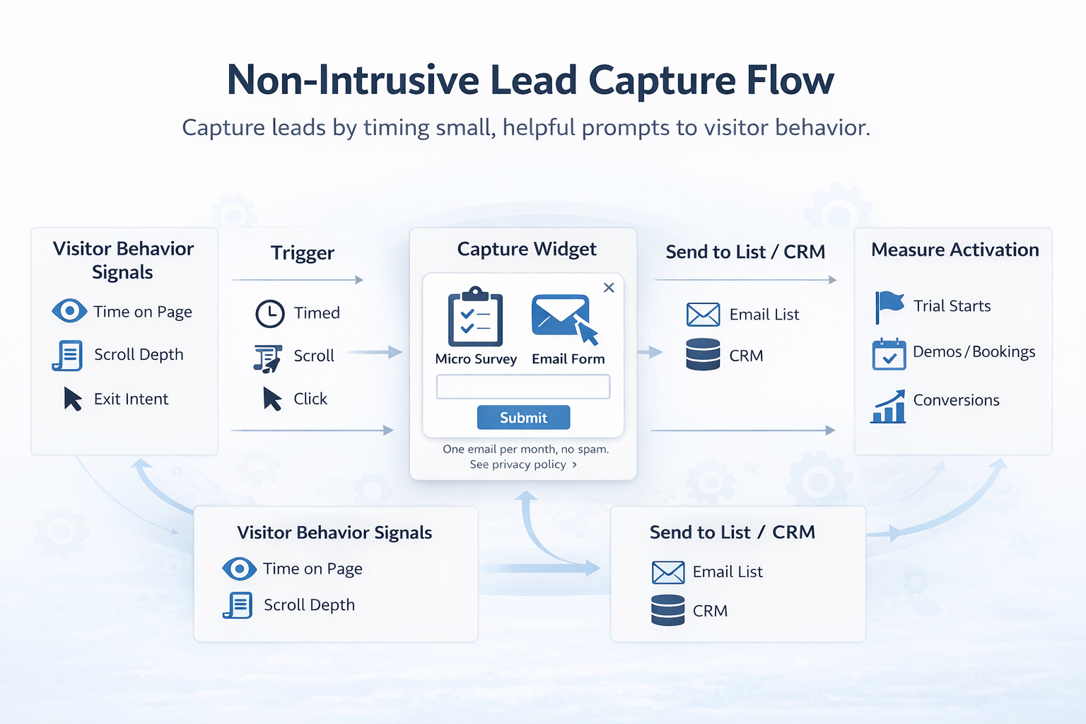
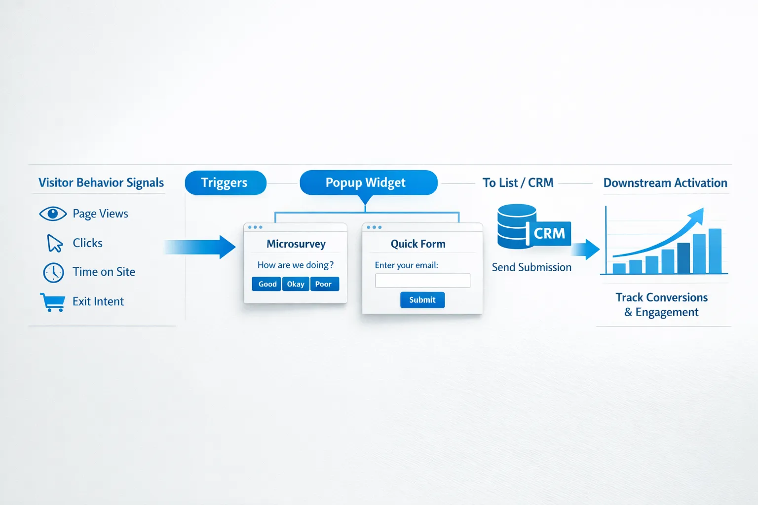
A simple framework: Right Message, Right Moment, Right Medium
- Right Message, align the offer to the page intent. On a pricing page, offer a ROI calculator or quote. On a feature page, offer a template that uses that feature. On documentation, offer release notes or early access.
- Right Moment, use behavior signals, for example, 45 to 60 seconds on page, 50 to 70 percent scroll, second session, or exit intent on desktop. On mobile, avoid full-screen interstitials.
- Right Medium, pick the least intrusive UI that can still be noticed, for example, inline block, slide-in from corner, or a small floating action button that opens a form on tap.

7 patterns that convert without being pushy
1) Inline offers inside content
Add an embedded form or CTA card inside the article or documentation, not as an overlay. Make the offer relevant to the section the user is reading.
Good for, top of funnel content, documentation, changelogs.
Example microcopy:
- Get the full teardown as a PDF, sent to your inbox.
- Ship this checklist to yourself, so you can use it later.
How to implement with Modalcast, create a form post and trigger it from an element click, for example a button inside the article, so the widget opens only when the user opts in. See practical how-tos in our guide on how to create a customer feedback form.
2) Slide-in after engagement
Use a small slide-in from the corner after meaningful behavior. Do not appear within the first 10 seconds. Give a clear close button.
Good for, blogs and resource pages where visitors often scroll.
Example microcopy:
- Enjoying this guide, get monthly product growth notes, 1 email per month.
- Prefer templates over theory, we will send you the template library link.
How to implement with Modalcast, create a form post, set a behavior or timing trigger such as time on page or scroll, and keep the layout compact. You can preview and iterate with Draft Posts before publishing, see Introducing Draft Posts in ModalCast.
3) Micro-commitment first, opt-in second
Start with a one-question microsurvey that helps the visitor, then offer a tailored resource. The opt-in follows naturally because the user already invested a click.
Good for, product pages and feature tours.
Example flow:
- Question, What are you trying to improve today, activation, retention, or conversion.
- Follow up, Based on your choice, get the matching playbook via email.
How to implement with Modalcast, use an instant survey or microsurvey, then display a contextual form. Our guide on microsurveys covers design and trigger tips.
4) Aha moment prompts in product
Trigger a light prompt when a user reaches a milestone in a free trial. Offer a case study, onboarding checklist, or option to talk to sales.
Good for, product-led SaaS during trials.
Example microcopy:
- You just imported your first dataset, want a 2 minute setup walkthrough in your inbox.
- Built your first automation, get the advanced tips for day 2.
How to implement with Modalcast, show a message from a user action by wiring the widget to an element trigger in the interface, for example, after a success toast.
5) Save progress on exit intent
On desktop, not mobile, detect exit behavior and offer to save progress or email the current page for later. This creates value rather than pushing a generic newsletter.
Good for, long forms, calculators, onboarding flows.
Example microcopy:
- Want to keep your changes, email a link to this draft to finish later.
- Not ready to book, send the comparison sheet to your inbox.
How to implement with Modalcast, create a form post that opens when users click a Save or Email me link you place near your form. Avoid full-screen interstitials on mobile to respect Google guidance.
6) Quiet floating action button
Keep a small Help and updates or Get templates button in the corner. This is user initiated, so it never interrupts. Inside, provide categories, subscribe, get updates, or request a demo.
Good for, site-wide access to resources without popups.
How to implement with Modalcast, enable the floating action button and stock it with posts, forms, and updates from a central feed. Visitors can open it when they want. See the setup guide.
7) Incentives that match intent
Discounts can work, but they should match user intent and stage. For SaaS, a time-boxed onboarding bonus or extended trial for subscribers is more credible than a random percentage off.
Good for, pricing pages and return visitors.
Example microcopy:
- Join the early access list for the new analytics module, get an extended trial when it ships.
- Subscribe for launch updates, receive a limited number of onboarding credits.
How to implement with Modalcast, create an offer post with a form. If you offer coupons in your model, you can use a coupon post to distribute unique or time bound codes, see ideas in Driving Conversions with ModalCast.
Quick comparison of patterns
| Pattern | Best for | UX risk level | Notes |
|---|---|---|---|
| Inline embedded form | Blog, docs, changelog | Low | Feels native, depends on content relevance |
| Slide-in after engagement | Articles, resources | Low to medium | Set a sensible delay and scroll threshold |
| Micro-commitment to opt-in | Feature pages | Low | Answer first, then ask for email |
| Aha moment prompt | In-app trial | Low | Tie to real progress signal |
| Save progress on exit | Desktop long forms | Medium | Keep small, avoid mobile interstitials |
| Floating action button | Site-wide utility | Low | Non-interruptive, always available |
| Intent-matched incentive | Pricing, return visits | Medium | Be transparent about the incentive terms |
Copy and design details that keep it friendly
- Lead with a benefit, do not lead with Subscribe to our newsletter. Try Send me the onboarding checklist or Get the 5 minute calculator.
- Offer frequency transparency, One email per month, no spam. This reduces anxiety.
- Add a clear privacy link, place it near the submit button.
- Single field first, start with email only. Use progressive profiling later via replies or in-product surveys.
- Clear close affordance, visible X and Esc to dismiss, especially for keyboard users.
- Avoid stacking prompts, ensure only one prompt is active at a time.
Targeting without creepiness
- Page and section targeting, run different offers on pricing, features, docs, and blog. This relies on intent in the open, not personal data.
- Referrer or campaign alignment, if a visitor arrives from a webinar page, offer the webinar slides or related material.
- Session stage, show stronger CTAs after two or more page views or on the second session, not to first-time visitors within 10 seconds.
- Respect existing customers, suppress capture on authenticated app routes, or limit prompts to updates and feedback requests.
You can achieve most of this with URL and element targeting plus timing triggers, which avoids complex identity data and still feels relevant.
Measure quality, not just opt-in rate
Email capture rates can go up when you are aggressive, but that often hurts brand trust and downstream activation. Track full funnel results.
Primary metrics:
- Submission rate, views to email submissions for each pattern.
- Lead quality, trial start, demo booked, or content engagement within 7 days.
- Unsubscribe and spam complaints, monitor within the first two sends.
- Assisted conversions, count closed won or upgrades influenced by captured leads.
Testing tips:
- Always keep a holdout, withhold the prompt from a small percentage to estimate incremental value versus natural signups.
- Test message first, then timing, then placement. Copy tends to yield bigger wins than layout tweaks.
- Cap frequency, for example, one prompt per session and a cool-down window for repeat visitors.
Implementation blueprint with Modalcast
Modalcast is a lightweight widget that combines forms, instant surveys, updates, and offers. You can implement the patterns above without adding complexity to your stack.
Suggested setup:
- Create a central feed, group your capture posts by page type, for example, Blog, Product, Docs.
- Draft and review, use Draft Posts to collaborate on copy and design, then publish when ready.
- Choose respectful triggers, use time on page, scroll, element click, or user action triggers. Avoid first-load triggers.
- Keep forms minimal, start with a single email field and a short note about frequency and privacy.
- Add value content, attach a case study, checklist, or template as the promised asset. You can also link to product updates or changelogs you publish through Modalcast.
- Monitor and iterate, use the analytics in your dashboard to track views, clicks, and submissions, and iterate weekly.
If you need a refresher on installation or feed setup, see the step-by-step setup guide.
Real world examples by page type
Homepage
- Offer, Send me a 3 minute product tour in my inbox.
- Trigger, after 30 to 45 seconds or after the second hero scroll.
- Medium, small slide-in on desktop, inline block on mobile.
Feature page
- Offer, Pick your use case, we will send the matching checklist.
- Trigger, microsurvey response, then open form.
- Medium, small modal inside the widget container, not full screen.
Pricing page
- Offer, ROI calculator results by email, or an invitation to a weekly live Q and A.
- Trigger, exit on desktop, or after a visitor opens two pricing FAQs.
- Medium, corner slide-in with dismiss option.
Documentation or changelog
- Offer, Get release notes and roadmap updates, monthly.
- Trigger, after reading time or on a second docs page.
- Medium, inline form between sections.
Blog post
- Offer, Download the companion template, sent via email.
- Trigger, 60 percent scroll or second pageview in the same session.
- Medium, inline CTA card plus optional slide-in.
Privacy and compliance basics
- Make consent explicit, include a short consent note and a link to your privacy policy near the submit button.
- Honor user choice, if users dismiss a prompt, set a cookie or use local storage to keep it hidden for a reasonable period.
- Avoid obstructive mobile formats, comply with Google guidance on mobile interstitials.
For more background on the UX impact of overlays, see Nielsen Norman Group’s research on popups and overlays: NNG popups guidance.
A quick audit checklist
- Does every lead capture message offer a specific, immediate value, not a generic newsletter pitch.
- Are triggers tied to engagement, not page load.
- Is there an easy, visible close control and no stacking of prompts.
- Is the form one field to start, with frequency and privacy notes.
- Are you measuring downstream quality, not just submission rate.
- Do mobile experiences avoid full-screen interstitials.
Closing thoughts
Lead capture that respects attention tends to produce fewer, better leads, and it preserves trust. If your capture pattern feels like a helpful tool to the user, you are on the right track.
When you are ready to implement these patterns, keep it simple. Use a single widget to run forms, microsurveys, updates, and offers, choose respectful triggers, and iterate from analytics. You can set this up quickly with Modalcast and maintain a non-pushy user experience across your site.
Explore how to combine feedback and capture to lift both UX and conversions, read our post on what a feedback widget is and why you need one, then try these patterns on one high traffic page first. Scale what works, retire what does not, and keep the experience friendly.
