Ship a Feedback Website Tool in 15 Minutes
Most teams overcomplicate feedback. You do not need a long survey, an analytics overhaul, or weeks of engineering time.

Most teams overcomplicate feedback. You do not need a long survey, an analytics overhaul, or weeks of engineering time. In 15 minutes, you can ship a lightweight feedback website tool that collects real user insights, protects UX, and gives your team a simple loop to act fast.
This guide shows a practical, minimal path to live feedback using a single, flexible widget. It is designed for SaaS founders, indie hackers, PMs, marketers, and website owners who want signal without the friction.
What you will ship in 15 minutes
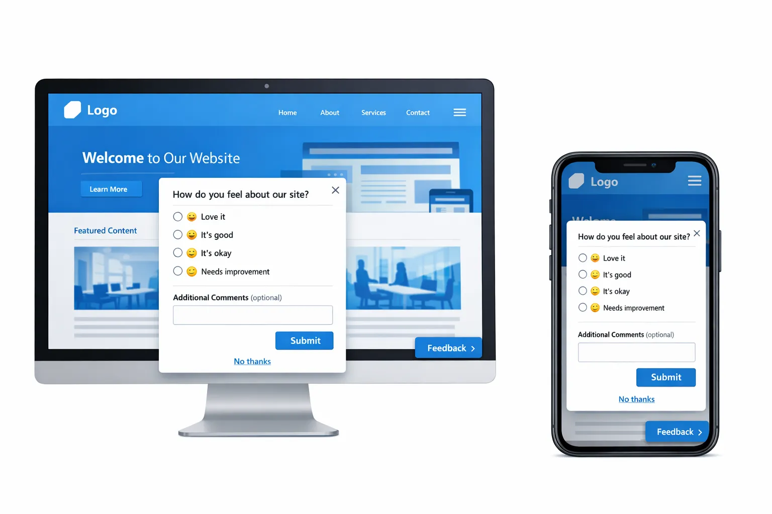
- A compact, always‑available feedback entry point that opens a two‑question form.
- A targeted prompt on your highest‑leverage page (for most, this is pricing, onboarding, or checkout) that asks one contextual question.
- Guardrails, frequency caps, and a clear “No thanks,” so it does not harm conversions.
- A basic measurement plan, so you know whether to iterate or scale.
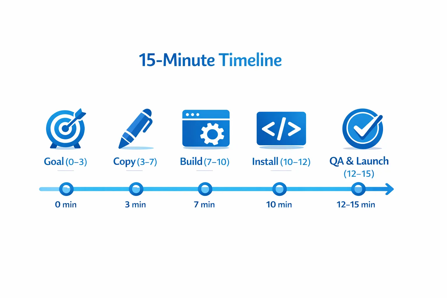
The 15‑minute blueprint
| Minute | Step | Output |
|---|---|---|
| 0–3 | Pick one goal and one audience | A single question to answer this week |
| 3–7 | Draft ultra‑short copy | Question, 4 quick options, optional email field |
| 7–10 | Build the widget | One microsurvey or form post in your feed |
| 10–12 | Install and target | Script installed, page targeting and frequency caps set |
| 12–15 | QA and launch | Works on desktop and mobile, respectful UX, live |
Minute 0–3: Pick one goal and one audience
Do not try to capture everything. Choose the one decision you need to make this week.
Common high‑leverage goals:
- Reduce friction on pricing pages. Question to answer: what is stopping qualified buyers from starting a trial?
- Capture bugs on error or help pages. Question to answer: what broke or felt confusing?
- Prioritize feature ideas from active users. Question to answer: what should we build next for this workflow?
Write your single, primary question based on that goal.
Minute 3–7: Draft ultra‑short copy
Use one primary question, four quick options, and an optional text field. Keep it scannable and mobile‑friendly.
Copy templates you can paste:
- Pricing hesitation: What is stopping you from starting a trial today?
- I need a demo
- Price is not clear
- Missing feature
- I am just researching
- Bug report: Did something break on this page?
- Yes, a button or link did not work
- A form failed or error appeared
- Content is unclear or outdated
- Other
- Feature input: What would make this page more useful for your workflow?
- Better integrations
- More automation
- Reporting or exports
- Collaboration features
Add an optional free‑text field labeled Optional details and an optional email field labeled Email, only if you want a reply.
Minute 7–10: Build the widget in Modalcast
- Create a new post in your Modalcast feed using a form or microsurvey component.
- Add your primary question first. Put the optional text field second. Keep it to two steps maximum.
- Set the success message to Thank you for the feedback. We use this to improve fast.
- Save. If you want a passive entry point, enable a floating action button labeled Feedback.
If you need step‑by‑step screenshots, follow the setup articles here:
Minute 10–12: Install and target
- Add the Modalcast widget script to your site template, ideally just before the closing body tag. Publishing platforms like WordPress, Shopify, and most custom stacks support this quickly.
- Target only the pages where the question is relevant. Start focused, for example, /pricing, /checkout, /app, or support pages.
- Set frequency caps so users do not see repeated prompts. At minimum, show once per user per day, and suppress for anyone who already responded.
Related implementation guidance:
Minute 12–15: QA and launch
Run through this quick checklist:
- Copy is 1–2 lines, options fit on one screen, and the button contrast is 4.5:1 or better.
- The prompt does not overlap cookie banners, chat widgets, or sticky CTAs.
- On mobile, tap targets are thumb‑friendly, at least 44 px tall.
- Closing the prompt is obvious, and there is a visible No thanks.
- The widget appears only on intended URLs and respects your frequency caps.
Publish.
Three ready‑to‑ship recipes (copy, targeting, measurement)
1) Pricing page hesitation catcher
- Targeting: Path contains /pricing. Trigger on exit intent for desktop and after 45 seconds for mobile.
- Question: What is stopping you from starting a trial today?
- Options: I need a demo, Price is not clear, Missing feature, I am just researching.
- Optional fields: Short text details, optional email.
- Success criteria: 5 to 15 percent response rate, at least 30 responses to find a dominant theme.
- Next action: If Missing feature is top, add a feature comparison block. If I need a demo is top, add a demo CTA near pricing toggles.
2) Post‑signup onboarding friction check
- Targeting: Path contains /welcome or /app onboarding step, show on step 2 or after 90 seconds of inactivity.
- Question: What almost made you stop during setup?
- Options: Import or data was hard, Integration issues, Not sure what to do next, Other.
- Optional fields: Short text details.
- Success criteria: 8 to 20 percent response rate from new signups. Track reduction in setup time to first value.
- Next action: Turn the top friction into an in‑product guide link or short video.
3) Bug report on error and help pages
- Targeting: Path contains /404 or /500 or /help.
- Question: Did something break or feel incorrect on this page?
- Options: Broken link, Form error, Outdated content, Other.
- Optional fields: URL or element that broke, optional email.
- Success criteria: Enough volume to identify recurring issues within 48 hours.
- Next action: Fix the top offender and post a brief update to close the loop.
Guardrails that protect UX and SEO
- Limit interruptions. Use one prompt per session, and sample 20 to 50 percent of traffic until you prove value.
- Respect intent. Do not interrupt checkout or payment steps. Place prompts after tasks, not during them.
- Make dismissal easy. A visible X, a No thanks link, and ESC key support reduce frustration.
- Keep it fast. Load the widget asynchronously and avoid blocking resources.
- Include privacy context. If you collect contact info, note how it is used in one sentence, and link to your policy.
For detailed patterns and guardrails, see Collect Feedback Without Killing Conversions and Popup Frequency Capping That Protects UX.
Measure the first week (simple, actionable metrics)
Focus on a few metrics you can act on quickly.
- Response rate: Responses divided by unique prompt views. Good early targets are 5 to 15 percent for highly targeted prompts.
- First screen drop‑off: Users who see the prompt but do not answer the first question. Rewrite the question if this is high.
- Top reasons: The leading option from your multiple choice list. This is your immediate backlog input.
- Post‑prompt conversion: For pricing prompts, compare trial starts within 24 hours between prompted and unprompted visitors. Keep a small holdout to monitor this.
Modalcast includes analytics to track engagement and responses. Start with trend lines, not perfect dashboards. You can refine instrumentation later.
Turn feedback into action in 48 hours
- Tag and group the top theme.
- Make one visible change tied to that theme. Keep it small, like clarifying a price toggle or adding a missing FAQ.
- Close the loop in‑product. Use the widget to post a short update that shows you listened, for example, You said the pricing was unclear, we added examples and a monthly toggle.
A minimal architecture that scales later
You need very little to start. A single Modalcast feed, one active microsurvey, and page‑level targeting covers most use cases. As volume grows, you can add:
- Additional prompts per audience segment or lifecycle stage.
- Embedded polls in documentation or release notes.
- Post‑transaction CSAT on email confirmation or success pages.
When you are ready for deeper workflows, explore these resources:
- How to Create a Customer Feedback Form Using ModalCast
- What is a Feedback Widget and Why You Need One?
Common pitfalls to avoid
- Too many questions. Two screens max, one multiple choice, one optional text field.
- Asking everyone, everywhere. Target specific pages and intents.
- No clear outcome. Always connect the question to a decision you will make in the next week.
- Aggressive timing. Avoid immediate open on page load. Give users a moment to orient.
- Hiding the close control. Make dismissal obvious, and remember that trust compounds.
If you have 10 more minutes
- Add a second prompt for active customers only, for example, dashboard pages.
- Create a lightweight backlog view by tagging responses in the Modalcast dashboard.
- A/B test two versions of your primary question to reduce first screen drop‑off.
- Add an always‑on Feedback button, so users can initiate contact on their terms.
Ship it today
You can ship a feedback website tool in the time it takes to brew coffee. Start with one question, a small audience, and clear guardrails. Prove value in a day, then scale thoughtfully.
Get the widget live in minutes with Modalcast. Follow the setup guide, then add your first microsurvey using the microsurveys walkthrough. Once it is live, keep it simple, measure results, and show users that feedback turns into action.
