Feedback Widget for SaaS: The Simple Setup That Actually Works
Most feedback widgets fail for a simple reason: they are set up like a survey project instead of a product decision tool.
Most feedback widgets fail for a simple reason: they are set up like a survey project instead of a product decision tool.
A “feedback widget for SaaS” that actually works does three things consistently:
- it shows up at a moment of real intent, 2) it asks a single decision-driving question, and 3) it routes answers into an owner and a next step.
This guide gives you a minimal setup you can ship fast, keep conversion-safe, and improve over time.
What “actually works” looks like (so you can measure it)
Before you touch copy or triggers, define success in a way that forces focus. A widget is working when it produces high-signal responses without creating friction.
High-signal means the response helps you make (or reverse) a decision:
- Which message belongs on the pricing page?
- Which onboarding step causes drop-off?
- Which integration is blocking purchase?
- Which doc page fails to answer the question?
Conversion-safe means you can run it without harming the primary journey on that page (trial signup, demo request, checkout, upgrade).
A practical definition you can adopt:
- 1 decision per widget prompt (not “collect feedback”)
- 1 primary metric + 1 guardrail metric
- Primary metric: response rate, completion rate, or “% with actionable reason”
- Guardrail metric: signup rate, demo CTR, upgrade conversion, or bounce rate on that page
If you want a deeper primer on widget patterns and why they work, see Modalcast’s explainer: What is a feedback widget and why you need one?
The simple setup blueprint (7 parts)
This is the setup that holds up in real SaaS funnels because it is designed for action, not volume.
1) Start with a decision you will make in the next 14 days
If you cannot name the decision, you cannot write a good question.
Good examples (specific, time-bound):
- “Decide whether to rewrite pricing page headline by next sprint.”
- “Decide which onboarding step to fix first.”
- “Decide whether to add an integration to the roadmap.”
Weak examples:
- “Learn what users think.”
- “Collect feedback on the site.”
A useful trick: write the decision as a sentence that begins with “We will…”.
2) Pick the lightest format that can answer the decision
A common mistake is starting with an open-text form because it feels flexible. In practice, it increases effort and reduces completion.
Use this rule:
- If you need distribution, use multiple choice.
- If you need explanation, use a short follow-up text field after a choice.
- If you need sentiment, use a rating (CSAT-style) plus a single “why?” follow-up.
Modalcast has a dedicated CSAT guide if you are measuring satisfaction: Enhancing customer satisfaction with CSAT surveys
3) Trigger on intent, not on timers
The fastest way to tank both conversions and response quality is “show after 5 seconds on every page.” It catches people before they have context.
High-performing intent moments in SaaS typically look like:
- Post-action: after signup, after completing a step, after publishing, after inviting a teammate.
- Friction: after repeated errors, retries, or back-and-forth navigation.
- Evaluation: when someone spends meaningful time on pricing, security, or integrations.
- Help intent: when someone reaches docs, search, or support pages.
If you want specific timing rules and do-not-disturb conditions, use this as a reference: User feedback popup timing rules that protect conversions
4) Add guardrails (the defaults that prevent regret)
Even a great prompt can become annoying if it appears too often or in the wrong place.
Start with conservative guardrails:
- Frequency cap: once per user per 14 to 30 days for the same prompt (tighter if it is a multi-step prompt).
- Exclude conversion-critical views: do not show on checkout, payment, or the final step of signup unless it is explicitly a recovery prompt.
- Sampling: only show to a subset (for example 10% to 30%) when you are testing.
- Mobile check: confirm it is thumb-friendly and does not block essential UI.
If popup collisions are already a problem for your site, you will get value from: Popup frequency capping that protects UX
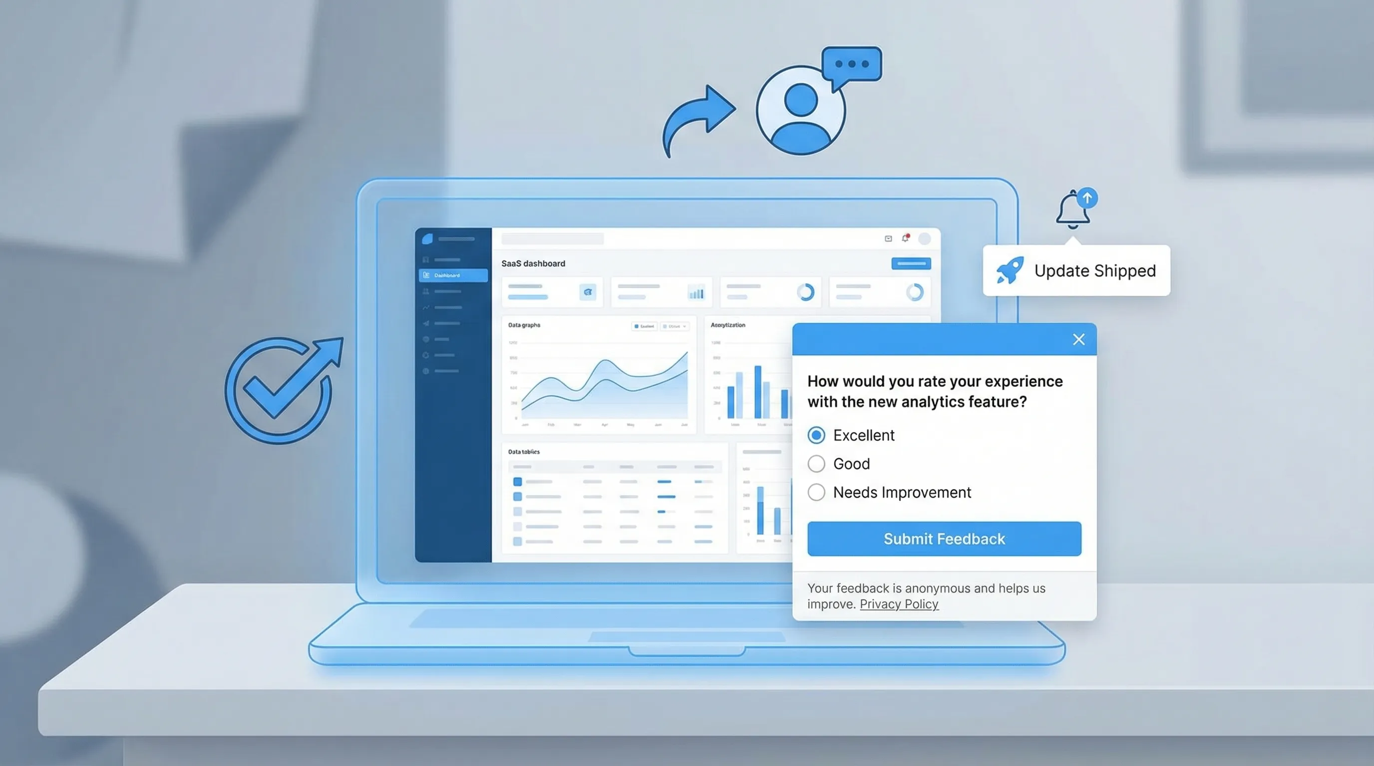
5) Write one question that a busy user can answer in 10 seconds
A reliable structure for SaaS feedback widgets:
- Question: “What stopped you from doing X today?”
- Choices: 4 to 6 options, plus “Other”
- Follow-up (conditional): “One sentence is enough. What happened?”
Make the options concrete and behavior-based (not internal jargon). For pricing, “Too expensive” is less useful than “Too expensive compared to alternatives” or “Missing a plan that fits my use case.”
If you want copy/paste templates by scenario (pricing objections, onboarding, churn, bugs), Modalcast published a full library here: Online customer feedback form templates for SaaS
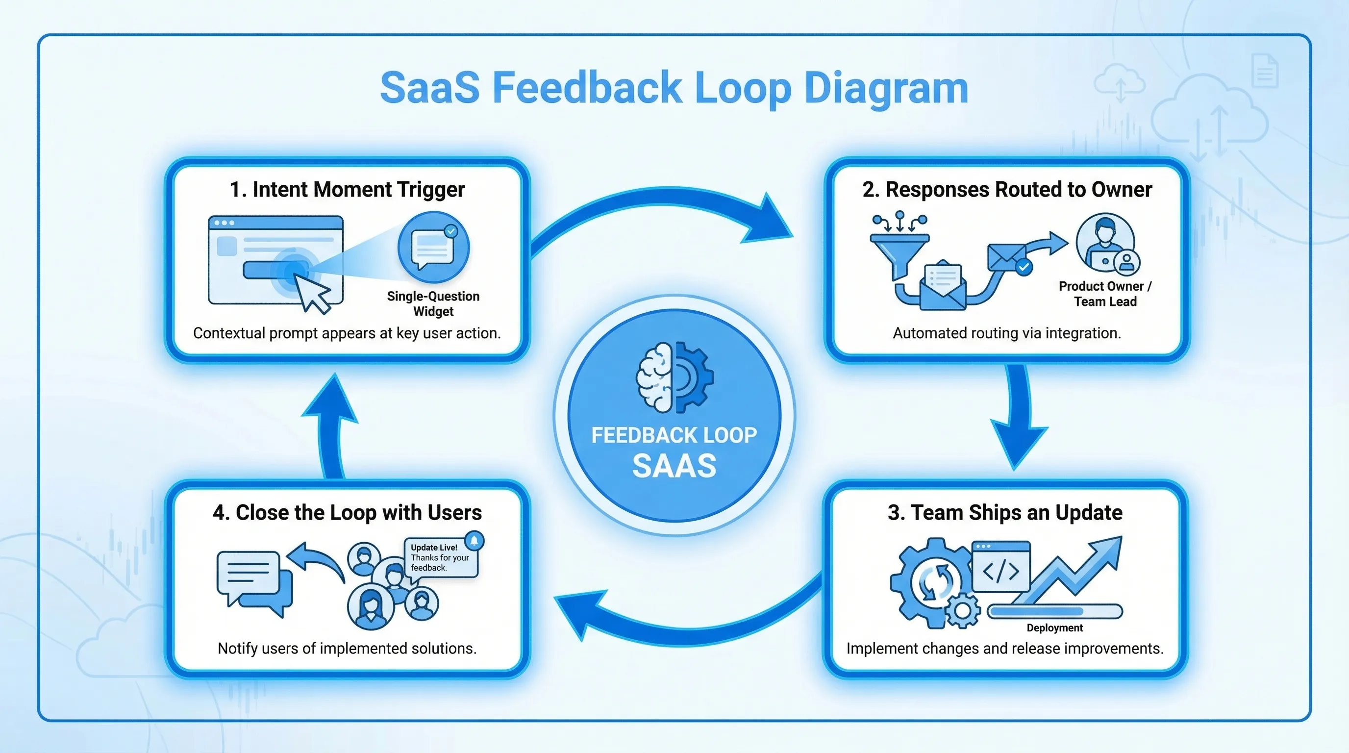
6) Route responses into an owner, not a channel
Most teams “collect feedback” and then wonder why nothing changes. Fix that by routing feedback to a named owner and an operating cadence.
A simple workflow that works for small teams:
- Assign one owner per prompt (pricing prompt owner is usually Marketing or Growth, onboarding prompt owner is usually Product).
- Review on a fixed cadence (twice a week is enough).
- Define what “done” means (update copy, ship a fix, add a doc, or run a follow-up test).
- Close the loop for high-intent responses (especially on pricing and cancellation).
7) Measure quality (not just response rate)
Response rate is easy to chase and easy to game. Add a quality measure.
A practical quality metric is:
- Actionability rate: percent of responses that clearly map to a next step.
For example, “Missing integration: HubSpot” is actionable. “Love it” is nice but not a roadmap input unless you know what “it” refers to.
If you are serious about “conversion-safe feedback,” run a lightweight holdout (keep 5% to 10% of eligible traffic unprompted) so you can watch guardrail conversions.
For a deeper playbook on protecting conversions, see: Collect feedback without killing conversions
Five “ship it this week” feedback widget setups (with copy)
These are intentionally minimal. Each one creates a decision.
| SaaS page or moment | Decision you are trying to make | Trigger (intent moment) | Widget question (example) | What you do with answers | Primary metric | Guardrail metric |
|---|---|---|---|---|---|---|
| Pricing page | Fix the #1 purchase blocker | After meaningful scroll or time on page (not immediately) | “What is the biggest thing stopping you from starting a trial today?” | Update plan packaging, add missing info, adjust FAQ, refine positioning | Actionability rate | Trial start rate |
| Post-signup (first session) | Improve activation path routing | After account creation, once | “What are you here to do first?” (choices by use case) | Route to the right onboarding steps, emails, or docs | Completion rate | Time to first value / activation rate |
| Docs article | Reduce support tickets for a topic | After scroll depth (end of article) | “Did this page answer your question?” (Yes/No) + “What’s missing?” | Patch docs, add examples, link to next step | “No” rate with actionable text | Docs bounce rate or support contact rate |
| In-app error or repeated retries | Identify the top reliability or UX issue | After 2 to 3 repeats of the same failure | “What were you trying to do when this happened?” + optional screenshot/upload (if you support it) | File bug with context, prioritize by volume | Submission rate | Task completion rate |
| Cancellation flow | Learn true churn reasons and attempt a save (ethically) | When user clicks cancel, before final confirmation | “What’s the main reason you’re leaving?” + “What would make you stay?” | Route to retention offers, fix gaps, follow up | Completion rate | Successful cancel flow (do not block) |
Notes that matter:
- Keep pricing prompts short and optional. It is a high-intent moment, but also high-friction if you interrupt too early.
- For post-signup, your best question is often not “How was signup?” but “What outcome are you here for?” because it lets you route.
If you want a dedicated guide on where to prompt inside the product (not just the marketing site), this is a strong companion: In-product feedback tool: where to prompt for max signal
A practical example: the “pricing objections” widget that doesn’t annoy buyers
Here is a simple build that SaaS teams can deploy without making the pricing page feel like a carnival.
Goal: Identify the top objection that prevents trial starts.
Trigger: Only for visitors who demonstrate evaluation intent (for example, they scroll past features and spend time near plan cards).
Question: “What’s stopping you from starting a trial?”
Choices:
- Missing a feature
- Missing an integration
- Not sure which plan fits
- Need security/compliance info
- Too expensive
- Other
Conditional follow-up: “One sentence is enough. What did you expect to see?”
Routing:
- “Need security info” routes to whoever owns trust content (security page, SOC 2 messaging, procurement FAQ).
- “Not sure which plan fits” is a signal to add a plan recommender, clearer plan labels, or a short comparison block.
Measurement:
- Primary: actionability rate.
- Guardrail: trial start rate on pricing page.
This is also a great candidate for careful placement. If your team is debating whether to use a feedback tab, a floating button, inline placement, or exit-intent, reference: Website feedback widget placement best practices to convert
How Modalcast fits into this setup (without adding complexity)
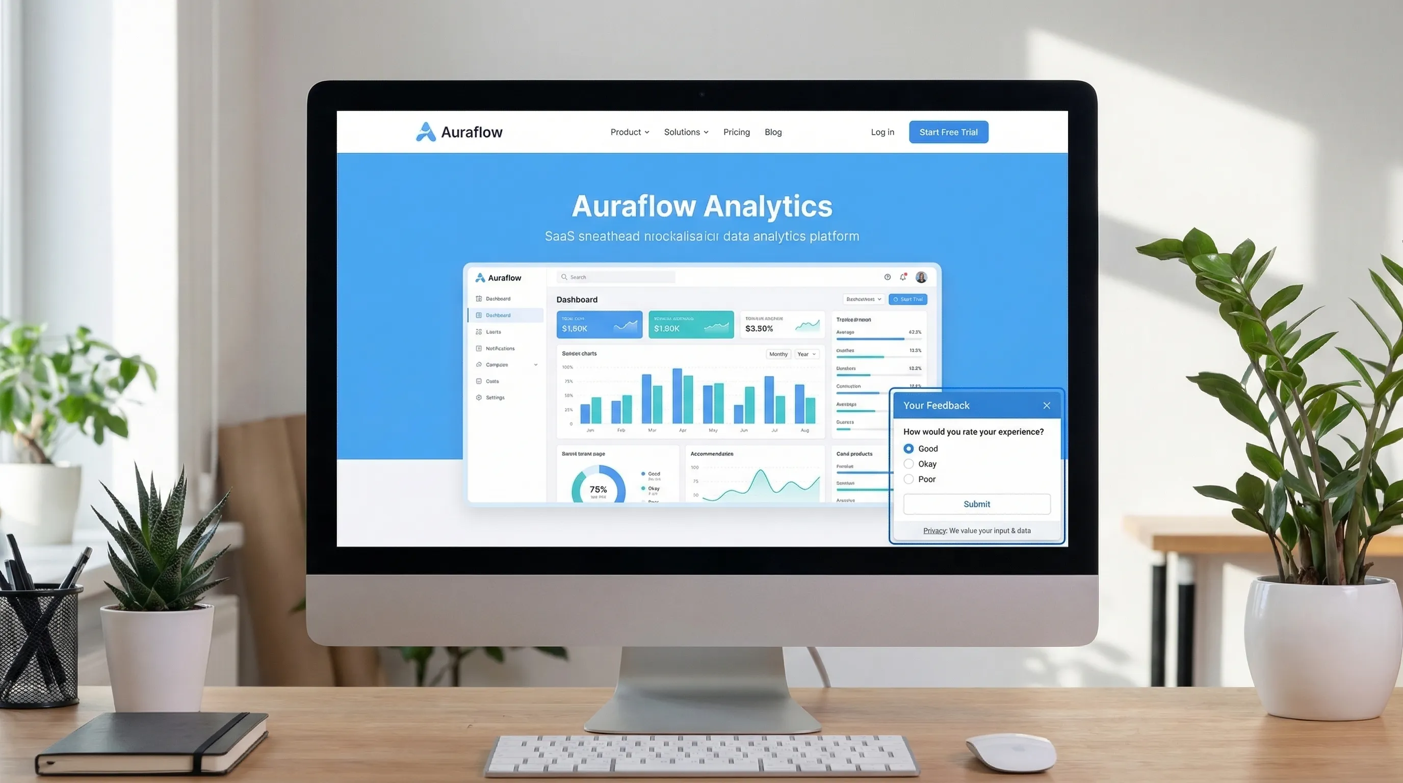
Modalcast is designed for the “lightweight widget” approach: one on-site widget you can use to collect feedback, share updates, capture leads, and promote offers without building a custom system.
At a high level, implementing the blueprint above in Modalcast typically means:
- Create a new post with a survey, poll, rating, or form.
- Configure where it appears (site pages or in-app views) and when it triggers.
- Add conservative frequency caps and exclusions.
- Publish, then install the widget snippet on your site.
If you want the exact install walkthrough, use Modalcast’s guide: Step-by-step instructions on setting up Modalcast
And if your main goal is microsurveys (single-question prompts with smart triggers), this guide pairs well with the framework here: How to set up microsurveys in your website or app
Common reasons SaaS feedback widgets fail (and quick fixes)
Failure: You ask for feedback everywhere
This produces noise and trains users to dismiss the widget.
Fix: run one prompt per lifecycle moment, with a cap, and rotate prompts monthly.
Failure: The question is not tied to a decision
You get opinions you cannot act on.
Fix: rewrite the question so each answer maps to a lever you can pull (copy change, feature priority, doc update, onboarding route).
Failure: The widget interrupts the main action
Even if conversions do not drop, the feedback will skew negative because you interrupted.
Fix: trigger after meaningful progress, or use passive placements (tab or floating button) on conversion pages.
Failure: No one owns the outcomes
Feedback becomes “a pile.”
Fix: assign an owner, set a review cadence, and commit to shipping one visible change per month that came from widget feedback.
Failure: You accidentally ship dark patterns
Aggressive or manipulative prompts can create short-term clicks and long-term trust damage.
Fix: use clear close controls, avoid confirm-shaming, avoid pre-checked consent, and make “no thanks” feel neutral. Modalcast has a good checklist here: Dark patterns to avoid in popups
Frequently Asked Questions
What is the best feedback widget for SaaS? The best feedback widget for SaaS is the one you can ship quickly, target by intent (not generic timers), cap frequency, and route responses to owners so feedback turns into decisions.
How many questions should a SaaS feedback widget ask? Start with one question. If you need more detail, use a conditional follow-up that only appears after a choice. Two steps is usually the practical limit.
Will a feedback widget hurt conversions? It can if it interrupts high-intent flows or shows too often. Use intent-based triggers, exclusions on critical steps, and frequency caps, then measure conversions with a small holdout.
Where should I put a feedback widget on a SaaS site? Use passive placements (tab or floating button) on conversion pages, and triggered microsurveys after intent moments like pricing evaluation, post-signup, or docs scroll completion.
How do I make feedback actionable instead of noisy? Tie each prompt to one decision, constrain answers with multiple choice, add a short conditional follow-up, and measure an actionability rate (not just response rate).
Try the “one prompt, one decision” setup with Modalcast
If you want a lightweight way to run a feedback widget for SaaS without building custom UI, routing, and iteration loops, Modalcast is built for this exact workflow.
Start with a single prompt (pricing, onboarding, docs, or churn), ship it, and review responses twice a week. You can get the widget live quickly from here: Modalcast.
