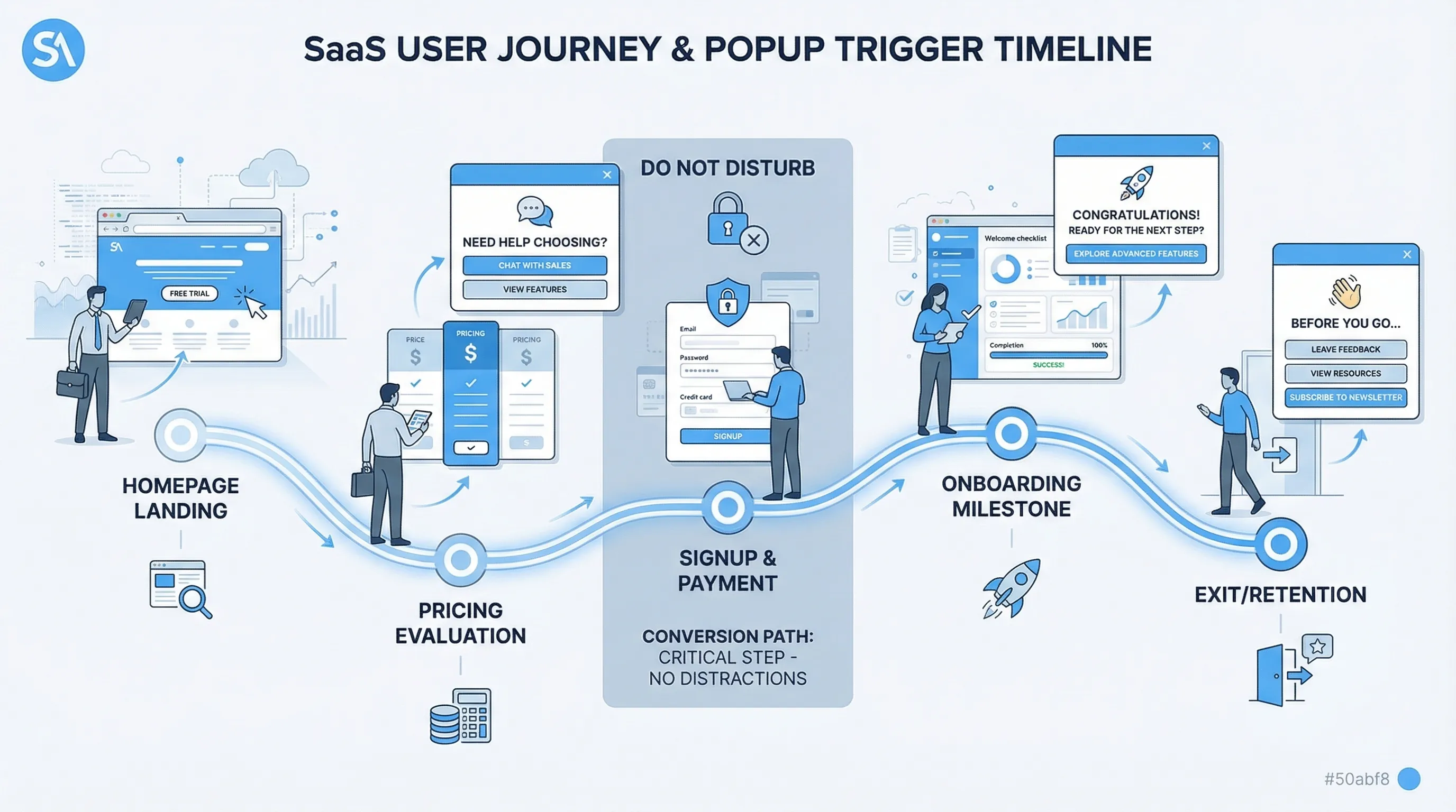
User Feedback Popup: Timing Rules That Protect Conversions
Popups are one of the fastest ways to collect product signal, and one of the fastest ways to tank conversions when they show up at the wrong moment.
Popups are one of the fastest ways to collect product signal, and one of the fastest ways to tank conversions when they show up at the wrong moment.
A user feedback popup is not just a question, it is an interruption. Timing is the difference between “helpful and relevant” and “get out of my way.” This guide gives you practical timing rules you can implement on a SaaS marketing site or in-product, with guardrails that protect signups, trials, and upgrades.
The real timing mistake: triggering by time instead of intent
A lot of teams start with rules like “show after 5 seconds” or “show on the second pageview.” That is easy to ship, but it ignores the user’s job-to-be-done.
Conversion-safe timing is usually:
- After the visitor has enough context to answer (they have seen the thing you are asking about)
- Before they are committed to a high-friction step (form fills, checkout, OAuth, payment)
- When the ask matches their intent (evaluating pricing, struggling with setup, reading docs)
If you do only one thing, do this: replace “seconds since load” with “signals of intent.”

Timing Rule 1: Never interrupt the primary conversion path
If your user feedback popup can appear on the same screen as your highest-value CTA, you need exclusion rules.
On a typical SaaS site, the “conversion path” includes:
- Signup and login pages
- Checkout and payment steps
- OAuth flows and redirect-based flows
- Multi-step onboarding forms (especially steps with validations)
Instead of asking for feedback inside these steps, move the ask one step earlier or one step later.
Example:
- Avoid: “What stopped you from signing up?” popup while the signup form is in view
- Prefer: Ask on pricing (pre-signup) or after the user abandons the form (exit intent), and keep it one question
Why this protects conversions: in high-stakes steps, users are in “execution mode.” Any interruption increases cognitive load and drop-off.
Timing Rule 2: Ask after a “moment of meaning,” not at random
Your highest-quality answers come right after the user experiences something concrete.
“Moments of meaning” you can use as triggers:
- Post-action success: “Saved,” “Published,” “Invited teammate,” “Export complete”
- Milestones: completed onboarding step 3, connected integration, created first project
- Feature first-use: first time they open a key feature, or after they finish using it
This is the simplest pattern that improves both response quality and conversion safety, because you are not competing with their main task.
Practical examples:
- After connecting Stripe: “How hard was setup?” (1–5) with optional follow-up
- After publishing a page: “What almost stopped you from publishing today?”
If you need product feedback for a feature, do not ask on the dashboard “because users are there.” Ask after the feature delivered value or friction.
Timing Rule 3: Use page intent to decide whether you should pop at all
On a marketing site, different pages mean different intent. Treat them differently.
- Homepage: low intent, high bounce risk. Prefer passive widgets or delayed, low-friction prompts.
- Pricing: evaluation intent. This is one of the best places for a targeted feedback prompt.
- Docs and help: problem-solving intent. Great for “Was this helpful?” and “What’s missing?”
- Changelog or updates: curiosity and adoption intent. Great for “Are you likely to use this?”
If you want more on “where,” pair this timing playbook with your placement strategy (see Website Feedback Widget Placement: Best Practices to Convert).
A conversion-safe starting matrix
Use this table as a default. It is intentionally conservative.
| Page / context | Safe trigger (timing) | What to avoid | Example question |
|---|---|---|---|
| Homepage | After meaningful engagement (scroll depth or second pageview) | Immediate load popups | “What brought you here today?” |
| Pricing | After plan comparison behavior (time on page, scroll, or viewing FAQ) | Blocking plan selection | “What’s unclear about pricing?” |
| Signup | Do not show during form completion | Any modal that steals focus | If needed, ask on exit intent only: “What stopped you?” |
| Docs article | After reading signal (scroll depth or time) | Popups that cover code samples on mobile | “Did this answer your question?” |
| In-app after key action | Immediately after success state | Asking before they complete the task | “How was that workflow?” |
| Cancel / downgrade flow | After reason selection or on confirm step | Guilt copy, hard-to-close prompts | “What’s the main reason you’re leaving?” |
Timing Rule 4: Gate with “readiness signals” (scroll, time, repeat visits)
Behavioral gates are useful when you do not have a clean post-action event.
The safest readiness signals for marketing pages are usually:
- Scroll depth: they reached the section relevant to your question
- Dwell time: they stayed long enough to plausibly read the content
- Repeat exposure: second visit to pricing, or returning within 7 days
Important nuance: time-based triggers are not inherently bad, they are bad when they are unconditional. “After 20 seconds” can be fine if it is only on a page with clear evaluation intent and only after a scroll threshold.
A practical rule that prevents most mistakes:
- Use at least two conditions for top-of-funnel pages (example: pricing page AND 50% scroll)
- Use one condition for high-confidence moments (example: after successful action)
Timing Rule 5: Use exit intent for recovery, not for research
Exit intent is tempting because it “doesn’t interrupt,” but it has two common failure modes:
- You ask something broad (“Any feedback?”) and get low-signal answers.
- You show it too often and train users to ignore you.
Exit intent works best when:
- The user has shown clear intent (pricing, docs, checkout start)
- The question is tightly tied to that intent
- The prompt is short and easy to dismiss
Good exit-intent user feedback popup prompts:
- Pricing exit: “What stopped you from choosing a plan today?”
- Docs exit: “What information were you looking for?”
- Signup exit: “Was there an error or just not ready?” (two-option choice)
If your goal is deep discovery research, exit intent is rarely the right channel. Use targeted interviews or longer surveys later.
Timing Rule 6: Put a feedback budget in place (frequency caps, cooldowns, sampling)
Even perfectly timed prompts become annoying when they stack.
Think in terms of a “feedback budget” per user:
- Per session cap: limit how many popups can appear in one session
- Cooldown: if they dismiss, do not show again for a defined period
- Sampling: show to a percentage of eligible visitors to reduce fatigue and bias
This is timing, not just UX. Frequency rules decide whether the user sees your popup at a fragile moment later.
For practical defaults (and how to prevent multiple campaigns from colliding), see Popup Frequency Capping That Protects UX.
Timing Rule 7: Match the question type to the moment
Timing is inseparable from what you are asking.
Use this pairing:
- Early evaluation (homepage, early pricing scroll): intent capture
- “What are you trying to accomplish?”
- Mid evaluation (pricing deep read, integrations page): objection capture
- “What’s missing to make this a yes?”
- Post-action (in-app): friction and effort score
- “How easy was that?”
- At-risk (cancel, downgrade, repeated errors): root cause
- “What’s the main reason?”
A common conversion killer is asking high-effort questions at low-intent moments, for example a multi-field form on first pageview.
If you need templates for the questions themselves, use a library like Online Customer Feedback Form Templates for SaaS (Copy/Paste), and then apply the timing rules in this post.
Timing Rule 8: Add “do not disturb” conditions (device, source, and accessibility)
Two visitors can be on the same page with very different constraints.
Add guard conditions such as:
- Mobile: avoid large modals that cover content, consider slide-ins or a passive feedback button
- Paid traffic landers: be extra cautious on first click, users are still validating the ad promise
- Accessibility: ensure the popup can be closed easily with keyboard, and does not trap focus
Also be mindful of search and SEO considerations. Google has long advised against intrusive interstitials that make content less accessible, especially on mobile (see Google Search Central on intrusive interstitials).
Three timing plays you can ship this week (with concrete rules)
These are practical, conversion-safe patterns that work well for SaaS.
Pricing-page objection capture (high signal, low risk)
Goal: learn why evaluators do not convert.
Timing rules:
- Only on pricing page
- Trigger after meaningful engagement (example: scrolled past plan cards, or spent long enough to compare)
- Do not show if the visitor has already started signup in the same session
- Cooldown if dismissed
Question: “What’s unclear or missing about pricing?” (single open text)
Why it protects conversions: it targets high-intent users, and avoids stealing attention from the signup form.
Docs feedback that improves activation (no interruption)
Goal: find documentation gaps that cause setup failure.
Timing rules:
- Only on docs pages
- Trigger near the end of the article, or after a scroll threshold
- Avoid showing on very short visits (bounce)
Question: “Did this article solve your problem?” (Yes/No)
Optional follow-up if “No”: “What were you trying to do?”
Why it protects conversions: it shows after consumption, not during task execution.
Post-action micro-survey in-product (best response quality)
Goal: detect friction inside the workflow that leads to churn.
Timing rules:
- Trigger after a success event (not when they open the feature)
- Only after the first or second completion (avoid asking on first exposure if the action is complex)
- Show at most once per user per time window
Question: “How easy was that?” (1–5)
Optional follow-up: “What made it hard?”
Why it protects conversions: it avoids interrupting the workflow and gathers actionable, contextual feedback.
How to measure timing without fooling yourself
Timing changes can create placebo wins. You need guardrails.
1) Define a primary goal and two guardrail metrics
Examples:
- Primary: trial starts
- Guardrails: bounce rate on pricing, signup completion rate
Or:
- Primary: number of high-signal feedback responses
- Guardrails: demo request rate, time-to-signup
2) Use a holdout whenever possible
If you can, keep a percentage of eligible users unprompted for a week or two, then compare conversion metrics. This helps you estimate incremental impact rather than just raw response volume.
3) Look at response quality, not just response rate
A timing change that doubles responses but yields “N/A” and “idk” is not a win.
A simple quality rubric:
| Quality level | What it looks like | What you can do with it |
|---|---|---|
| High signal | Specific context and a clear blocker | Make a product, pricing, or UX decision |
| Medium | Vague concern, but points to an area | Use to form a hypothesis and follow up |
| Low | One-word answers, unrelated comments | Ignore or adjust targeting/timing |
4) Watch for collision effects
If you also run lead capture or promo popups, your feedback prompt might be “fine” in isolation but harmful in combination.
Set a priority order (conversion-critical first), then ensure only one message can fire in a short window.
Implementation notes (without assuming your stack)
Most SaaS teams implement these timing rules with a lightweight on-site widget or a small set of front-end triggers that can fire based on page context and events.
With a tool like Modalcast, the goal is to keep the implementation simple: configure a feedback prompt, target it to the right pages or user segments, and apply trigger rules and frequency limits so the popup shows at conversion-safe moments.
If you want a broader strategy for collecting feedback without harming revenue, pair this post with Collect Feedback Without Killing Conversions. For a quick reminder on what not to do (especially with close buttons, consent, and manipulative copy), see Dark Patterns to Avoid in Popups.
A quick sanity checklist before you launch
Before turning on a user feedback popup, confirm:
- The popup cannot appear during signup, checkout, or other high-friction steps
- The trigger is tied to intent (post-action, deep pricing engagement, docs reading), not just page load
- You have a cap and a cooldown
- The question matches the moment and can be answered in under 10 seconds
- You have defined guardrail metrics and a way to compare against a baseline
If you get those right, you will usually see the best of both worlds: more useful feedback, and conversions that stay stable.
