Online Customer Feedback Form Templates for SaaS (Copy/Paste)
Most SaaS teams know they need an online customer feedback form, they just do not want to spend two weeks debating wording, fields, and where it should show up.
Most SaaS teams know they need an online customer feedback form, they just do not want to spend two weeks debating wording, fields, and where it should show up. Templates help because they remove guesswork and force a form to do one job: capture a usable signal at the right moment.
Below is a library of copy/paste feedback form templates for common SaaS scenarios (pricing objections, onboarding friction, bug reports, churn reasons, docs feedback, and more). Each template includes:
- The goal and best placement
- A ready-to-use prompt with field labels and button text
- A “what to do with responses” note so the data turns into action
How to pick the right template (without over-surveying)
A feedback form works when it answers a decision you can actually make. Before you paste anything into your site, decide these three things:
1) What decision will this feedback power?
Examples:
- “Do we need an annual plan explanation above the fold?”
- “Which integration blocker is killing activation?”
- “Are docs failing because they are unclear or incomplete?”
If you cannot name the decision, the form will turn into a junk drawer.
2) Who should see it?
SaaS feedback quality depends on targeting. A pricing objection form shown to existing paid users will produce noise. A bug report shown to anonymous visitors will produce dead ends.
3) What is the minimum data needed to take action?
As a rule, fewer fields win. Nielsen Norman Group’s guidance on form UX consistently emphasizes reducing input burden and asking only what you will use (good for completion rates and data quality). See their research on form design guidelines.
Quick chooser: template by SaaS moment
| SaaS moment | Use this template when you want to learn | Where it usually works best | Typical length |
|---|---|---|---|
| Pricing page | The objection that blocks signup | Pricing page (after scroll, or exit intent) | 1 to 2 questions |
| Post-signup | What the user is trying to do (and what might block them) | After account creation or first login | 2 to 3 questions |
| Feature usage | Whether a feature delivered value | After a key action completes | 1 question + optional comment |
| Bugs | Fast reproduction details | In-app “Report a bug” entry point | 4 to 6 fields |
| Docs | What was missing or confusing | Docs pages | 1 click + 1 short question |
| Support | CSAT + follow-up reason | After a ticket closes | 2 questions |
| Cancellation | True churn reason and save opportunities | Cancel flow | 2 to 4 questions |
| Inactive users | Why they stalled | In-app for returning users, or email landing | 1 to 2 questions |
Copy/paste templates (SaaS-ready)
Each template is written so you can drop it into a modal, slide-in, embedded block, or feedback widget.
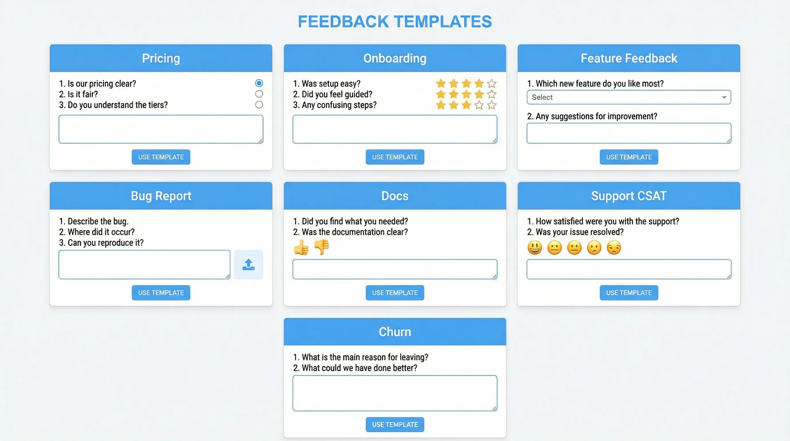
Template 1: Pricing objection (high intent, low friction)
Use when: A visitor is evaluating pricing and might leave.
Placement: Pricing page, after 20 to 40 seconds on page, or on exit intent.
Title: Quick question before you go
Prompt: What’s stopping you from signing up today?

Field 1 (single select):
- Price is too high
- Missing a feature
- Unsure it will work for my use case
- Need security/compliance details
- Need to compare with alternatives
- Other

Field 2 (optional, short text):
Tell us what you were hoping to see.
Placeholder: “Looking for …”

Primary button: Send
Secondary button: Not right now
Success message: Thanks. If you share an email, we can follow up with specifics.
Optional Field 3 (email): Email for a reply (optional)
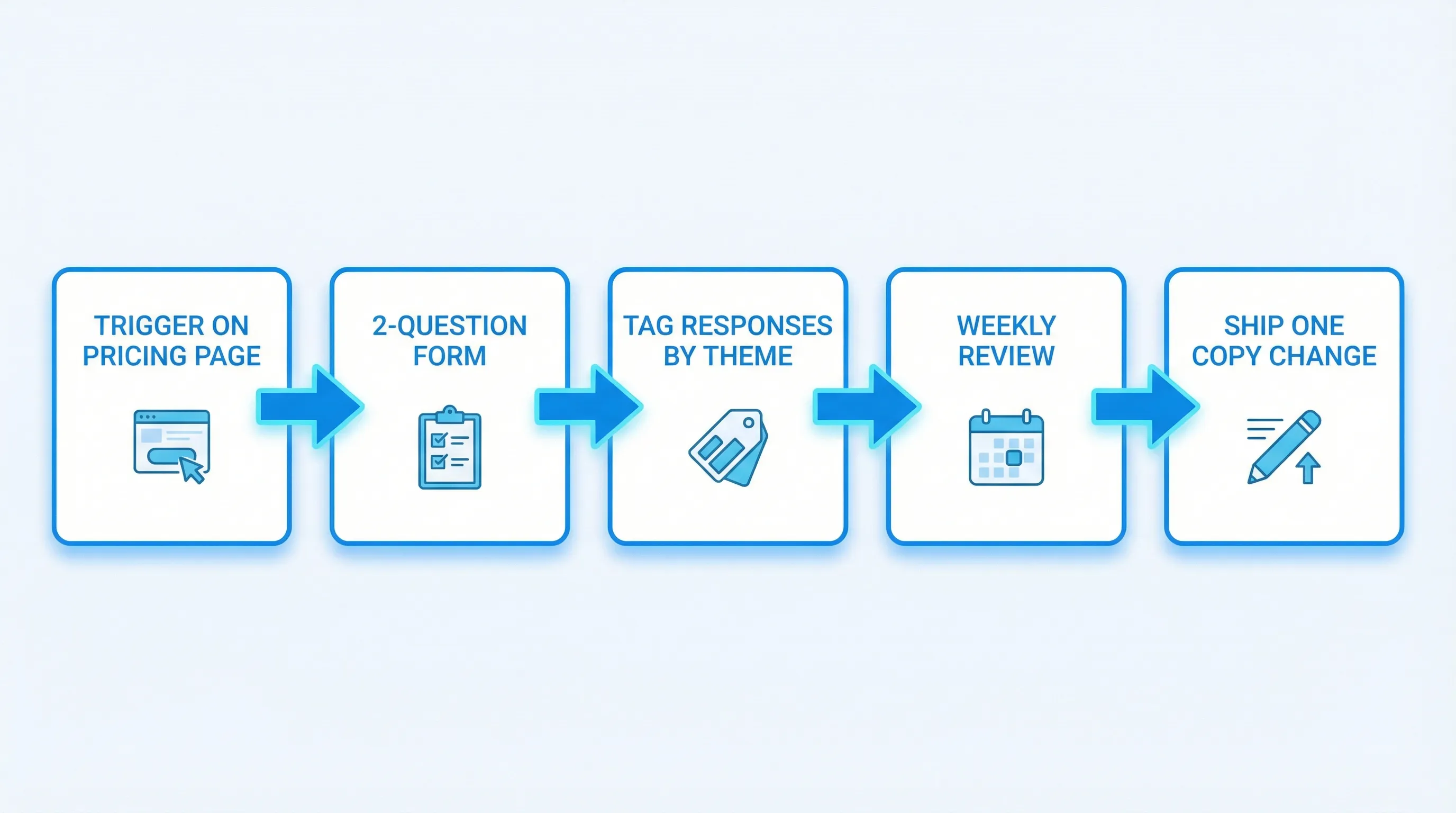
What to do with responses:
- Tag responses by objection type and page variant.
- Treat “Need security/compliance details” as a cue to improve the security page and link it near pricing.
- Treat “Missing a feature” as a routing rule to product marketing or roadmap triage.
Template 2: “Which plan is right?” (pricing clarity)
Use when: You suspect confusion between tiers is hurting conversion.
Placement: Pricing comparison table, triggered by clicking “Compare plans” or hovering long on plan cards.
Title: Help us make pricing clearer
Prompt: Which part of our plans is confusing?

Field 1 (single select):
- Feature differences between plans
- Seats and billing rules
- Usage limits
- Add-ons
- Annual vs monthly

Field 2 (short text):
What were you trying to confirm?
Placeholder: “I need to know if …”

Primary button: Submit
Success message: Thank you. We’ll use this to improve the pricing page.
What to do with responses: Turn the top 2 confusion themes into:
- One new “How billing works” section
- One tooltip or microcopy change near the confusing element
Template 3: Post-signup intent capture (routes onboarding)
Use when: You need to understand “job to be done” early so you can guide activation.
Placement: Immediately after signup, or first time they enter the app.
Title: What are you here to accomplish?
Prompt: We’ll tailor setup tips based on your goal.

Field 1 (single select):
- Evaluate the product
- Set up for my team
- Integrate with another tool
- Solve a specific problem today
- Just exploring

Field 2 (single select):
How would you describe your role?
- Founder
- Product
- Engineering
- Marketing
- Sales
- Support
- Other

Field 3 (optional, short text):
What would “success” look like this week?
Placeholder: “If I can … then it’s working.”

Primary button: Continue
Success message: Thanks. We’ll recommend next steps.
What to do with responses: Use the goal and role to route:
- Setup checklist variants
- Which help docs to surface
- Which onboarding email sequence to send
If you run these prompts via a widget, add frequency caps so users only see it once.
Template 4: Activation blocker (only for users who stall)
Use when: New users sign up but do not complete the key action within your time-to-first-value window.
Placement: In-app prompt after inactivity or when they return without activation.
Title: Can we help you get set up?
Prompt: What’s blocking you right now?

Field 1 (single select):
- I’m not sure what to do first
- I can’t connect an integration
- I don’t have time right now
- I’m missing a feature
- I hit an error

Field 2 (optional, short text):
If you can share one detail, we’ll point you to the right fix.
Placeholder: “I tried to …”

Primary button: Send
Secondary button: Skip
Success message: Thanks. We’ll use this to improve onboarding.
What to do with responses:
- “Not sure what to do first” is usually an onboarding UX issue.
- “No time” often calls for a shorter quickstart path or a done-for-you template.
- “Integration” blockers are highest leverage because they block value realization.
Template 5: Feature value pulse (after a meaningful action)
Use when: You want feedback tied to an actual completed workflow, not opinions in the abstract.
Placement: After the user completes the feature’s “success event.”
Title: Quick check
Prompt: Did this do what you expected?

Field 1 (single select):
- Yes
- Not really

Conditional Field 2 (short text, shown if “Not really”):
What was missing or unexpected?
Placeholder: “I expected …”

Primary button: Submit
Success message: Got it. Thank you.
What to do with responses:
- Track “Not really” rate by persona or plan.
- Use the text follow-up to create a tight set of themes.
If your tooling does not support conditional logic, keep both questions visible but label the second as optional.
Template 6: Feature request (high-signal, low noise)
Use when: You want actionable requests, not a wishlist.
Placement: Inside the app, or from a persistent “Feedback” entry point.
Title: Request a feature
Prompt: Tell us what you need and why.

Field 1 (short text):
What are you trying to accomplish?
Placeholder: “I want to …”

Field 2 (short text):
What’s the workaround today?
Placeholder: “Right now we …”

Field 3 (single select):
How urgent is this?
- Nice to have
- Important
- Blocking

Primary button: Send request
Success message: Thank you. We review these weekly.
Optional Field 4 (email): Email for follow-up (optional)
What to do with responses: Score requests by “blocking” frequency and revenue impact (if you can attach account or plan data).
Template 7: Bug report (repro-first, not essay-first)
Use when: You need reproducible issues from real users without dragging them into a support thread.
Placement: In-app, accessible from help menu or feedback widget.
Title: Report a bug
Prompt: If you share what happened, we’ll investigate.

Field 1 (short text):
What were you trying to do?
Placeholder: “I clicked … to …”

Field 2 (short text):
What happened instead?
Placeholder: “It showed …”

Field 3 (short text):
Steps to reproduce (if you can)
Placeholder: “1) … 2) … 3) …”

Field 4 (single select):
How bad is it?
- Minor annoyance
- Breaks my workflow
- Completely blocked

Optional Field 5 (file upload or screenshot): Attach screenshot (optional)
Optional Field 6 (email): Email for follow-up (optional)

Primary button: Send bug report
Success message: Thanks. If we need more info, we’ll reach out.
What to do with responses: Automatically attach context if possible (URL, app version, browser). If not, at least capture the page or screen name in a hidden field.
Template 8: Docs feedback (one click, then one question)
Use when: You want high-volume, low-friction documentation quality signals.
Placement: Bottom of docs pages.
Prompt: Was this page helpful?
Buttons: Yes / No

If “No”, show:
Question: What was missing?
- Example code
- Step-by-step instructions
- Explanation of concepts
- Troubleshooting
- It’s outdated
- Other

Optional comment:
Tell us what you were trying to do.
Placeholder: “I’m trying to …”

Submit button: Send
Success message: Thank you. This helps us improve the docs.
What to do with responses:
- Prioritize updates by “No” volume and page traffic.
- Add a “last reviewed” process internally so docs do not silently rot.
Template 9: Post-support CSAT (simple and diagnostic)
Use when: You want to catch support quality issues early and identify product gaps driving tickets.
Placement: After ticket resolution, in-app or email landing.
Title: How did we do?
Prompt: Rate your support experience.

Field 1 (single select):
- Great
- OK
- Not good

Field 2 (short text):
What could we improve?
Placeholder: “It would have been better if …”

Primary button: Submit
Success message: Thanks. We read every response.
What to do with responses: Route “Not good” to a human follow-up and tag the ticket category so you can see which product areas generate dissatisfaction.
For a deeper CSAT primer, see Modalcast’s guide on CSAT surveys.
Template 10: Cancellation feedback (honest reasons, not guilt)
Use when: You need real churn drivers, and you want a save path without dark patterns.
Placement: In cancel flow after the user clicks “Cancel,” before confirmation.
Title: Before you cancel
Prompt: What’s the main reason you’re leaving?

Field 1 (single select):
- Too expensive
- Missing a feature
- Hard to set up
- Not using it enough
- Switching to another tool
- Support issues
- Other

Field 2 (optional, short text):
What’s the one thing we could change?
Placeholder: “If you had … I would stay.”

Field 3 (single select):
Would any of these help?
- Pause my plan
- Talk to support
- See a quick setup guide
- Nothing, I still want to cancel

Primary button: Continue
Secondary button: Go back
Success message: Thank you for the feedback.
What to do with responses:
- “Hard to set up” should feed onboarding and product UX work.
- “Switching” should feed competitive positioning and migration tooling.
- Keep the save options legitimate and easy to dismiss. If you need guardrails, Modalcast has a recent post on dark patterns to avoid in popups.
Template 11: Inactive user pulse (why they stopped)
Use when: Users have accounts but have not hit the core action recently.
Placement: In-app when they return, or on a dashboard they still visit.
Title: Quick question
Prompt: What made you stop using the product?

Field 1 (single select):
- I solved the problem
- I never got it set up
- I didn’t see enough value
- It was too hard to use
- I switched tools
- I’m not the right person

Optional Field 2 (short text):
If you want, tell us what you expected.
Placeholder: “I hoped it would …”

Primary button: Send
Success message: Thanks. This helps us improve.
What to do with responses: If you capture “I’m not the right person,” consider adding an internal “invite the owner” flow or better role-based onboarding.
Template 12: Content reader feedback (turn traffic into roadmap signal)
Use when: Your blog/docs drives traffic and you want to know what visitors are trying to achieve.
Placement: End of article, or as a subtle slide-in after scroll depth.
Title: Was this useful?
Prompt: What should we cover next?

Field 1 (single select):
- More examples
- A step-by-step guide
- A template I can copy
- Benchmarks and numbers
- Tool comparisons

Field 2 (short text):
What problem are you trying to solve?
Placeholder: “I’m trying to …”

Optional Field 3 (email):
Send me the next post (optional)

Primary button: Send
Success message: Thanks. We’ll use this to plan upcoming posts.
What to do with responses: This is a clean way to align content strategy with real buyer problems, without guessing.
A lightweight “field pack” you can reuse across templates
If you want consistency across multiple forms, standardize these pieces:
- Email (optional): only when you will follow up
- Role: helps interpret feedback (founder vs engineer often means different needs)
- Urgency: nice-to-have vs blocking
- Free-text follow-up: one short question, one box
When you implement, also capture context automatically when possible:
- Page URL (or screen)
- Plan or tier
- Account age
- Device type
This turns subjective comments into patterns you can segment.
Microcopy you can paste to build trust (and get better answers)
Trust improves completion and honesty. Add a short line near the submit button.
Privacy note (short): We’ll use this to improve the product. No sales follow-up unless you ask.

Time expectation: Takes 10 seconds.

Optionality: Email is optional. We’ll only reply if you want a response.
If you operate in regulated markets, check your legal requirements for consent language. For general privacy expectations, the FTC’s consumer protection materials are a useful baseline for avoiding deceptive UX practices (see the FTC’s overview of dark patterns).
Turning form responses into action (a simple ops loop)
Templates are only half the work. The other half is making sure feedback creates decisions.
Route every template to an owner
A practical default:
- Pricing objections: marketing owner
- Setup blockers: product or onboarding owner
- Bugs: engineering triage
- Docs: docs owner
- Support CSAT: support lead
- Cancellation: retention owner
Review cadence that prevents backlog rot
Keep it simple:
- Weekly: review new themes and top blockers
- Monthly: ship one change per high-volume theme
- Quarterly: audit whether forms still match your current product stage
Close the loop in one sentence
Where it makes sense, send a short follow-up when something changes. Even a simple “We updated X based on your note” increases future response rates and reduces the sense that feedback goes into a void.
Implementing these templates on your site (without engineering drag)
Most SaaS teams deploy these as a widget-triggered modal, slide-in, or embedded block so they can:
- Target by page, behavior, or lifecycle moment
- Apply frequency caps to protect UX
- Iterate copy quickly
Modalcast is designed for this lightweight approach, a single widget you can use to collect feedback, share updates, and capture leads. If you want a fast path to production, start with one template (pricing objection or post-signup intent are usually the highest leverage) and ship it using an on-site feedback widget.
Related guides that pair well with this template library:
- Ship a feedback website tool in 15 minutes
- Feedback widget design tips that boost responses
- Online feedback form for SaaS: examples and best practices