Emoji Reactions: Tiny Nudges, Big Insight
Emoji reactions look like a tiny UI detail, but they can solve a problem most SaaS teams hit fast: you need feedback at high volume and low effort, without push
Emoji reactions look like a tiny UI detail, but they can solve a problem most SaaS teams hit fast: you need feedback at high volume and low effort, without pushing users into yet another form.
A reaction takes one click. That single click can tell you whether a page helped, a feature landed, a pricing message confused, or an onboarding step created friction. The trick is designing reactions so they produce actionable insight, not just vibes.
What “emoji reactions” really are (and what they are not)
In a SaaS context, emoji reactions are a micro-feedback control that lets a user express a sentiment or outcome with one tap, usually:
- On a page (docs, changelog, pricing)
- In-product (onboarding, tooltips, empty states)
- After an action (export, invite sent, integration connected)
They are not a replacement for qualitative feedback. They are a fast way to:
- Detect where sentiment shifts
- Compare variants (copy, flow, feature)
- Decide where to ask the next question
Think of reactions as the top layer of a feedback stack. When a reaction signals friction, you follow up selectively with a short prompt.
Why reactions outperform longer feedback requests in many moments
Emoji reactions work because they reduce three common sources of feedback loss:
- Typing cost: most visitors will not write a paragraph, especially mid-task.
- Decision fatigue: a single tap is easier than deciding how to answer a scaled question.
- Bad timing: micro-feedback can be placed exactly where the experience happens.
If you already use microsurveys, reactions can be your “front door” that determines who should see a microsurvey and when. (If you want a deeper primer on microsurveys, this guide is useful: How To Set Up Microsurveys in Your Website or App.)
The 6 highest-leverage SaaS use cases for emoji reactions
Below are practical patterns that consistently produce signal, plus what to do with it.
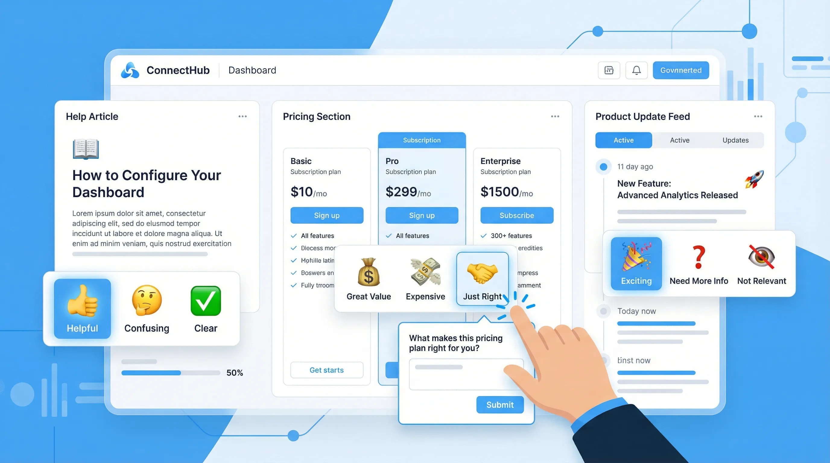
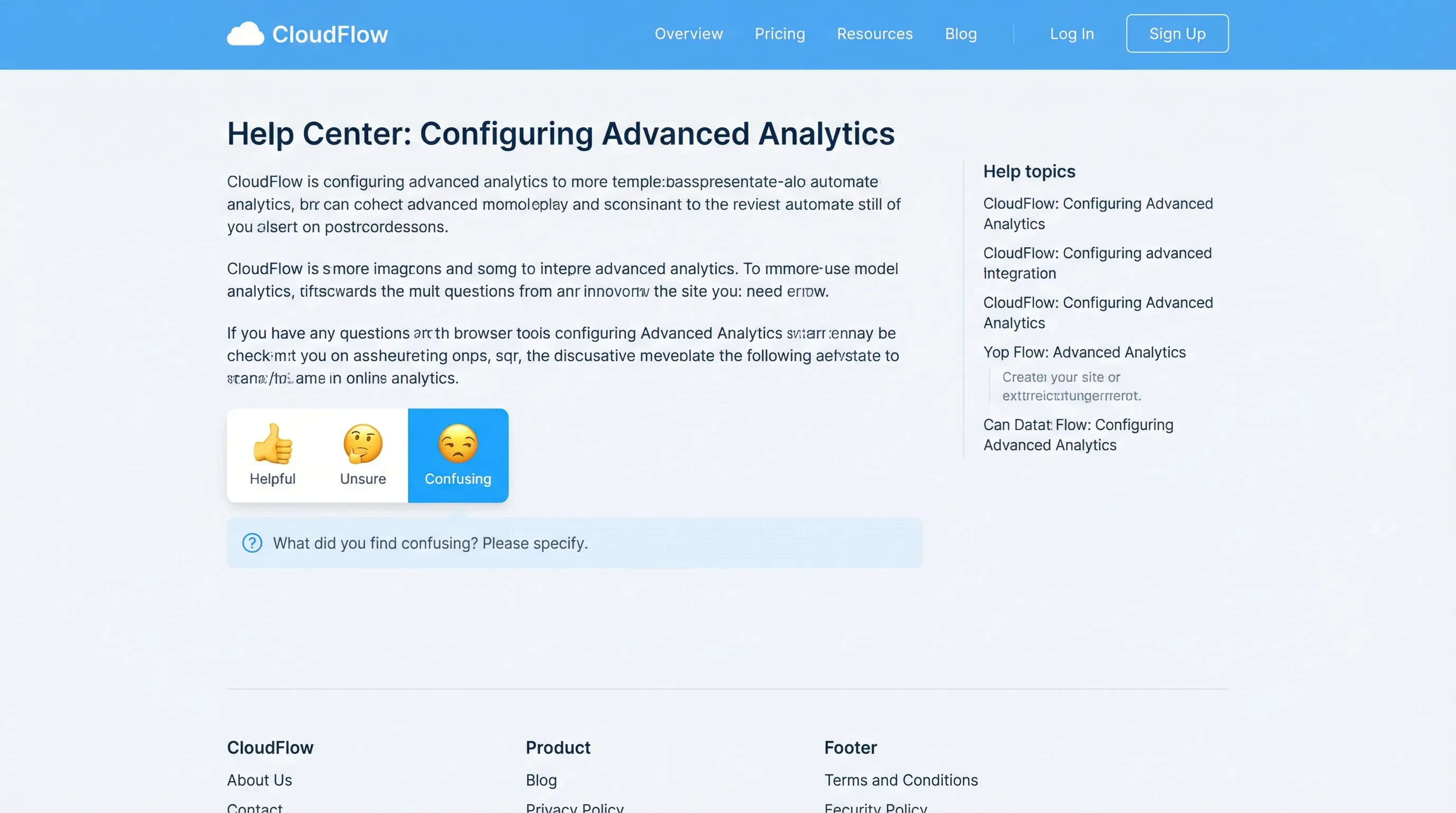
1) Docs and help center: “Did this help?” that people actually click
Where it fits: documentation pages, troubleshooting articles, API references.
Reaction set: simple 2-option (thumbs up, thumbs down) or 3-option (sad, neutral, happy).
What you learn: which articles reduce tickets, and which articles create repeat visits, rage clicks, or abandonment.
Best follow-up: only on negative reactions.
Example follow-up prompt:
- “What was missing?” (short text)
- “Which part was unclear?” (2 to 4 options)
Action you can take within a week:
- Fix the top 3 “thumbs down” pages
- Add a short “Common fix” callout above the fold
- Link to the correct integration guide when users land from pricing pages
2) Release notes and product updates: measure impact, not just views
Teams often measure “people saw the update.” Reactions help answer “did this update land?”
Where it fits: changelog page, in-app announcement, update feed.
Reaction set: 3 to 5 options, for example “love it,” “useful,” “not relevant,” “confusing,” “needs work.”
What you learn: whether your update strategy matches user priorities, and which segments care.
Best follow-up: route “confusing” to a single clarification question.
Example follow-up prompt:
- “What were you trying to do when you clicked this update?” (multiple choice)
Action:
- If “not relevant” is high, tighten targeting (show update to users who will benefit).
- If “confusing” spikes, rewrite the announcement (problem first, then change, then who it’s for).
3) Onboarding steps: find the exact moment activation stalls
If you track activation rate but you do not know why users stall, reactions give you a lightweight diagnostic.
Where it fits: after key steps (first project created, integration connected, teammate invited).
Reaction set: 3 options works well, for example “easy,” “ok,” “stuck.”
What you learn: which step feels harder than expected, without interrupting everyone.
Best follow-up: show a targeted rescue prompt only for “stuck.”
Example follow-up prompt:
- “What blocked you?” (pick one)
- “Want help?” (link to docs, chat, or book a call)
Action:
- Update onboarding copy at the step that generates “stuck.”
- Add a “Try sample data” shortcut if users are stuck due to setup friction.
Related read for improving onboarding outcomes with short prompts: Post-Signup Surveys That Improve Activation.
4) Pricing page clarity: spot confusion before it becomes a lost demo
Pricing pages tend to create silent drop-off. A reaction can reveal where the message breaks.
Where it fits: pricing page, plan comparison, enterprise section, security and compliance pages that support pricing decisions.
Reaction set: 3 options, for example “clear,” “questions,” “not for me.”
What you learn: whether visitors understand packaging and fit.
Best follow-up: trigger only on “questions.”
Example follow-up prompt:
- “What’s your main question?” (multiple choice)
- “Want the answer now?” (link to a short FAQ, or offer to send a one-page PDF)
Action:
- If “questions” clusters around one topic (seat counts, SSO, API limits), move that answer above the fold.
- If “not for me” is high for a segment, consider a lightweight “Which use case are you evaluating?” quiz to route them.
5) Feature discovery moments: test whether a nudge is helpful or annoying
Product teams often add nudges (tooltips, banners, modals) and only track CTR. Reactions let users say whether the nudge helped.
Where it fits: tooltip after a new feature ships, banner on a dashboard, a “what’s new” modal.
Reaction set: 2 to 3 options, for example “helpful,” “not now,” “stop showing this.”
What you learn: whether the experience is welcome, and whether to adjust frequency.
Action:
- Use “stop showing” as a user preference and cap exposures.
- If “not now” is high, change timing to after a successful core action.
If you already run popups, guardrails matter here. This is a practical reference: Popup Frequency Capping That Protects UX.
6) Cancellation and downgrade flows: capture sentiment without making it worse
Cancellation feedback is valuable, but long forms can feel like punishment. Reactions provide a respectful first step.
Where it fits: cancel confirmation screen, downgrade modal, “pause plan” path.
Reaction set: 3 to 5 reasons expressed as emojis plus labels (labels matter), for example “too expensive,” “missing feature,” “not using,” “buggy,” “switching.”
What you learn: top churn drivers, quickly.
Best follow-up: keep it optional and short.
Example follow-up prompt:
- “What’s the one thing we could fix?” (short text)
Action:
- If “not using” dominates, add an in-product “save” offer based on education, not discount.
- If “missing feature” dominates, route to a public roadmap or ask which feature.
Designing emoji reactions so they produce usable data
The biggest mistake is treating reactions as decoration. Treat them as an input control.
Choose a scale you can interpret
In practice:
- 2 reactions are best for binary usefulness (helpful or not).
- 3 reactions are best for friction checks (easy, ok, stuck).
- 5 reactions can work for sentiment, but only if you label each option clearly.
More options can reduce response rate and increase ambiguity.
Always pair emojis with labels
Emoji interpretation varies across cultures, devices, and contexts. Labels make your data analyzable and reduce “what does this mean?” debate internally.
Example:
- 🙂 “Clear”
- 😕 “I have questions”
- 🙁 “Confusing”
Make the follow-up conditional
Most teams get this backwards and show a text box to everyone.
A better pattern:
- Show reactions to everyone
- Show a single follow-up question only to negative or uncertain reactions
This keeps UX light and increases the quality of the written feedback you do collect.
Don’t use reactions as a dark pattern
If your reaction UI is really a disguised CTA (for example, “😍 Love it” opens an upsell, “😡 Hate it” closes the widget), users will learn not to trust it.
A good ethical baseline is: reactions should primarily benefit the user experience (clarity, routing, fixes), not just extract value.
For related guidance on respectful on-site patterns, see Dark Patterns to Avoid in Popups.
Where to place reactions (so you get signal without harming conversion)
Placement should match intent. A reaction works best when it’s tied to a specific moment.
| Page or moment | What to ask with reactions | What you can improve next | Best trigger timing |
|---|---|---|---|
| Help center article | “Was this helpful?” | Content gaps, support deflection | After 30 to 60 seconds on page |
| Release note item | “Was this update useful?” | Targeting, announcement clarity | After scroll to update body |
| Onboarding milestone | “How did that step feel?” | Copy, defaults, automation | Immediately after step completion |
| Pricing page section | “Is this clear?” | Packaging clarity, FAQ placement | After 50% scroll or plan toggle |
| Feature nudge | “Was this helpful?” | Timing and frequency | After interaction with the nudge |
| Cancel flow | “Why are you leaving?” | Save offers, roadmap, education | Right before final confirmation |
If you want a broader placement playbook beyond reactions (feedback tabs, slide-ins, post-action prompts), this article goes deeper: Website Feedback Widget Placement: Best Practices to Convert.
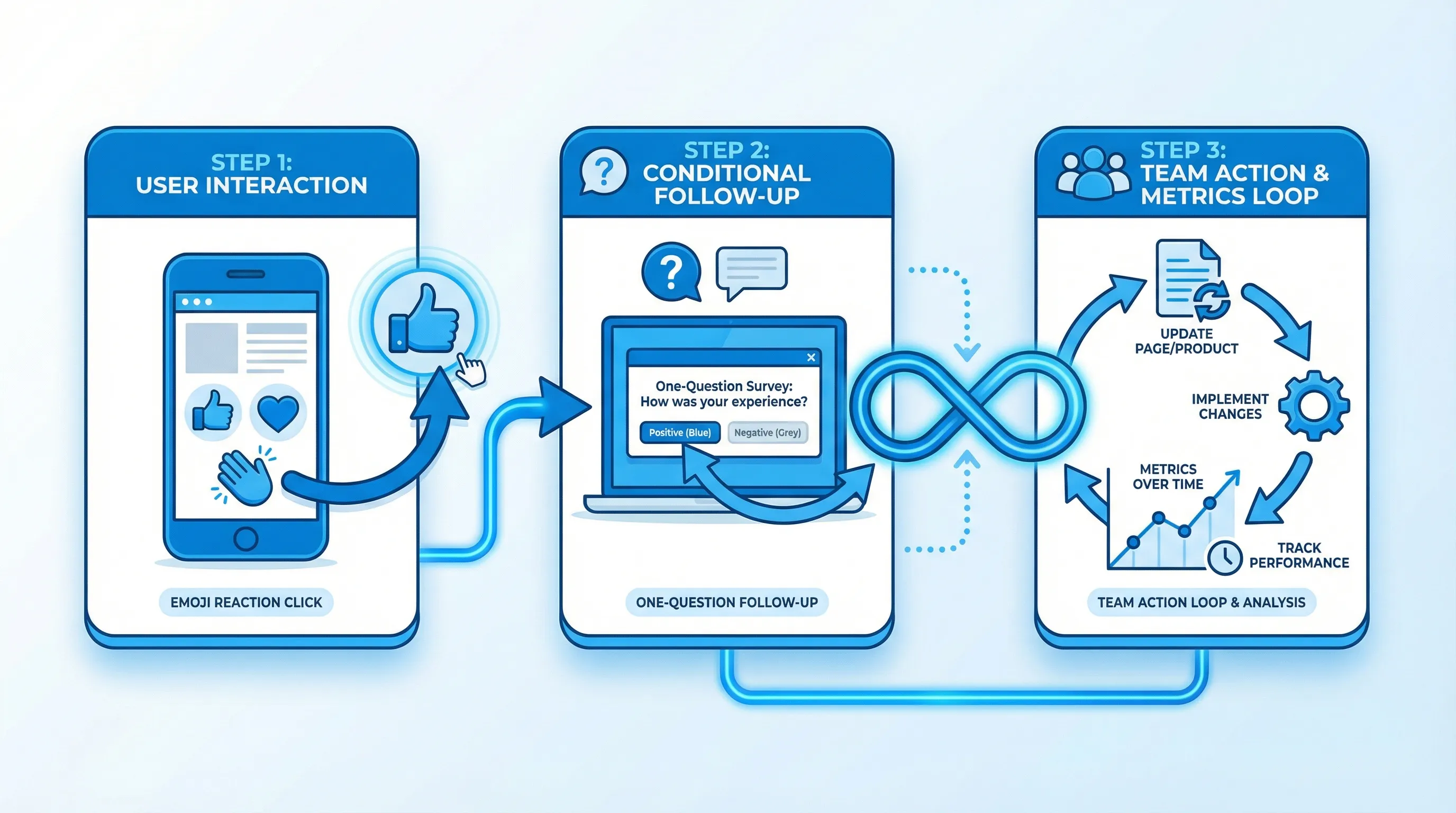
Turning reaction clicks into “big insight”: a simple analysis workflow
Reactions are easy to collect. The value comes from how you operationalize them.
1) Define the decision the reaction will inform
Before you ship, write down:
- What decision will this data influence?
- What threshold will trigger action?
Examples:
- “If an onboarding step gets more than 15% ‘stuck’ this week, we rewrite the step and re-test.”
- “If a pricing section gets more than 10% ‘confusing,’ we move the answer above the fold.”
2) Segment by context (not demographics)
The most useful segments are usually behavioral:
- New vs returning users
- Pre-signup vs in-product
- Plan type (if known)
- Traffic source (for pricing clarity)
Even lightweight segmentation can explain why a reaction result looks “mixed.”
3) Add one follow-up question, then stop
The goal is to keep the loop short:
- Reaction
- One follow-up (optional)
- Action
If you need more, run a separate research survey later. Trying to turn a reaction into a full questionnaire is how you recreate survey fatigue.
4) Close the loop where the reaction happened
When you fix something, consider posting a small update in the same context:
- “We updated this doc section based on feedback.”
- “We clarified billing terms in the pricing FAQ.”
This builds trust and can increase future response rates.
A practical “reaction library” you can copy
These are reaction sets that tend to be interpretable in SaaS, with minimal ambiguity.
| Use case | Reaction labels (example) | Why it works |
|---|---|---|
| Helpfulness | Helpful, Not sure, Not helpful | Maps directly to a content outcome |
| Friction | Easy, OK, Stuck | Diagnoses effort, not emotion |
| Clarity | Clear, I have questions, Confusing | Gives you a clean rewrite signal |
| Relevance | Relevant, Not relevant | Improves targeting and segmentation |
| Satisfaction (lightweight) | Happy, Neutral, Unhappy | Directional sentiment, fast |
If you need a more formal satisfaction metric, use CSAT. Reactions are best as a fast signal that tells you where to run CSAT, not a replacement for it.
Implementing emoji reactions with a lightweight widget
You can implement reactions in a few ways:
- Inline on a page (docs, pricing)
- As a small slide-in prompt after a trigger
- Inside a feedback widget that users can open when they want
If you are using a feedback widget tool like ModalCast, the basic approach is:
- Create a short poll post using emojis as answer options (with labels)
- Choose where it appears (specific pages or in-product locations)
- Set a trigger (scroll depth, time on page, post-action)
- Add an optional follow-up for negative or uncertain responses
- Monitor results and iterate
ModalCast is designed for exactly this style of lightweight, on-site engagement, combining feedback collection, updates, and lead capture in one widget. If you want background on what a feedback widget is and when to use it, this is a helpful overview: What is a Feedback Widget and Why You Need One?.
Common pitfalls (and how to avoid them)
Pitfall: ambiguous emojis that create debate
Fix: use fewer options, add labels, and make the question specific to the page.
Pitfall: collecting sentiment but not context
Fix: add one conditional follow-up for negative or uncertain reactions.
Pitfall: too many prompts per session
Fix: apply frequency caps, exclude high-stakes flows, and sample impressions.
Pitfall: optimizing for response count, not decisions
Fix: define action thresholds and track trend changes after fixes.
Frequently Asked Questions
Are emoji reactions better than CSAT or NPS? They are different tools. Emoji reactions are best for fast, contextual signals on specific moments (docs clarity, onboarding friction). CSAT and NPS are better for structured measurement across a relationship or journey.
How many emoji options should I offer? Start with 2 or 3. Use 5 only if each option has a clear label and you already know how you will act on each bucket.
Should I show a follow-up question after every reaction? Usually no. Show a follow-up only after negative or uncertain reactions. That keeps the experience lightweight and increases the quality of written feedback.
Where do emoji reactions work best on a SaaS website? Help center pages, pricing sections, release notes, and post-action moments (after a key step completes) tend to produce the cleanest signal.
Can emoji reactions hurt conversions? They can if they are over-triggered, interrupt key flows, or feel manipulative. Keep them contextual, small, and frequency-capped, and avoid running them on the same sessions as aggressive lead capture.
Ship your first reaction prompt this week
If you want to collect feedback without adding a heavy survey toolchain, start with one reaction prompt in a high-intent spot (docs, onboarding, or pricing), add one conditional follow-up, and set an action threshold.
ModalCast makes it straightforward to run these lightweight reactions as part of a single on-site widget, alongside microsurveys, updates, and lead capture. Explore ModalCast at modalcast.com when you are ready to ship a reaction prompt and iterate quickly.
