Anonymous Feedback Form: Best Practices for SaaS Websites
If you are trying to learn what users really think, an anonymous feedback form can outperform most “rate us 1 to 10” prompts. The reason is simple: anonymity reduces social risk.
If you are trying to learn what users really think, an anonymous feedback form can outperform most “rate us 1 to 10” prompts. The reason is simple: anonymity reduces social risk. People will tell you “your pricing page feels sketchy,” “I don’t trust your security story,” or “your onboarding is confusing” when they are not worried about hurting a relationship with your team.
But anonymity also creates new problems: lower context, harder follow-up, and more noise if you do not design the prompt carefully.
This guide covers the best practices SaaS teams use to get high-signal anonymous feedback on marketing sites and inside the product, without harming conversions or trust.
What “anonymous” should mean on a SaaS website
Before you ship the form, align on definitions. Many teams accidentally promise anonymity while still collecting identifiers (or enough metadata to re-identify someone).
Three practical modes: anonymous, pseudonymous, identified
| Mode | What you collect | What you gain | Tradeoffs | Best for |
|---|---|---|---|---|
| Anonymous | No name/email, no account ID, avoid free-text fields that request PII | More candid responses, more criticism, more sensitive feedback | Harder to follow up, more ambiguity | Pricing objections, trust concerns, “why didn’t you sign up,” docs quality |
| Pseudonymous | A stable user ID (or session ID) but no visible identity | You can connect feedback to behavior while keeping perceived privacy | Not truly anonymous, requires careful disclosure | In-product onboarding friction, feature adoption, churn risk signals |
| Identified | Email/name/account, often with a ticket | You can resolve issues faster, close the loop 1:1 | Lower candor, more “polite” feedback | Support intake, bug reports requiring reproduction, enterprise requests |
Best practice: If your goal is insight, default to anonymous (or pseudonymous) and add an optional path to share contact details.
Do not over-promise anonymity
Avoid copy like “100% anonymous” unless you have verified it end-to-end with legal and engineering. A safer, truthful pattern is:
- “We won’t ask for your name or email unless you choose to share it.”
- “Your feedback is read by our product team.”
- “Please do not include passwords, API keys, or personal data.”
If you operate in regulated environments or serve EU users, coordinate your wording with your privacy policy and data handling practices. For reference, see the GDPR text and your local guidance.
When an anonymous feedback form is the right tool
Anonymous forms work best when the user’s honest answer could feel risky, awkward, or confrontational.
High-leverage SaaS use cases
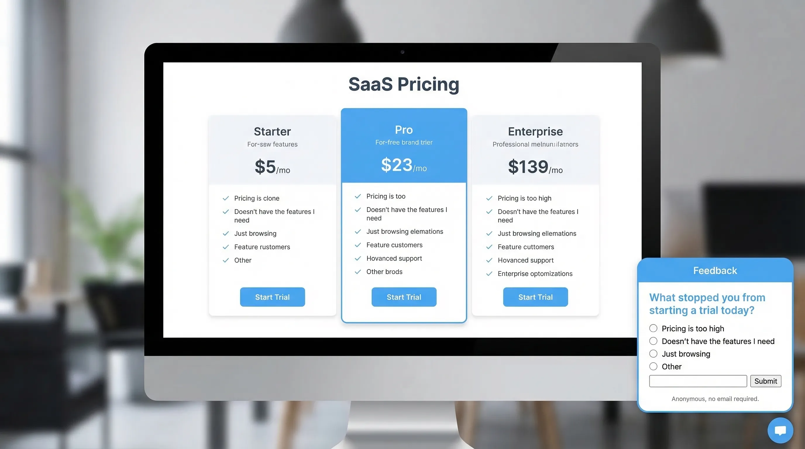
Pricing page objections (BOFU): “What stopped you from starting a trial today?” gets you revenue-adjacent insight fast.
Trust gaps: Security, reliability, data handling, and compliance concerns often show up more clearly when users are not identified.
Onboarding friction (MOFU): After a user fails to complete a key setup step, anonymity can produce more truthful “this is confusing” feedback.
Docs feedback (TOFU/MOFU): Anonymous “Was this page helpful?” prompts are high volume and low friction.
Cancel flow learning: If you only collect identified cancellation tickets, you often get polite, incomplete reasons.
When anonymity hurts (and what to do instead)
If the response will require immediate follow-up, anonymity can slow you down.
Common examples:
- Bug reports that need device details, steps to reproduce, or account context.
- Billing issues.
- Sales conversations.
Pattern that works: Ask for the insight anonymously first, then offer an optional follow-up.
Example:
- Q1 (anonymous): “What’s the main reason you’re cancelling?”
- Q2 (optional): “If you want a reply, leave an email (optional).”
Best practices that consistently improve signal quality
The difference between “random venting” and “actionable product insight” is usually form design and timing.
1) Ask one decision-driven question
Anonymous feedback performs best when it maps to a decision you can make next week.
Good question types:
- Obstacle: “What blocked you from upgrading today?”
- Confusion: “What part of this page is unclear?”
- Expectation gap: “What did you expect to find here but didn’t?”
- Tradeoff: “What would you need to see to feel confident trying us?”
Avoid:
- “Any feedback?” (too broad)
- Multi-part questions (“What did you like and dislike and what should we build next?”)
2) Capture context without capturing identity
You can massively increase usefulness without collecting personal data.
Context that helps triage:
- Page or route (pricing, checkout, docs article)
- Plan shown (monthly/annual)
- App state (onboarding step name)
- Device category (mobile/desktop)
- Source category (paid, organic, partner)
If you capture context automatically, disclose it plainly. If you cannot disclose it confidently, keep it minimal.
3) Use trust microcopy that answers “Is it safe to be honest?”
Anonymous feedback increases when people believe two things:
- You truly do not need their identity.
- Their words will not be used against them.
Microcopy examples you can paste:
- “Anonymous by default. No name or email required.”
- “This goes to our product team, not sales.”
- “Please avoid sensitive info (passwords, API keys).”
4) Keep completion time under 20 seconds
An anonymous form is not a survey. The highest-performing setups are:
- One question on the first screen
- Optional follow-up only if needed
- No more than 1 to 3 fields total
If you want richer profiles, use progressive profiling over multiple moments rather than a long anonymous form. (Modalcast has a good primer on the strategy in Progressive Profiling: A Simple Starter Guide.)
5) Time the prompt to intent, not page load
Anonymous prompts can still damage conversions if they interrupt the wrong moment.
Safer timing patterns:
- After a meaningful action (trial created, integration connected)
- After repeated friction (2+ validation errors, multiple failed attempts)
- On exit intent only for recovery, not as your default
If you want a deeper timing framework, see User Feedback Popup: Timing Rules That Protect Conversions.
6) Add guardrails: frequency caps and exclusions
Even a perfectly written prompt becomes annoying when it shows too often.
Operational guardrails:
- Cap anonymous prompts per user/session
- Exclude high-intent conversion paths (checkout, payment step)
- Suppress if the user already submitted recently
(If you are building a broader on-site stack, Popup Frequency Capping That Protects UX is a solid reference.)
7) Prevent spam without adding friction
Anonymous forms invite low-effort spam, but you can often avoid CAPTCHAs.
Lightweight protections that usually work:
- Honeypot field (hidden input that humans do not fill)
- Minimum time to submit (blocks bot-fast posts)
- Basic rate limiting by session
- Profanity and link filtering on the backend (flag, do not block silently)
If abuse becomes common, add stronger defenses progressively. Do not punish all users upfront.
Practical anonymous feedback form patterns (with copy)
Below are four patterns SaaS teams ship quickly. Each one is designed around a specific decision.
| Use case | Where to trigger | Primary question | Optional follow-up |
|---|---|---|---|
| Pricing objections | Pricing page after 30 to 60 seconds, or on exit intent | “What stopped you from starting a trial today?” | “What were you hoping to see on this page?” (short text) |
| In-product friction | After repeated errors or a failed setup milestone | “What went wrong?” | “If you want help, leave an email (optional).” |
| Docs quality | Bottom of docs pages | “Did this answer your question?” (Yes/No) | If No: “What was missing?” |
| Cancellation insights | Cancel flow confirmation screen | “What’s the main reason you’re leaving?” (select) | “What would make you consider coming back?” (short text) |
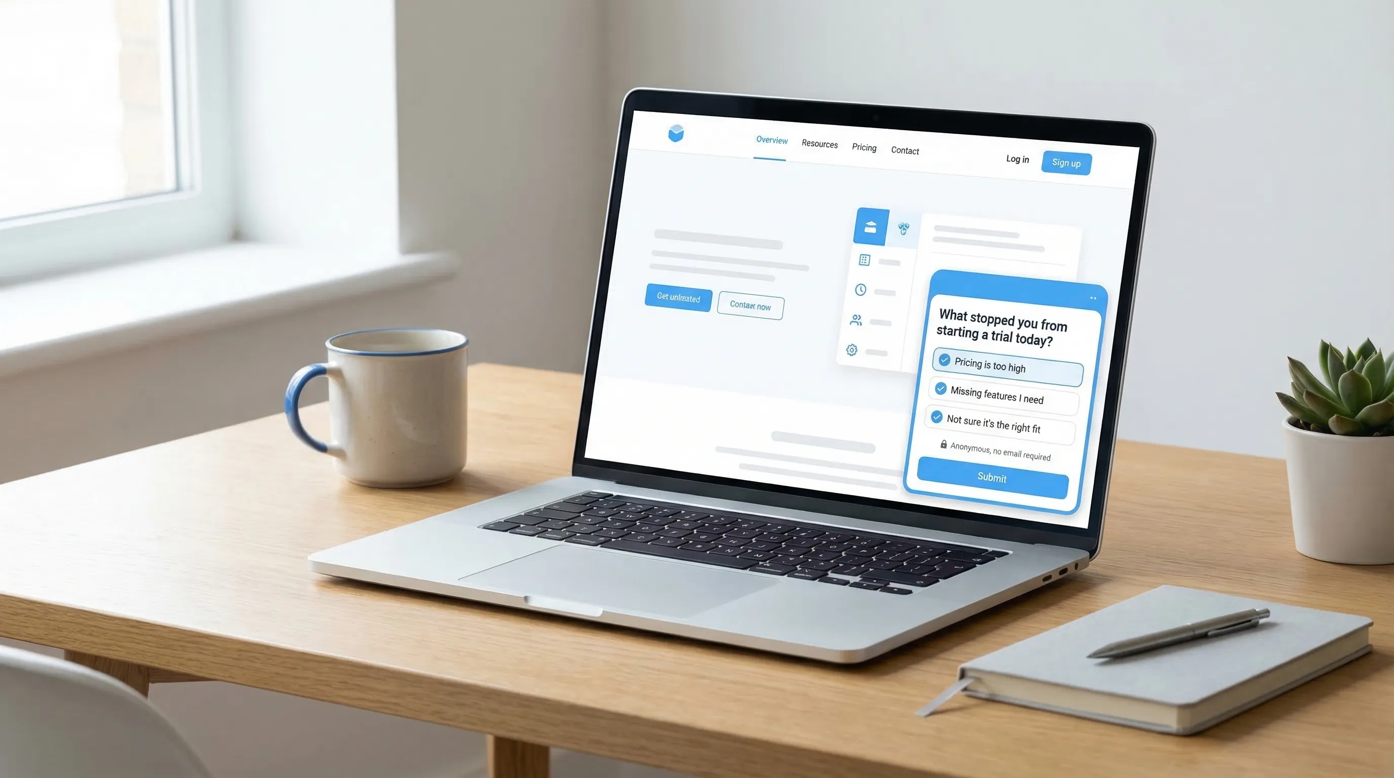
Pricing page pattern: reduce polite answers, get real objections
Goal: Find the one change that unlocks more trials.
Form fields:
- Q1 (required, single select): “What stopped you from starting a trial today?”
- Too expensive
- Missing a feature
- Not sure it works for my use case
- Need to discuss with team
- Concerned about security/privacy
- Other
- Q2 (conditional, short text): “What would you need to see to feel confident?”
Trust microcopy:
- “Anonymous feedback, no email required.”
What to do with it:
- Turn the top 2 objections into an experiment backlog (page copy, pricing packaging, proof points).
In-app friction pattern: separate insight from support
Goal: Learn what breaks onboarding, without forcing a ticket.
Form fields:
- “What blocked you just now?” (short text)
- “Which step were you on?” (pre-filled if you can, otherwise optional)
- “Want a reply?” (toggle)
- If toggle = yes: “Email (optional)”
Key detail: label the email field as optional and explain why you might use it.
Docs feedback pattern: high volume, low bias
Goal: Improve self-serve, reduce support load, increase activation.
Start tiny:
- “Was this helpful?” (Yes/No)
Only if No, ask:
- “What did you expect to find?” (short text)
This keeps your response rate high and avoids long, low-quality comments.
Cancellation pattern: prevent the “Other” graveyard
Goal: Identify fixable churn reasons.
Use a single-select list that reflects real hypotheses, not generic categories. For example, separate “Too expensive” from “Hard to justify ROI” because they lead to different fixes.
Then ask one follow-up:
- “If we could fix one thing, what should it be?”
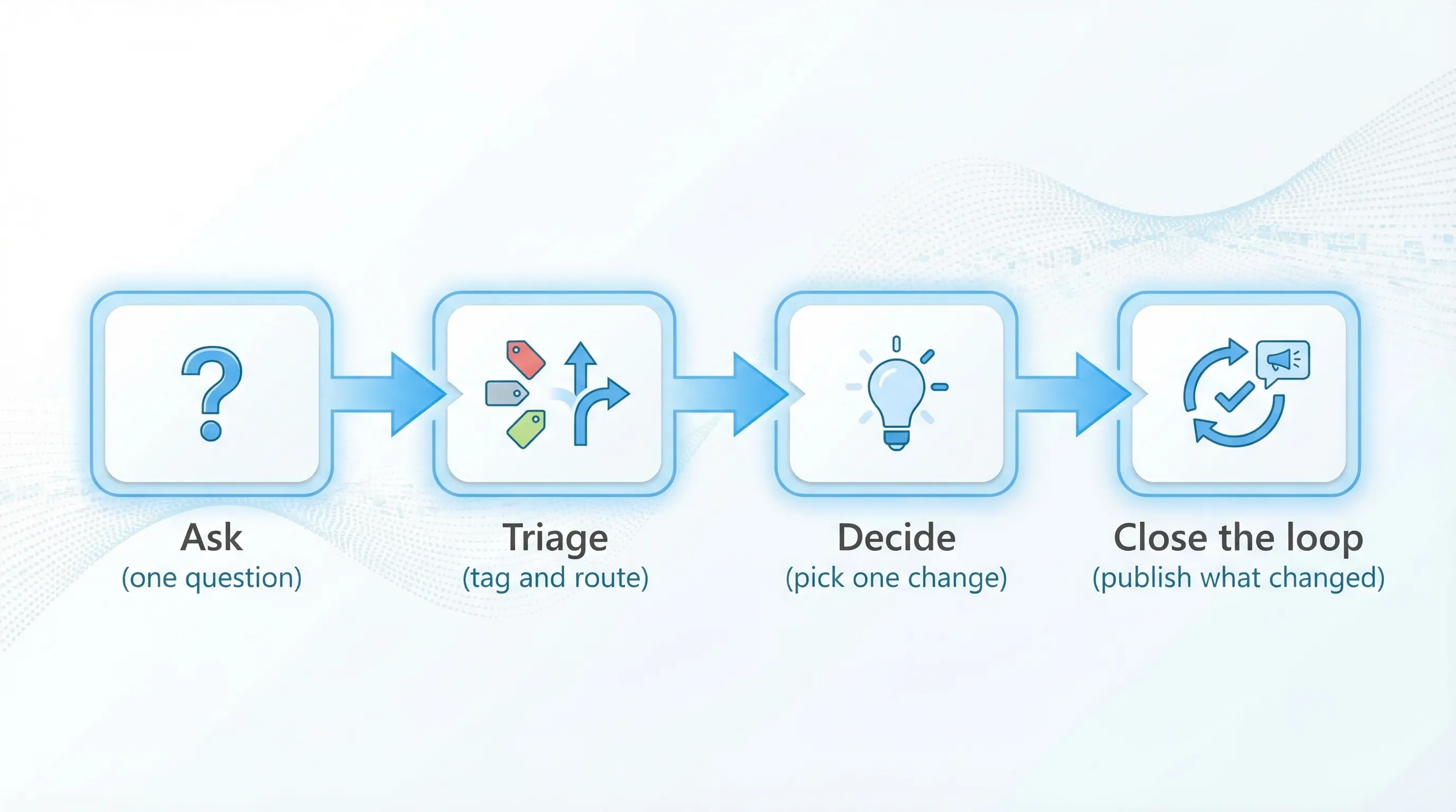
How to operationalize anonymous feedback (so it drives decisions)
Anonymous feedback only matters if it becomes a repeatable workflow.
Create a simple triage system
At minimum, tag each response with:
- Theme (pricing, onboarding, reliability, missing feature)
- Severity (blocking, annoying, nice-to-have)
- Funnel stage (visitor, trial, active user, churn)
Then assign an owner for each theme. Ownership is what prevents “we read it” from becoming “we forgot it.”
Track metrics that reflect quality, not just volume
Helpful metrics for anonymous forms:
- Prompt view rate (did it render and was it seen?)
- Submission rate (did people complete it?)
- Median completion time (a proxy for friction)
- Action rate (percentage of themes that turn into a shipped change or test)
If you want to go deeper on conversion guardrails, pair this with the framework in Collect Feedback Without Killing Conversions.
Close the loop without identifying anyone
You do not need identities to build trust.
Ways to close the loop publicly:
- “You asked, we shipped” changelog notes
- A quarterly “What we changed based on your feedback” post
- In-product announcements when you fix a recurring complaint
This increases future response rates because users see proof that feedback leads to change.
Privacy and compliance basics (practical, not legal advice)
Anonymous does not automatically mean privacy-safe. A few simple practices reduce risk:
- Data minimization: Do not ask for personal data “just in case.”
- Avoid sensitive fields: Add a reminder not to include secrets or regulated data.
- Retention: Set a retention window that matches the purpose.
- Transparency: Link to your privacy policy near the form when appropriate.
For teams operating in the US and EU, it is worth reviewing the FTC’s privacy and security guidance and the requirements that apply to your product.
Shipping an anonymous feedback form with a lightweight widget
For most SaaS teams, the fastest path is to deploy the form as an on-site widget so you can iterate copy, timing, and placement without rebuilding your site.
Modalcast is designed for this “single lightweight widget” approach, you can publish feedback prompts, on-site messages, and simple forms without adding a complex survey stack. If you want to get practical about where to place it, start with Website Feedback Widget Placement: Best Practices to Convert, then ship one anonymous prompt tied to a real decision (pricing objections is a good first bet).