Feedback Widget Design Tips That Boost Responses
Most feedback widgets are abandoned for the same three reasons, the question feels irrelevant, the timing is off, or the experience looks like work. Good design removes that friction.
Most feedback widgets are abandoned for the same three reasons, the question feels irrelevant, the timing is off, or the experience looks like work. Good design removes that friction. The result is shorter time to insight, more representative responses, and fewer annoyed users.
This playbook distills practical design tips you can apply today. Each recommendation is grounded in UX research and real patterns that work for SaaS and content sites.
The response-rate equation
Use this simple mental model. Response rate is the product of four variables, relevance, timing, ease, trust. You do not need to be perfect on all four, but lifting any one meaningfully will boost responses.
- Relevance, Ask a question that matches the user’s immediate task or context.
- Timing, Trigger only when the user has enough context to answer, and when interruption cost is low.
- Ease, Make it a 10 second interaction, one clear action, zero guesswork.
- Trust, Be transparent about purpose, privacy, and what happens next.
The sections below show how to design each lever.
Visual design that reduces effort
One screen, one job
Keep the first view laser focused. Show a single, concrete question or rating. Hide optional fields behind a follow up step that appears only after a quick tap. Multi question layouts look like surveys, which suppresses starts.
Thumb friendly targets
Make options large enough to tap without precision. Apple’s Human Interface Guidelines recommend at least 44 by 44 points for touch targets, and Material Design’s guidance is similar. See Apple’s Human Interface Guidelines and Material recommendations for touch targets. In practice, buttons and chips around 44 to 48 px tall with 8 to 12 px spacing feel reliable on mobile.
- Reference, Apple Human Interface Guidelines, touch-target sizing, Apple HIG
High contrast, obvious actions
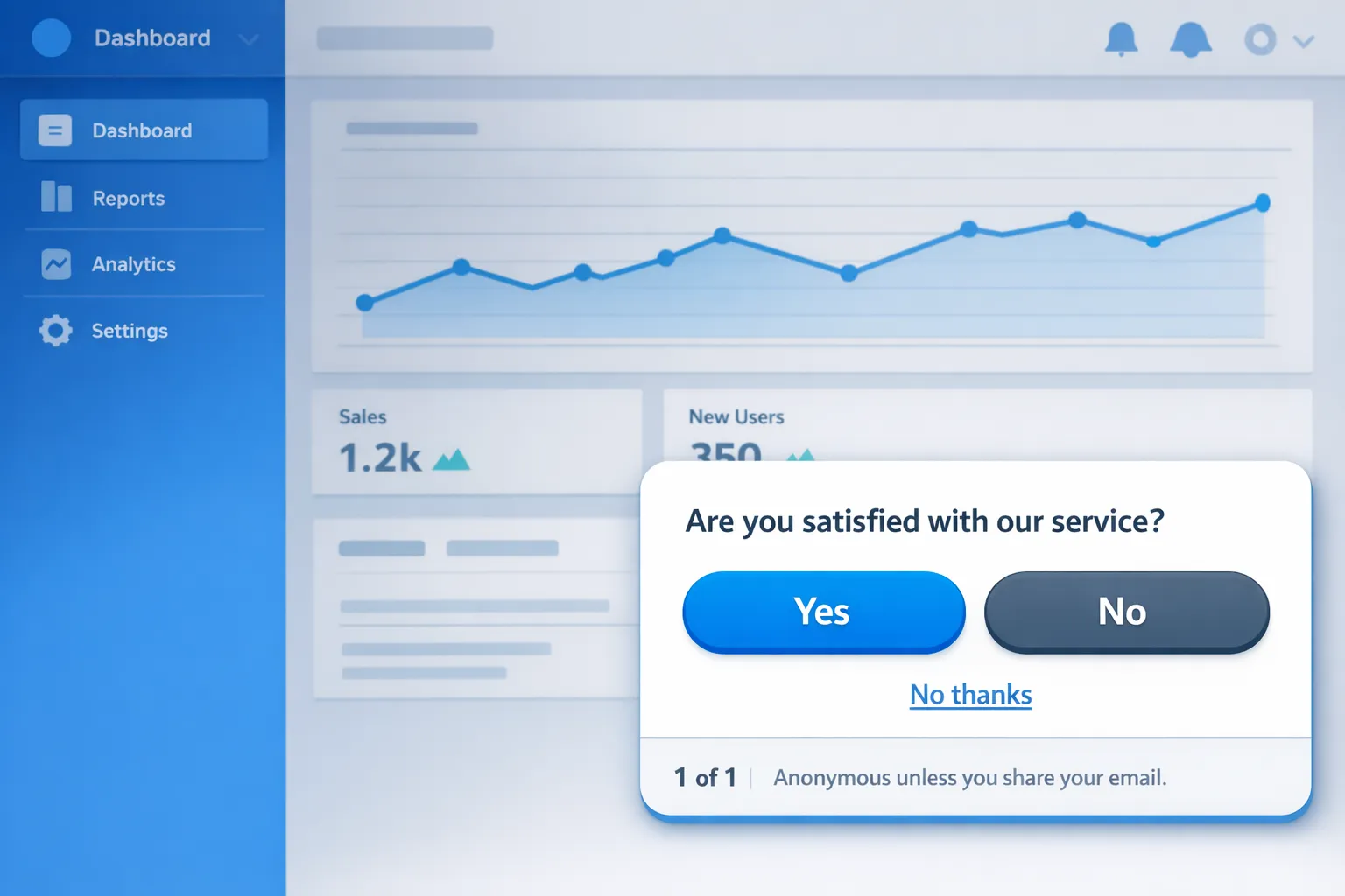
Text and controls should meet or exceed WCAG non text contrast guidance so they remain legible in all conditions. Avoid subtle ghost buttons for primary actions. Make the primary choice a filled button, secondary choices outlined, and include a visible “No thanks”.
- Reference, WCAG 2.1, 1.4.11 Non text contrast, W3C
Inline validation and persistent labels
If you request text or email, validate inline and in context. Do not rely on a post submit error. Keep labels visible outside of placeholders so users do not forget what a field means after they start typing. Inline validation reduces error rates and abandonment, see research from Baymard on form validation.
- Reference, Inline validation patterns, Baymard Institute
Dark mode and motion
Honor the user’s color scheme. Provide a dark theme with the same contrast ratios and clear states. Keep motion minimal, short ease in transitions under 150 ms help draw attention without feeling jumpy. Avoid bouncing or oscillating animations which read as ads.
Copy and microcopy that earns the click
Promise and scope upfront
Tell people why you are asking and how long it takes.
- “Quick question to improve onboarding, 10 seconds.”
- “1 question about your pricing page experience.”
Clarity about scope increases start rate because it reduces uncertainty. See NNG’s guidance on microcopy for examples.
- Reference, Microcopy, tiny words with big UX impact, Nielsen Norman Group
Make the first tap effortless
Use choice chips or buttons for the first response, not a dropdown. People should be able to answer with one tap, no scrolling.
Good examples:
- “Did you find what you needed on this page?” Yes, No
- “How clear is our pricing?” Very clear, Somewhat clear, Unclear
- “What almost stopped you from signing up?” with 4 to 6 common reasons as buttons, plus Other
Ask concrete, single purpose questions
Avoid double barreled prompts like “How satisfied are you with our pricing and support?”. Split them. If you need depth, reveal a single follow up when relevant.
Respect no
Add visible control language, “No thanks” or “Not now”, just as clearly as Accept or Submit. This paradoxically increases starts by signaling respect.
Close the loop
Use the thank you state to show the feedback goes somewhere. Examples, “We read every response”, “We review weekly and prioritize changes”, “Want updates?” then an optional email field with clear consent text.
Interaction design, flows that feel light
Progressive disclosure
Use a two step pattern. Step 1, an easy quantified choice. Step 2, only appears for people who want to add context, a single text field prefilled with a prompt like “What would make this better?”. Show “1 of 2” and “2 of 2” so effort is predictable.
Contextual follow ups
Branch follow ups based on the initial choice. If the user selects “Unclear pricing”, offer 4 common reasons like “Missing feature comparison”, “Total cost not obvious”, “Plan limits confusing”, “Annual vs monthly unclear”. Conditional logic raises relevance without lengthening the experience for everyone.
Keyboard and shortcuts
Support Enter to submit and Esc to dismiss on desktop. Manage focus order and return focus to the triggering element after close for accessibility and polish.
Frequency capping
Defaults that work well, do not prompt on the first page view, cap to one prompt per session, snooze for 7 to 14 days after a dismissal, and do not show again after a completed response unless soliciting a different question in a different context.
For more patterns that protect conversion while you collect feedback, see our guide, Collect Feedback Without Killing Conversions.
Placement and timing by page type
Home, landing pages from ads
Use a passive feedback entry like a floating “Feedback” button and avoid intrusive interstitials on mobile. Google advises against intrusive interstitials that obstruct content, especially for mobile search visitors. If you must show a prompt, use a small bottom slide in after engagement, for example 20 seconds engaged time or 50 percent scroll.
- Reference, Avoid intrusive interstitials, Google Search Central
Pricing and comparison pages
Trigger on exit intent or after 20 to 30 seconds of activity. Ask what information is missing. Offer 4 to 6 specific gaps mapped to your page sections, then show a link to the relevant section immediately after submission.
Onboarding and setup flows
Prompt after a stall, for example 90 seconds idle on a step, or after a repeat error. Ask “What is unclear about this step?” with common blockers. If they choose a blocker, inline reveal a tiny tip or link to docs.
In app dashboards
Use a passive feedback button plus occasional in product microsurveys keyed to feature usage, for example after the first export, ask “How did export go?” with a single five point scale and optional text.
Documentation and help center
Ask “Was this article helpful?” with Yes or No, then conditionally ask for a suggestion if No. Offer to file a ticket only after submission to keep the main action fast.
Performance and accessibility matter to responses
Load behavior
Lazy load the widget after primary content is interactive. Lightweight scripts and deferred loading preserve Core Web Vitals. Keep Interaction to Next Paint under 200 ms for widget interactions, because sluggish UI directly suppresses submission rates.
- Reference, Interaction to Next Paint, web.dev
Keyboard, focus, and screen readers
- Provide visible focus states that meet contrast guidelines.
- Trap focus within the widget while open, and return it to the trigger on close.
- Announce opening and closing states to assistive tech with ARIA attributes.
- Ensure Esc to close never loses context.
Mobile safe areas
Respect device safe area insets so buttons do not sit under notches or system bars. Avoid being obscured by the on screen keyboard by anchoring the widget above it.
Trust and privacy signals users notice
- Say how responses are used. “Used only to improve onboarding,” beats generic “Help us improve.”
- If anonymous, state it. “Anonymous unless you share your email.”
- If you ask for email, make it optional for feedback, and add clear consent text for marketing as a separate opt in. Do not pre check it.
- Link to your privacy policy from the widget footer.
These lines reduce perceived risk, which increases both starts and honest answers.
Incentives without distortion
If you incentivize, keep it light. Small perks like a chance to win a gift card can boost completion, but heavy incentives can bias responses toward speed rather than quality. Prefer contextual value, immediate help, or early access over cash when possible.
What to measure and how to iterate
Track the smallest set of metrics that explain both response rate and experience quality.
- View rate, Percent of eligible users who saw the widget.
- Start rate, Views that began a response.
- Completion rate, Starts that submitted.
- Time to complete, Median seconds from open to submit.
- Text enrichment rate, Submissions with a non empty comment.
- Dismiss rate, Views that actively closed without starting.
- Conversion impact, Holdout comparison for your core KPI, for example signup or checkout.
Run simple A/B tests on copy, first question type, and button labeling. Keep one variable per test and run to stable traffic, not to a fixed date. If you do not have an experimentation platform, alternate variants by traffic source or device type for a rough cut, then rotate.
Proven patterns you can deploy today
1. Pricing page “missing info” probe
- Trigger, 25 seconds on page or exit intent.
- Q1, “What is missing on this page?” Buttons, Feature comparison, Total cost, Limits, Security, Other.
- Follow up, only if Other, “What else would help you decide?” free text.
- After submit, show a link to the most relevant section or start a chat.
2. Post signup “first impression” check
- Trigger, First login, after 60 seconds of activity.
- Q1, “How confident do you feel about getting value from product today?” Very confident, Somewhat, Not yet.
- Follow up, personalized tip or short doc link based on choice.
3. Onboarding stall recovery
- Trigger, 90 seconds idle on a setup step or 2 failed attempts.
- Q1, “What is unclear about this step?” Buttons matched to step tasks.
- Follow up, micro tip inline.
4. Docs “was this helpful?” with fix request
- Trigger, After reaching the end or 30 seconds engaged time.
- Q1, Yes or No.
- Follow up if No, “What should we fix or clarify?” free text.
5. Feature request pulse
- Trigger, Dashboard, once per user per quarter.
- Q1, “Which would help you more next?” 4 to 6 roadmap themes. Follow with an optional email for updates.
A compact design checklist
| Element | Recommendation | Why it lifts responses |
|---|---|---|
| First screen | One concrete question, visible scope like “10 seconds” | Reduces uncertainty and perceived effort |
| Controls | Large, high contrast buttons or chips, 44 to 48 px targets | Faster first action on mobile |
| Dismissal | Clear “No thanks” and Esc to close | Builds trust, reduces annoyance |
| Labels | Persistent labels, inline validation | Prevents errors, lowers friction |
| Progress | “1 of 1” or “1 of 2” indicator | Sets expectations, improves completion |
| Privacy | One line on use, link to policy | Increases honesty and start rate |
| Frequency | One prompt per session, 7 to 14 day snooze | Avoids fatigue, protects KPIs |
| Performance | Lazy load, snappy interactions under 200 ms | Keeps Core Web Vitals healthy, feels responsive |
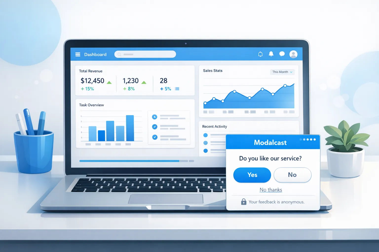
Implementing these tips with Modalcast
You can apply every pattern above with Modalcast’s lightweight feedback widget.
- Use passive placement with a floating feedback button, then add targeted slide ins for contextual prompts.
- Configure event based triggers, for example time on page, scroll depth, exit intent, or in product milestones.
- Build two step microsurveys with button choices first, then an optional text field.
- Add short, specific microcopy and a visible “No thanks.”
- Monitor views, starts, completions, and time to complete in your Modalcast dashboard, then iterate on copy and timing.
If you are new to micro surveys, start with this how to guide, How To Set Up Microsurveys in Your Website or App, then layer the design tips from this article. For collecting feedback while protecting conversion, read, Collect Feedback Without Killing Conversions.
Final takeaway
Boosting responses is not about louder popups. It is about aligning four levers, relevance, timing, ease, and trust. Design your feedback widget so the first tap is easy, the task is clear, and the user feels respected. Do that, and you will capture more signal with less friction, the kind of feedback you can act on.
References mentioned, Apple Human Interface Guidelines, Apple HIG. WCAG 2.1 Non text contrast, W3C. Microcopy guidance, Nielsen Norman Group. Intrusive interstitials, Google Search Central. Inline validation, Baymard Institute. Web Vitals, INP, web.dev.
