Online Feedback Form for SaaS: Examples and Best Practices
A well placed online feedback form can remove guesswork from your roadmap, unstick onboarding, and surface revenue blockers before they snowball. For SaaS teams, the key is timing and specificity.

A well placed online feedback form can remove guesswork from your roadmap, unstick onboarding, and surface revenue blockers before they snowball. For SaaS teams, the key is timing and specificity. Ask the smallest, most actionable question at the exact moment a user hits friction, and route the response to the person who can fix it.
This guide shows practical examples you can copy, field-by-field templates, and vetted best practices that respect UX, privacy, and performance.
Where online feedback forms create leverage in SaaS
- Activation, reduce time to first value by capturing setup blockers in flow.
- Conversion, learn the real objections on pricing, upgrade, and paywalls.
- Retention, understand feature gaps and cancellation reasons while there is still a chance to save the account.
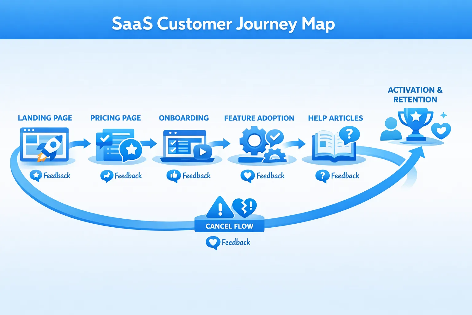
SaaS-ready online feedback form examples you can deploy
Each pattern pairs a user moment with one focused question and a clear next step.
| Scenario | Goal | Trigger | Primary question | Owner and next step |
|---|---|---|---|---|
| Onboarding step blocker | Reduce setup drop-off | Idle on a setup step or user tries to close the step | “Did anything make this step hard?” If yes, “What happened?” | PM or UX reviews daily, fix copy or flows, update docs |
| Pricing page hesitation | Increase trial starts | Exit intent or deep scroll without click | “What is preventing you from starting a trial today?” Options like Not ready, Price not clear, Missing feature, Need approval | PMM reviews weekly, adjust pricing copy, add ROI calculator, start sales assist experiments |
| Feature request, problem-first | Prioritize roadmap by job to be done | On feature pages or after repeated use of related screens | “What are you trying to accomplish that is hard to do today?” Optional priority selector | PM tags requests by theme, score by impact and frequency |
| Bug or unexpected behavior | Triage faster | After an error message or repeated failed action | “Something did not work as expected. What went wrong?” Optional steps to reproduce | Engineering triage, link to issue tracker, close the loop |
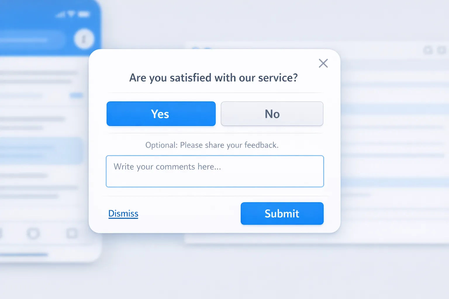
| Post-support CSAT | Validate resolution quality | After chat closes or a help article is viewed | “Did this solve your issue?” Yes or No, optional comment | Support lead tracks CSAT trends, follow up on No responses |
| Cancel flow reason | Reduce churn and inform save plays | In downgrade or cancel flow | “Main reason for canceling?” Options like Missing feature, Price, Switching, Not using | Lifecycle team triggers save offer or handoff to success |
| Trial paywall exit | Improve upgrade conversion | When a paywalled feature is hit but user dismisses | “What would make this upgrade worth it today?” | PMM validates value proposition, tests targeted upgrade copy |
| Empty state guidance | Unblock first action | In empty dashboards or new projects | “What is unclear about getting started?” Optional we can email help checkbox | UX updates empty-state content and walkthroughs |
| Recently shipped feature pulse | Verify impact post launch | After user engages with new feature | “Is this new feature helping you do X?” Thumbs up or down, optional comment | PM measures sentiment, plans iteration or expansion |
Copy you can use right now
- Onboarding blocker microform: “Did anything make this step hard?” (Yes or No). If Yes, “What happened?” Short textarea. Optional “Share email if you want a reply.”
- Pricing objection finder: “What is preventing you from starting a trial today?” Multi-select, then “What would change your mind?” Short textarea.
- Cancel reason: “What made you decide to cancel?” Multi-select with Other, then “Anything we could have done differently?” Short textarea. Optional “Can we email you if we fix this?”
- Help article usefulness: “Was this article helpful?” Yes or No. If No, “What was missing?” Short textarea.
Best practices for online feedback forms in SaaS
- Start with one decision you will make from the form. If multiple teams need input, create separate microforms instead of one long survey.
- Aim for a 10 second completion time. One to three inputs per form is a good default.
- One question per screen improves focus. Use a short follow up only when needed.
- Use answer choices that map to actions. For example, pricing objections that match a playbook, or cancel reasons that route to owners.
- Always include an Other option plus a small free text field. It captures nuance without blowing up analysis.
- Make opting out simple and visible. A clear close option keeps trust and protects conversions.
- Time forms to intent. Trigger after relevant actions, not on page load. Sample only a portion of users to avoid fatigue. If you run multiple campaigns, cap frequency so users see the most important one first. See guidance in Popup Frequency Capping That Protects UX.
- Capture context automatically, within your privacy policy. Add hidden fields for page URL, referrer, plan, account size, and environment. This turns free text into actionable insight without asking extra questions.
- Design for accessibility and mobile. Use proper labels, visible focus, sufficient contrast, and generous touch targets. Follow the W3C’s WCAG 2.2 guidance for forms and inputs. WCAG 2.2 Quick Reference
- Keep forms lightweight for performance. Avoid heavy images or scripts that slow page interactions. Faster pages get more responses and more conversions.
- Close the loop. Respond to users when possible, publish changelogs or updates, and show progress. It increases future response rates and loyalty.
- Test wording and placement. Small changes in copy or trigger timing can double response rates. Learn quickly, then standardize across similar moments.
For granular usability guidance on fields, labels, and validation patterns, Baymard’s form usability research is a strong reference. Baymard Institute, form usability
For privacy compliance, make sure your data capture aligns with GDPR and regional rules, especially if you collect contact information or usage context. EU data protection overview
Templates by lifecycle stage
These concise templates minimize friction and keep analysis straightforward.
Activation, onboarding
- Question 1: “Did anything make this step hard?” Yes or No.
- If Yes: “What happened?” Short textarea.
- Optional: “We can reply if you want help.” Email field, optional.
Pricing and conversion
- Question 1: “What is preventing you from starting a trial today?” Multi-select with options tailored to your product and an Other field.
- Follow up: “What would change your mind?” Short textarea.
Feature request, problem-first
- Question 1: “What are you trying to accomplish that is hard to do today?” Short textarea.
- Optional: “How important is this for your workflow?” Low, Medium, High.
Post-support CSAT
- Question 1: “Did we solve your issue?” Yes or No.
- If No: “What is still unresolved?” Short textarea.
Cancel flow
- Question 1: “Main reason for canceling?” Multi-select with Other.
- Follow up: “Anything we could have done differently?” Short textarea.
- Optional: “Can we notify you if we fix this?” Email field, optional.
Metrics that matter
Track a small set of diagnostic and outcome metrics. Review weekly with the owners who can act on them.
| Metric | What it indicates | How to improve |
|---|---|---|
| Response rate | Relevance and timing | Better triggers, shorter copy, clearer value of answering |
| Completion rate | Friction in the form | Fewer fields, one question per screen, mobile polish |
| Median time to complete | Cognitive load | Simplify choices, remove complex terms, add examples |
| Thematic distribution | Where effort should go | Normalize tags, look for patterns by plan and segment |
| Post-response action rate | Behavior change tied to insight | Route insights to owners fast, run follow-up experiments |
| Close-the-loop rate | Trust and future participation | Acknowledge submissions, publish updates and fixes |
Implementing this with ModalCast
ModalCast lets SaaS teams add focused feedback forms and microsurveys without adding complexity. You can create a post, choose a form or survey component, set triggers by page or behavior, and publish to your site or app in minutes.
Helpful how-tos and playbooks from the ModalCast blog:
- Build your first online feedback form step by step: How to Create a Customer Feedback Form Using ModalCast
- Trigger small, contextual questions in flow: How To Set Up Microsurveys in Your Website or App
- Protect UX while collecting insights: Collect Feedback Without Killing Conversions and Popup Frequency Capping That Protects UX
- Improve completion rates with modern form UX: High-Converting Forms: Best Practices for 2025 and Feedback Widget Design Tips That Boost Responses
If you want to draft multiple forms or announcements, write and refine them first, then publish when ready using Draft Posts. See Introducing Draft Posts in ModalCast.
A simple rollout plan
- Week 1, launch two microforms in high intent places, onboarding blocker and pricing hesitation. Sample a portion of traffic and cap frequency.
- Week 2, add cancel reason capture and post-support CSAT. Start a weekly triage with PM, PMM, support.
- Week 3, analyze themes and ship at least one change per theme. Publish an update to show progress, then iterate wording and triggers.
Bottom line
An online feedback form is not about collecting more opinions, it is about intercepting the next obstacle and turning it into a fast, visible fix. Start with the moments that block revenue and activation, ask only what you need to act, and close the loop. When you are ready to ship these patterns without engineering overhead, you can implement them quickly with ModalCast’s lightweight widget. Sign up at modalcast.com to try it with a free trial.
