How to Collect Feedback Without Surveys (5 Low-Friction Plays)
Most SaaS teams don’t have a “feedback problem.” They have a survey problem: too many asks, at the wrong time, with questions that feel like homework.

Most SaaS teams don’t have a “feedback problem.” They have a survey problem: too many asks, at the wrong time, with questions that feel like homework.
If your goal is to collect feedback without surveys, the answer is not “never ask anything.” It’s to replace long, multi-question forms with low-friction signals users are already willing to give.
Below are five practical plays you can ship on a marketing site or inside your product, plus examples and guardrails so you get signal without annoying people.
What “without surveys” really means (and when it’s the right choice)
“Without surveys” usually means avoiding:
- Multi-step questionnaires
- Random popups that interrupt task flow
- Generic NPS/CSAT blasts that don’t connect to a specific decision
Instead, you’re collecting feedback through:
- One-tap sentiment (reactions)
- Open-text feedback that’s optional and contextual
- Behavioral feedback (what people do, not what they say)
- Support and sales evidence (what they complain about when money is on the line)
This approach works best when you need directional insights fast, like:
- “Is this page clear?”
- “Which objection is blocking upgrades?”
- “Did this doc help?”
- “What broke in this flow?”
If you’re doing deeper discovery (new persona, new market), you’ll still want interviews. But for week-to-week product and conversion decisions, low-friction feedback wins on volume and timeliness.
The 5 low-friction plays (quick comparison)
| Play | Best for | Where it works | Friction | Output you can act on |
|---|---|---|---|---|
| Passive feedback entry point | Bugs, “something’s off” moments | App + docs + marketing site | Very low | A steady stream of issues and ideas, with context |
| Emoji reactions | Sentiment at scale | Docs, changelog, onboarding steps, pricing sections | One tap | “Good/bad” signal, trend over time |
| Inline “Was this helpful?” plus optional comment | Fixing content and UX clarity | Docs, help center, key marketing sections | Low | Specific edits to copy, IA, and UI |
| Exit and abandonment reason capture (non-survey) | Conversion recovery | Pricing, checkout, cancel/downgrade, trial end | Low | The top 1 to 3 blockers to remove |
| Support + sales transcript mining | High-signal objections and pain | Helpdesk, live chat, CRM notes | None for users | The language users use, plus revenue impact |
You don’t need all five. Most teams do best starting with two: one passive channel (always available) plus one contextual signal (reactions or helpfulness).
Play 1: Add a passive feedback entry point (so users can tell you when it matters)
A passive entry point is an always-available way to say, “Tell us what’s wrong” without interrupting.
Where to place it
- In-app (bottom corner)
- Docs/help center
- Pricing page (subtle, not blocking)
What to collect (keep it minimal)
- “What were you trying to do?” (optional)
- “What happened?” (free text)
- Screenshot or page URL (automatic if possible)
- Email (optional, only if they want a reply)
Copy that works
- Button label: “Feedback” or “Report an issue”
- Prompt title: “What’s not working?”
- Placeholder: “Tell us what you expected to happen…”
- Trust line: “No login required. We read every message.”
Why this beats surveys
You’re capturing feedback at the moment of frustration, not days later when context is gone.
Implementation note with Modalcast
Modalcast is built for lightweight on-site prompts and forms. A common setup is a small feedback widget users can open when they choose (instead of a forced survey). If you want the broader concept of why widgets work, see: what a feedback widget is and why teams use one.
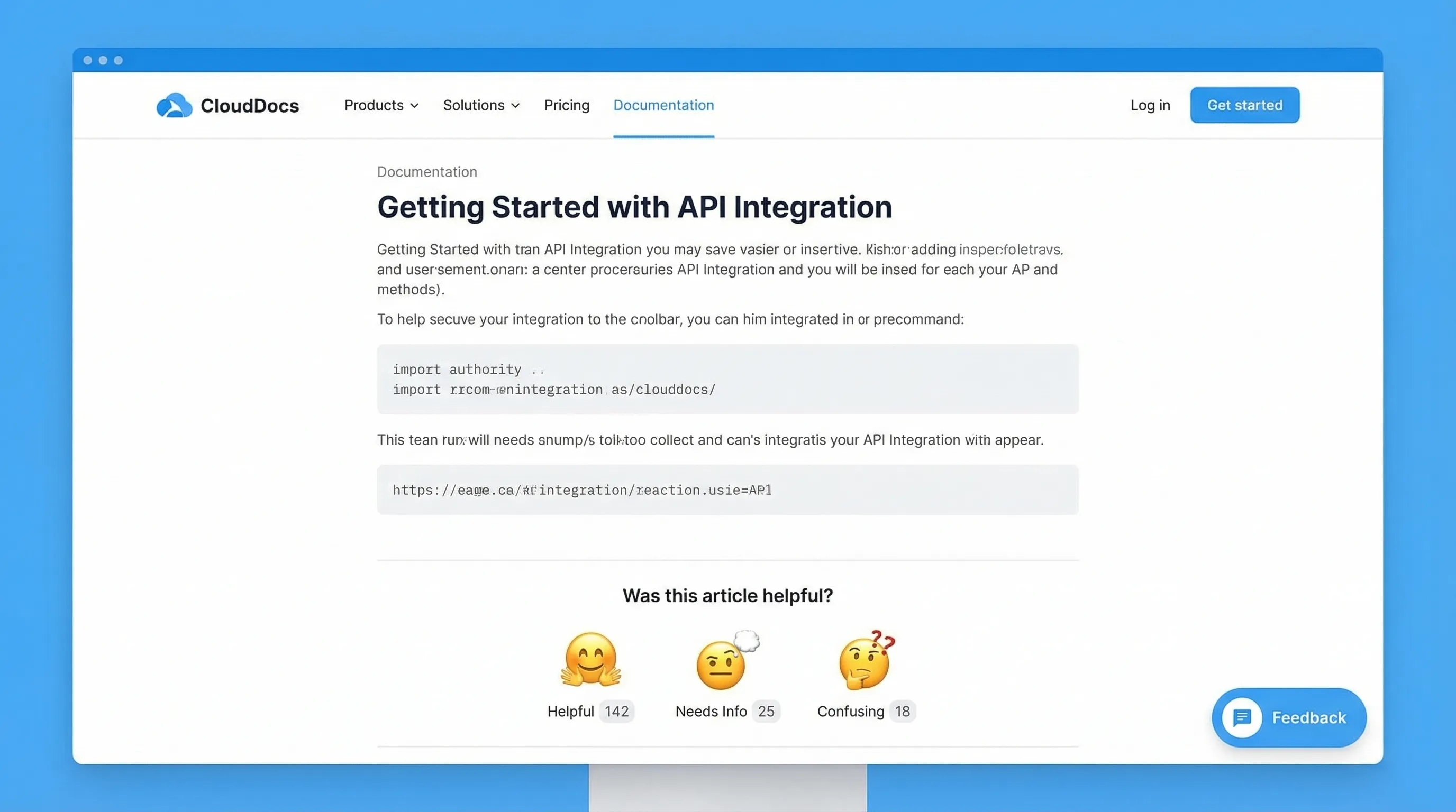
Play 2: Use emoji reactions for one-tap sentiment (high volume, low effort)
Emoji reactions are a cheat code for response rate because they ask for almost nothing.
Best places to add reactions
- Documentation pages (each article)
- Release notes/changelog entries
- Onboarding checklists or “success” screens
- Pricing FAQ sections (after a key explanation)
A simple reaction set that stays interpretable
- 👍 / 👎 (binary)
- 😀 / 😐 / 🙁 (3-point)
Avoid 5 to 7-point scales if you’re trying to stay “surveyless.” More choices increase hesitation and reduce taps.
Optional follow-up (only after a negative reaction)
When someone taps the negative option, you can ask a single optional prompt:
- “What was missing?”
- “What’s unclear?”
- “What should we fix first?”
That conditional follow-up is important: it keeps the default interaction one tap.
How to turn reactions into action
- Track negative rate by page (docs) or by release note
- Set a threshold (example: investigate anything below 70% positive once it has enough volume)
- Use the top negative pages as your weekly content backlog
Modalcast has published a deeper guide on this pattern if you want to go further: Emoji reactions: tiny nudges, big insight.
Play 3: Add inline “Was this helpful?” prompts (and treat the comment as a bug report)
This is the lowest-friction way to improve docs, onboarding guides, and even marketing explanations.
The pattern
- Question: “Was this helpful?”
- Actions: Yes / No
- If “No,” show one optional text box: “What’s missing?”
Why this works
You get two layers of signal:
- A quantitative “helpful rate” you can trend
- Qualitative notes that point to exact edits
Where SaaS teams see fast wins
- Integration docs (users are either unblocked or stuck)
- Billing and plan-change articles
- “How it works” sections on pricing pages
Example: pricing page clarity
If you explain seat-based pricing, add the prompt under that paragraph. When people answer “No,” you’ll often see the same phrases repeated (for example, “Do contractors count?”). That tells you exactly which sentence to add and which tooltip to ship.
If you later decide to add intent-based timing and guardrails (so you don’t interrupt conversions), Modalcast has a useful companion piece: user feedback popup timing rules that protect conversions.
Play 4: Capture abandonment reasons without running a survey
Most “exit surveys” fail because they look like a survey.
The low-friction version is a single-click reason picker that appears only when the user shows strong abandonment intent.
Where this is most valuable
- Pricing page (about to bounce)
- Trial-to-paid screens
- Cancel/downgrade flow
- Demo request flow (abandoning the form)
A conversion-safe format
- Title: “Before you go, what stopped you today?”
- Options (single click):
- “Just researching”
- “Too expensive”
- “Missing a feature”
- “Not sure it fits my use case”
- “Need security/compliance info”
- Optional follow-up only after select choices (example: “Which feature?”)
This is not a survey. It’s a routing mechanism for your next action.
What to do with the results
- If “Need security info” is high, your next sprint is a security page, not more ads.
- If “Missing a feature” dominates, require a short follow-up (“Which feature?”) and tag those answers.
- If “Too expensive” is common, test value framing before discounting (for example, add an ROI example near the plan table).
Guardrails
- Don’t show on high-intent flows unless it’s truly exit intent
- Frequency cap aggressively (for example, once per 30 days per device)
- Exclude existing customers if you’re trying to learn pre-purchase objections
If you’re trying to keep feedback collection from hurting conversion rate, this related playbook is worth reading: collect feedback without killing conversions.
Play 5: Mine support and sales conversations (feedback your users already gave you)
If you want feedback without surveys, start with the feedback people give when they:
- can’t complete a task
- are evaluating a purchase
- are threatening to churn
That feedback is sitting in:
- Helpdesk tags
- Live chat transcripts
- Sales call notes
- CRM fields like “lost reason”
A simple weekly workflow that works for lean teams
Pick a cadence you can sustain (weekly is enough), then:
- Pull the top 20 to 50 recent tickets/chats from your key segment (trials, new paid, churn risk).
- Tag each conversation with a single “root cause” label (keep the taxonomy small).
- Capture verbatim phrases users repeat (these become landing page headlines, tooltips, and onboarding steps).
Common tags for SaaS
- Setup confusion
- Missing integration
- Permissions/roles limitations
- Reporting gaps
- Pricing model mismatch
- Performance/reliability
- Security review friction
How this connects back to on-site collection
Once you identify the top 1 to 2 blockers from support or sales, you can deploy one of the on-site plays above to quantify it at scale.
Example:
- Support says: “People don’t understand how seats work.”
- Add an inline helpfulness prompt under the seat explanation.
- If negative feedback remains high, rewrite copy, add an example, and re-measure.
How to operationalize “surveyless” feedback (so it doesn’t become noise)
Low-friction feedback is easy to collect and easy to drown in. The difference between “random comments” and “a feedback system” is a lightweight operating model.
Use a decision-first intake
For each prompt, write down the decision it supports:
- “If we learn X, we will do Y within two weeks.”
If you can’t complete that sentence, don’t ship the prompt.
Route feedback to an owner (and set expectations)
Even small teams should assign ownership:
- Docs helpfulness goes to whoever owns documentation
- Pricing objections go to marketing or growth
- Bug reports go to engineering triage
Then set a visible SLA internally (example: reviewed twice per week). Users don’t need an instant response, but they do need to feel you’re listening.
Close the loop in public, when possible
When you fix something based on feedback, say so:
- “Updated this doc based on your comments.”
- “Added an example to clarify seat pricing.”
This increases future response rates because people see a payoff.
Putting it together: a starter stack you can ship this week
If you want a practical default, start here:
- Passive feedback entry point across the site and app
- Emoji reactions on docs (plus optional “what’s missing?” on negative)
- One abandonment reason picker on pricing exit intent
That covers:
- Continuous bug/UX input
- Content clarity at scale
- The highest-leverage conversion objections
Modalcast’s core idea is to run these engagement and feedback prompts through a single lightweight widget, so you can collect feedback, share updates, and capture leads without bolting on a complex stack. If you want to see how teams approach the widget side of this, browse the playbooks in the Modalcast blog or start from the fundamentals in the feedback widget guide.
