High-Converting Forms: Best Practices for 2025
It is easy to obsess over ad creative and landing page design, but in 2025 your form is the moment of truth. With Chrome advancing the Privacy Sandbox timeline, third‑party cookies are fading and first‑party data collection becomes the lifeblood of growth.
It is easy to obsess over ad creative and landing page design, but in 2025 your form is the moment of truth. With Chrome advancing the Privacy Sandbox timeline, third‑party cookies are fading and first‑party data collection becomes the lifeblood of growth. A high‑converting form respects attention, reduces friction on mobile, and earns trust with transparent data practices. This guide distills the practices that consistently lift completion rates without sacrificing compliance or UX.
Start with a clear value exchange
People do not complete forms, they accept offers. Before changing fields or colors, make the value explicit, specific, and immediate.
- Lead gen, promise a concrete next step and timeline, for example “Get a 10 minute personalized demo this week.”
- Newsletter, clarify the outcome, frequency, and an example issue title.
- Waitlist, specify access criteria, expected dates, and any early‑access perks.
- Promotions, state the savings, conditions, and expiration.
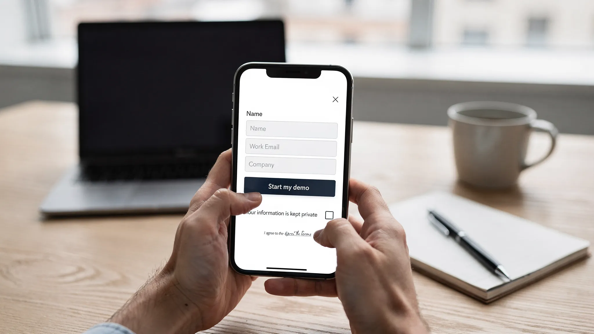
Position this value in the header, then align the primary call to action with the promise. Avoid vague CTAs like “Submit.” Favor “Get the case study,” “Reserve early access,” or “Start my demo.”
Practice data minimization
Collect the least amount of data required to deliver the value. Shorter forms convert more, and asking for unnecessary data raises consent risk.
- Limit required fields to the minimum, then introduce optional fields only if they truly personalize delivery.
- Use progressive profiling across sessions rather than one long form. Ask for email now, company details later when interest is higher.
- Reveal fields conditionally. For example, show “Team size” only if the user selects “Company” rather than “Personal project.”
Data minimization also aligns with privacy regulations. Keep consent specific and separate, and link to your policy.
Design mobile‑first, one column, thumb friendly
Most form starts happen on mobile. Layout choices should reduce cognitive load and thumb travel.
- Use a single column layout with clear vertical spacing.
- Keep labels visible at all times rather than relying on placeholder text.
- Make the CTA full width on mobile with clear contrast and a comfortable height.
- Ensure tap targets meet or exceed recommended sizes and spacing, as described in the WCAG 2.2 guidance for target size and focus appearance. See the W3C’s quick reference for current criteria at W3C WCAG 2.2 Quick Reference.

Use the right input types, autocomplete, and input masks
Helping the browser help your users is one of the quickest wins. Correct input types trigger the right mobile keyboard, autocomplete reduces typing, and smart formatting prevents errors.
- Email, tel, and number inputs display optimized keyboards on mobile.
- The autocomplete attribute unlocks browser and password manager autofill. See MDN’s autocomplete reference.
- Input masks should guide formatting, not block valid entries. Always preserve the raw value in case users paste formatted data.
Here is a quick mapping that prevents common friction:
| Field | Recommended input | Useful autocomplete values |
|---|---|---|
| Full name | text | name |
| First name | text | given-name |
| Last name | text | family-name |
| Phone | tel | tel |
| Company | text | organization |
| Job title | text | organization-title |
| Address | text | address-line1, address-line2 |
| City | text | address-level2 |
| State or region | text or select | address-level1 |
| Postal code | text | postal-code |
| Country | select | country |
| Credit card number | text | cc-number |
| Expiration | text | cc-exp |
| CVC | text | cc-csc |
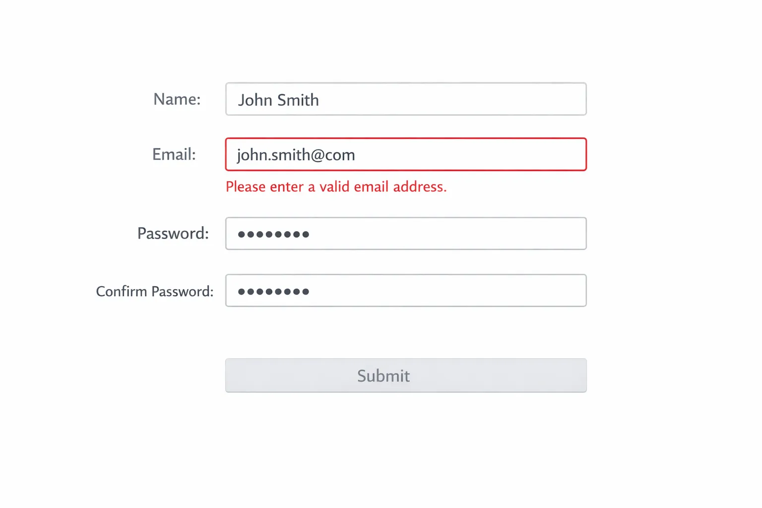
Validate inline, not after submit
Error handling is where many forms lose users. Validate in real time as a field loses focus, and show helpful, specific guidance right where the user is looking.
- Do not wait until submit to reveal multiple errors.
- Never wipe user input after an error. Preserve all fields.
- Place error text adjacent to the field and describe the fix, for example “Use a work email like name@company.com.”
- Distinguish errors with color and icons and ensure non‑color cues for accessibility.
Baymard Institute’s research has repeatedly found that inline validation improves completion rates and reduces error cascades. See their guidance on inline validation at Baymard, Inline form validation.
Build accessibility into the form, it increases conversions
Accessible forms are easier for everyone. Clear labels, logical order, and robust focus states reduce friction for keyboard, screen reader, and mobile users.
- Use semantic elements and associate labels with inputs.
- Provide clear instructions and note required fields in the label.
- Ensure focus is never obscured, and provide visible focus styling. WCAG 2.2 adds criteria like Focus Appearance and Focus Not Obscured. See W3C WCAG 2.2 Quick Reference.
- Avoid redundant entry. If you already captured data, allow reuse or prefill rather than asking users to retype it. See WCAG 2.2, Redundant Entry.
Make trust explicit, consent clear, and policies easy to find
Users convert when they believe their data will be respected and protected.
- Place a short privacy note near the CTA, for example “We only use your email to send the demo details.”
- Separate marketing consent from terms acceptance, do not bundle multiple purposes into one checkbox.
- Link to your privacy policy next to the consent and avoid pre‑checked boxes.
As third‑party cookies phase out, first‑party data becomes more valuable. Align your collection practices with evolving standards like the Privacy Sandbox timeline, see Chrome’s Privacy Sandbox timeline.
Performance is a conversion feature
Every extra request, heavy script, or blocking widget increases abandonment. Simplify your form page and measure the impact of speed on completion.
- Minimize third‑party scripts on the form view and defer nonessential code.
- Load form assets inline or as early as possible to avoid layout shifts.
- Reduce image sizes and use system fonts or a single optimized font.
For a deeper view of why speed matters to UX and business outcomes, see web.dev, Why speed matters.
Time and target forms by intent, not just by page
When you ask can matter as much as what you ask. Trigger forms when a user is ready.
- Show a two‑step form after engagement, for example on scroll depth or after viewing key sections.
- Use exit intent to rescue abandoning visitors with a shorter ask or a relevant incentive.
- Respect frequency capping and suppress forms for recent submitters or logged‑in users.
Contextual delivery often outperforms always‑on modals, because the request matches the user’s current goal.
Keep spam out without punishing humans
Overly aggressive bot protection hurts honest users. Use layered, low‑friction defenses.
- Honeypot fields that real users never see.
- Rate limiting and server‑side validation for known bad patterns.
- Lightweight challenges only when risk scores indicate it is needed.
Measure the right form metrics
Do not stop at “conversion rate.” Track diagnostic metrics to find friction.
| Metric | Definition | Why it matters |
|---|---|---|
| Form start rate | Form starts divided by page views or eligible sessions | Reveals visibility and initial appeal |
| Completion rate | Submissions divided by starts | The headline measure of friction |
| Abandonment rate | 1 minus completion rate | The inverse of completion |
| Field time | Median time spent per field | Highlights confusing inputs |
| Error rate per field | Errors divided by attempts for a field | Pinpoints validation issues |
| Return to form rate | Users who resume and submit after abandoning | Indicates the value of reminders |
Instrument form events consistently, for example start, field focus, field error, submit success, and submit failure. Analyze by device, traffic source, and segment to prioritize fixes.
Proven high‑converting patterns for 2025
Two‑step lead capture
Ask for email first on step one, then show optional enrichment fields on step two with a progress indicator. Users who stop at step one still convert for nurturing, while motivated users self segment.
Demo request with scheduling
Pair a short form with an embedded scheduler or a clear next step confirmation. If scheduling is not possible, promise a specific follow‑up time window and honor it.
Newsletter with sample value
Show a recent issue preview and the number of readers. Replace “Subscribe” with a benefit oriented CTA, for example “Get the weekly teardown.”
Waitlist with expectation management
Communicate selection criteria, timelines, and what happens after sign‑up. Maintain engagement with updates. For tactics and components, see our guide on creating an effective waitlist landing page.
Post‑purchase or post‑trial microsurveys
Use single question forms for quick feedback and route follow‑ups based on response. For implementation details, see our walkthrough on setting up microsurveys.
Turning best practices into live forms with Modalcast
You do not need a redesign to benefit from these improvements. Modalcast lets you ship and iterate high‑converting forms quickly, without heavy engineering.
- Lead capture forms, launch targeted forms that match user intent and use progressive disclosure to keep step one fast.
- Instant surveys, collect one question insights to remove friction and improve your longer forms.
- Reactions and feedback, detect frustration points and invite quick comments when users hesitate.
- Coupon promotions, pair time sensitive offers with exit intent to rescue abandonment ethically.
- Share product updates, turn post‑submit pages into value hubs that keep users engaged.
- Customizable widget and easy management tools, tailor design to your brand and update forms without code deployments.
- No credit card trial, experiment safely and see the impact before you commit.
If you are building a customer feedback flow, our step by step guide to creating a customer feedback form is a practical companion to this playbook.
Your 7 day plan to lift form conversions
- Day 1, define the value exchange and rewrite the CTA to match it.
- Day 2, remove 2 to 4 nonessential fields and enable autocomplete and proper input types.
- Day 3, add inline validation with specific error messages.
- Day 4, improve mobile layout, spacing, and CTA size.
- Day 5, add a short privacy note and separate consent.
- Day 6, set up an exit intent version that asks for less, for example only email, and test a small incentive.
- Day 7, instrument events, review field time and errors, and plan your next iteration.
Ready to put this into practice? Spin up a high‑converting form in minutes with Modalcast’s simple widget, then iterate with real user signals. Start your trial at Modalcast and turn more visits into valuable conversations.
