Website Design for SaaS: 10 UX Fixes That Lift Conversions
Small UX issues on a SaaS website rarely look dramatic in isolation. But in aggregate, they quietly tax attention, reduce trust, and add friction right where pe

Small UX issues on a SaaS website rarely look dramatic in isolation. But in aggregate, they quietly tax attention, reduce trust, and add friction right where people decide whether to start a trial, request a demo, or bounce.
This guide is a practical, conversion-focused checklist: 10 UX fixes you can ship without redesigning your whole site, plus what to measure so you know they worked.
Before you start: define “conversion” and set guardrails
Most SaaS teams change the site and then argue about whether it helped. Avoid that by agreeing on a primary conversion and 2 to 4 guardrail metrics.
A simple starting set:
- Primary: trial starts, demo requests, or “contact sales” submits
- Guardrails: bounce rate on key pages, CTR to pricing/signup, form completion rate, and Core Web Vitals (especially LCP and INP)
If you can, keep one key page (or one traffic segment) as a lightweight holdout for 1 to 2 weeks. Even imperfect comparisons beat vibes.
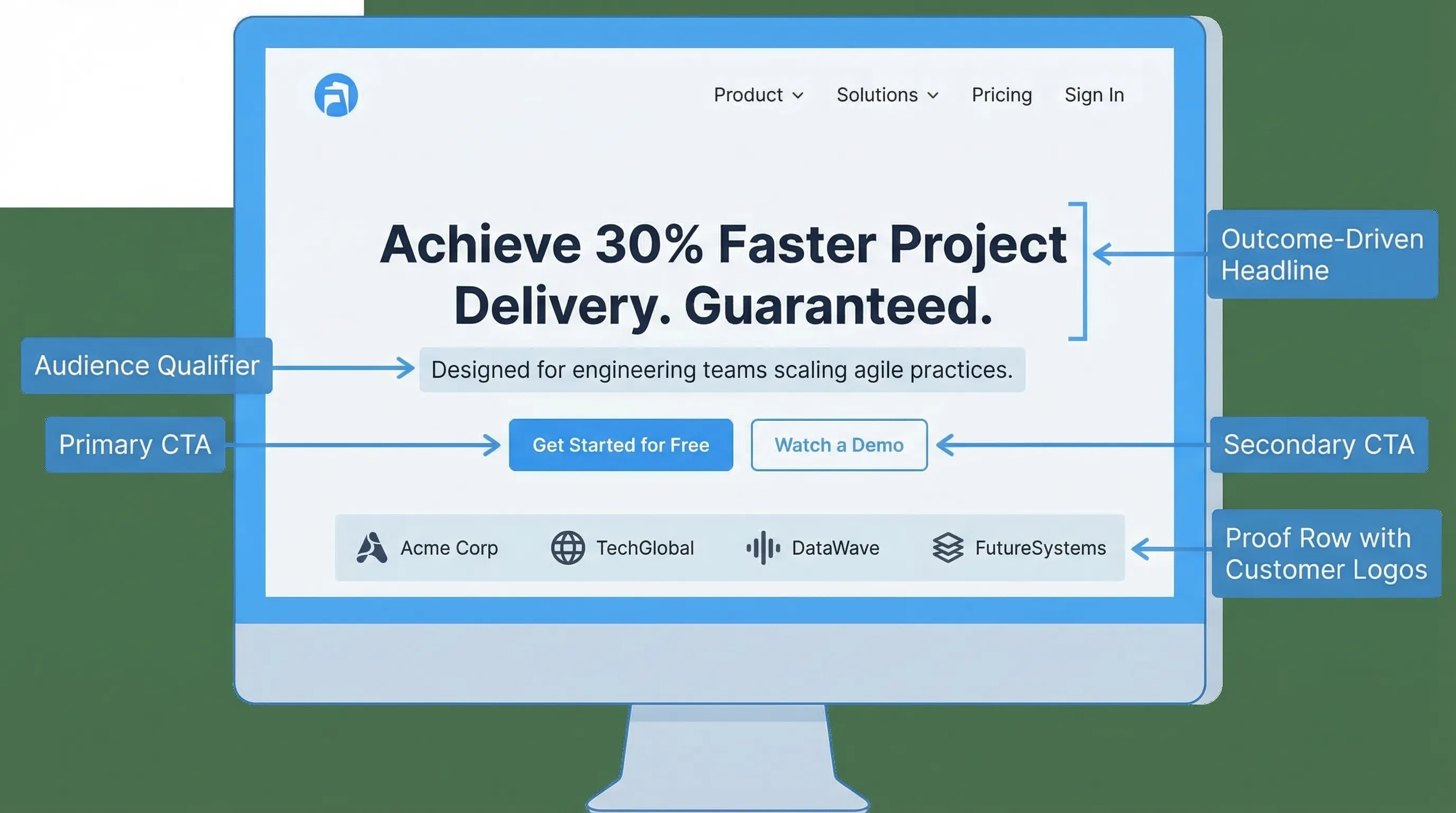
Fix 1: Make the first screen answer three questions fast
On your homepage (and often your pricing page), visitors decide in seconds whether they are in the right place. Your first screen should clearly answer:
- Who is this for? (role, company type, use case)
- What outcome do I get? (business result, not a feature list)
- Why believe you? (proof that matches the claim)
A practical “hero” structure that consistently tests well in SaaS:
- Headline: outcome + audience (example: “Ship SOC 2 evidence in weeks, not months”)
- Subhead: how it works in one sentence (example: “Automate evidence collection across your cloud stack with auditor-ready reporting.”)
- Proof line: number, customer type, or recognizable signal (example: “Trusted by security teams at 100+ B2B SaaS companies.”)
- CTA: one primary action (trial or demo), one secondary (watch, read docs, see pricing)
If you want a deeper reference on clarity and scannability, Nielsen Norman Group’s research on how people read on the web is a good anchor point: How Users Read on the Web.
Fix 2: Enforce a single primary CTA per page (and make it consistent)
A common SaaS conversion killer is “CTA soup”: Start free, Book demo, Contact, Talk to sales, Request access, Join waitlist, Get pricing, all fighting for attention.
Pick one primary CTA per page based on page intent:
- Homepage: usually “Start free trial” (PLG) or “Request a demo” (sales-led)
- Pricing: same as homepage, plus plan selection that leads to it
- Feature pages: “See pricing” or “Start trial”, not five choices
- Docs: “Try it” is okay, but avoid interrupting the task
Then keep CTA labels consistent across nav, buttons, and the top right header. Consistency reduces decision fatigue and helps returning visitors.
Fix 3: Make pricing effortless to evaluate (not just pretty)
Pricing pages convert when they help visitors self-qualify quickly. The most reliable UX improvements here are usually structural:
- Add a short “Who it’s for” line per plan (not only feature checkmarks)
- Put the differentiators first (the 3 to 6 features that actually change plan choice)
- Make “limits” explicit (seats, usage, projects, contacts), and define units
- Include a path for edge cases (enterprise/security, invoice, procurement)
Also, reduce the “scroll tax”. If key information is scattered, people abandon evaluation.
A practical pattern:
- Plan cards (differentiators + limits)
- Comparisons table for details
- FAQ addressing common objections (billing, cancellation, security, support)
- Proof near the CTA (testimonial or short case result)
If you see confusion in sales calls like “Wait, is this per user or per workspace?”, that is a pricing UX issue, not a sales issue.
Fix 4: Put proof next to the claim (not on a separate ‘Customers’ page)
Trust doesn’t work as a separate destination. It works when it supports the exact moment of doubt.
Examples of “claim and proof” pairing:
- Claim: “Set up in 10 minutes” → Proof: 2-step setup graphic + “No-code install” + short quote from a customer
- Claim: “Improves activation” → Proof: a mini case study snippet (metric + timeframe + context)
- Claim: “Enterprise-ready security” → Proof: security page link, compliance posture, or security FAQ right on pricing
Avoid generic testimonials that don’t match the job the visitor is hiring you for. A specific line from a specific persona beats “Great product!” every time.
Fix 5: Remove form friction (and stop asking for ‘nice to have’ data)
SaaS websites routinely lose conversions on forms that are too long, unclear, or error-prone.
High-impact form fixes:
- Ask only what you need for the next step (often: email + one qualifier)
- Use correct input types and autocomplete, especially on mobile
- Validate inline (and explain errors in plain language)
- Make privacy and follow-up expectations explicit (“We’ll email a link. No spam.”)
NN/g has a solid library on form usability patterns and common mistakes: Form Design Best Practices.
A practical SaaS example:
If your demo request form has 10 fields because sales “wants more context”, test a two-step flow:
- Step 1: email + company size (or role)
- Step 2 (optional): context question after submission confirmation (or via follow-up email)
You often keep lead quality while increasing submissions.
Fix 6: Improve perceived speed (because slow pages leak intent)
For SaaS marketing sites, speed problems often come from third-party scripts, heavy images, and overbuilt animation.
Start with two checks:
- Measure with PageSpeed Insights on your top landing pages
- Compare performance by traffic source (paid traffic tends to be less patient)
Then prioritize:
- Compress and correctly size hero images
- Defer non-critical scripts
- Remove or delay low-value tags (extra chat widgets, unused analytics)
Google’s Web Vitals documentation is the most direct reference for what to measure and why: Web Vitals.
Fix 7: Make navigation task-based (not org-chart-based)
Navigation should match what visitors are trying to do, not how your team thinks internally.
Common SaaS nav improvements:
- Use verbs and outcomes where possible (for example: “Use cases” or “Solutions” can work if it is concrete)
- Ensure the “money paths” are always one click away (pricing, trial/demo, docs)
- Add a “Security” link if you sell B2B, it reduces friction for serious evaluators
Also, check whether your mobile nav hides critical paths behind multiple taps. If your CTA disappears on mobile, you are undercutting a large share of traffic.
Fix 8: Make pages scannable with outcome-first sections
Most SaaS pages are written like spec sheets. High-converting pages read like decision support.
A reliable section pattern is:
- Outcome headline (what improves)
- One-paragraph explanation (how it works)
- Proof (stat, quote, screenshot, short example)
- CTA (only if it fits the page intent)
This reduces cognitive load and helps visitors “skim to yes”. It also makes your content easier to repurpose for ads and email.
Fix 9: Treat accessibility as a conversion feature
Accessibility improvements often lift conversion because they improve clarity for everyone, especially on mobile and under time pressure.
Start with basics:
- Color contrast and readable font sizes
- Clear focus states for keyboard users
- Buttons that are easy to tap (thumb-friendly targets)
- Labels that are not only placeholders
If you need a standard to align around, use WCAG as the reference point. Even small changes here reduce form errors and abandoned flows.
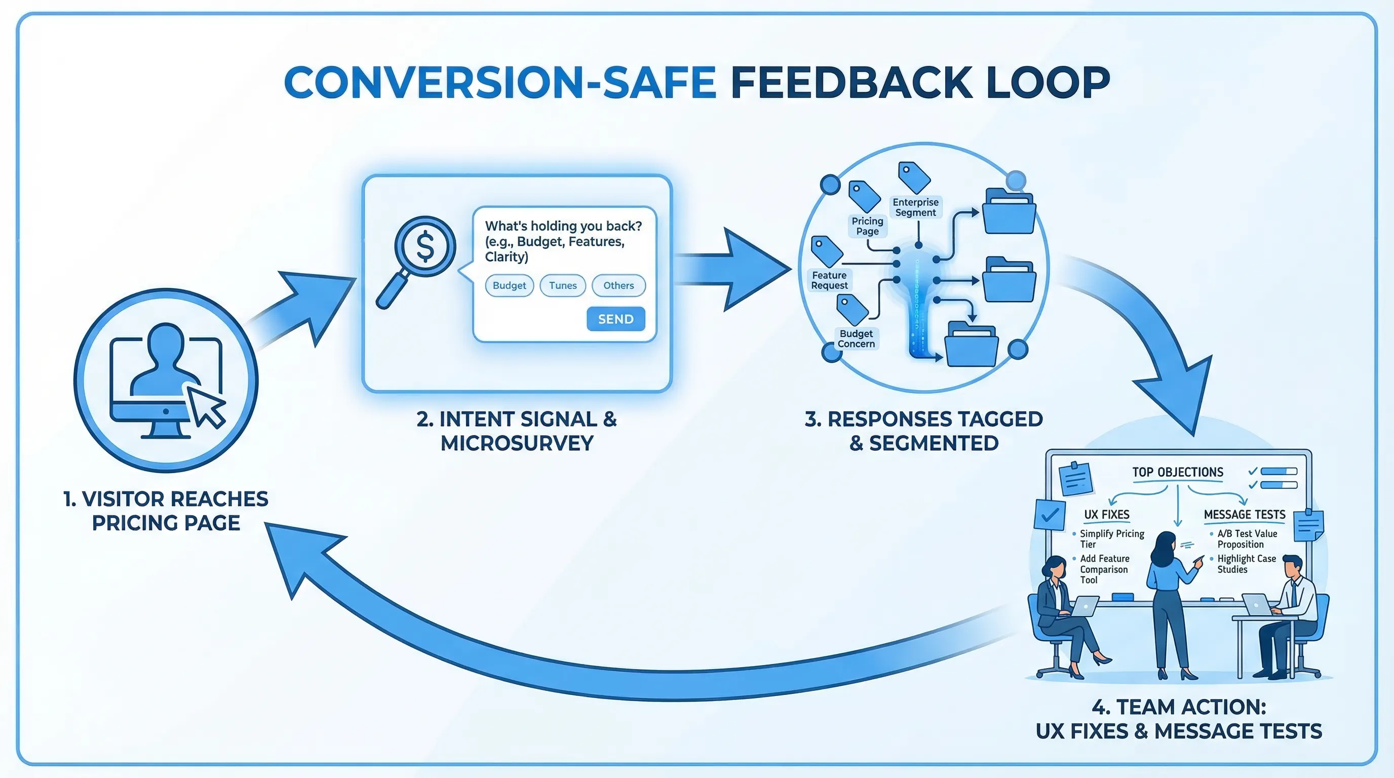
Fix 10: Add a lightweight feedback loop on your highest-intent pages
When conversions stall, analytics tells you where users drop. It rarely tells you why.
A simple, conversion-safe way to capture “why” is a one-question prompt on a high-intent page, shown with strict guardrails:
- Pricing page (after 20 to 40 seconds or after plan interaction): “What’s stopping you from starting a trial today?”
- Signup page (on exit intent): “What made you leave?”
- Docs page (after scroll): “Did this answer your question?”
Two rules keep this from harming conversions:
- Trigger after intent signals (scroll, time on page, interaction), not instantly
- Use frequency caps so the same visitor isn’t interrupted repeatedly
This is also where an on-site widget can pull double duty: collect feedback, capture leads, or share an update without adding a heavyweight toolchain.
If you want implementation guidance focused on protecting UX, these two playbooks are useful:
A quick prioritization table (what to fix first)
Use this to decide where to start based on impact and effort.
| UX fix | Best page(s) to apply | Typical symptom | What to measure | Fast test idea |
|---|---|---|---|---|
| Clarity in first screen | Homepage, landing pages | High bounce, low scroll | Bounce, CTR to pricing/signup | Rewrite hero with audience + outcome + proof |
| One primary CTA | All top pages | Many clicks, few conversions | CTA CTR, conversion rate | Remove extra CTAs, keep one primary |
| Pricing evaluation UX | Pricing | Long time on page, low click to signup | Plan clicks, signup start rate | Add “Who it’s for” lines and explicit limits |
| Proof near claims | Homepage, pricing, demo page | Low trust, low form starts | Form starts, CTA CTR | Insert proof blocks beside key claims |
| Form friction removal | Demo/trial forms | High abandon rate | Form completion rate | Reduce fields, add inline validation |
| Perceived speed | All, especially landing | High bounce on paid traffic | LCP/INP, bounce | Compress hero media, defer scripts |
| Task-based navigation | Header, mobile nav | Users get lost | Click paths, exits | Re-label nav to match jobs, add Security/Docs |
| Scannable sections | Feature pages | Low scroll depth | Scroll depth, CTA CTR | Reformat sections to outcome + proof |
| Accessibility basics | All | High errors on mobile | Form errors, completion | Contrast, focus, input labels |
| Feedback loop | Pricing, signup, docs | “We don’t know why” | Response rate, top objections | One-question microsurvey with caps |
How to run this as a 2-week conversion sprint
If you want a practical cadence:
- Week 1: Fix 1 to 3 on homepage and pricing (clarity, CTA, pricing evaluation). Ship, measure, and avoid changing five things at once.
- Week 2: Fix 4 to 6 (proof, forms, speed) and launch one feedback prompt on pricing to capture remaining objections.
The key is to treat UX as an experiment pipeline. Each fix should map to a hypothesis you can validate.
Frequently Asked Questions
Which SaaS website UX fix usually has the biggest conversion impact? Clarity in the first screen and pricing evaluation UX tend to have outsized impact because they affect almost every visitor’s decision path.
How do I improve conversions without a full redesign? Focus on structural fixes: one primary CTA, clearer plan differentiation, fewer form fields, better proof placement, and faster pages. These are often copy and layout changes, not rebrands.
How many CTAs should a SaaS page have? One primary CTA per page is a strong default. You can include a secondary link (for lower-commitment actions), but avoid multiple competing primary buttons.
How can I learn why people aren’t converting on my pricing page? Add a one-question microsurvey triggered after intent signals (time on page, plan interaction) and protect UX with frequency caps. Pair responses with session context (page, device, segment).
Do popups hurt conversions? Untargeted, interruptive popups can. Intent-based prompts with clear value, strict frequency caps, and timing that avoids core flows can increase conversions while preserving UX.
Turn UX fixes into a repeatable feedback loop with Modalcast
Shipping UX improvements is easier when you can quickly validate assumptions with real user input.
Modalcast is a lightweight on-site widget that helps SaaS teams collect feedback, share updates, capture leads, and promote offers without adding a complex stack. If you want to pair the UX fixes above with fast, targeted microsurveys on pages like pricing or signup, you can get started here: Modalcast.
