Website Feedback Software: What to Choose for SaaS Sites
Picking website feedback software for a SaaS site is less about “which tool is best” and more about “which decisions will this feedback unlock, with the least f
Picking website feedback software for a SaaS site is less about “which tool is best” and more about “which decisions will this feedback unlock, with the least friction for users and the least overhead for your team.” The wrong choice usually fails in one of two ways: it collects lots of opinions you cannot act on, or it annoys visitors and quietly hurts conversions.
This guide gives you a practical way to choose feedback software for a SaaS marketing site (and, where relevant, your app) based on real workflows: diagnosing drop-off, improving activation, validating messaging, and turning feedback into shipped changes.
Start with the decision, not the tool
Before comparing vendors, write down the decision you want to make in the next 30 days. Good website feedback setups are decision-driven.
Common SaaS website decisions feedback can support:
- Pricing page drop-off: “What information is missing for someone to start a trial or request a demo?”
- Positioning clarity: “What did you think we do after reading the homepage?”
- Objection discovery: “What is stopping you from trying us today?”
- Lead quality: “Which use case brought you here, and how urgent is it?”
- Documentation friction: “Did this doc answer your question, if not, what is missing?”
If you cannot name the decision, you are likely to collect vague feedback (“love it” / “hate it”) that does not change anything.
What “website feedback software” includes (and what it does not)
For SaaS sites, feedback software typically falls into a few categories. Some tools do only one category well. Others cover multiple.
Here’s a practical map of the landscape.
| Category | What it looks like on your site | Best for | Watch-outs |
|---|---|---|---|
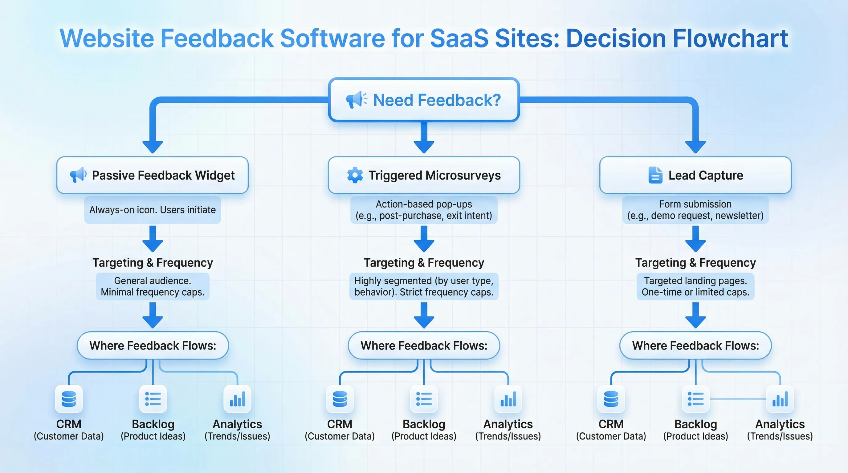
| Passive feedback widget | A “Feedback” tab or floating button users can open anytime | Always-on bug reports, quick requests, low interruption | Can skew toward power users and problem reporters only |
| Triggered microsurveys | 1-question or 2-question prompts shown on specific pages or behaviors | Diagnosing drop-off on pricing, onboarding pages, docs | Needs good targeting and frequency caps to avoid annoyance |
| On-site forms for lead capture plus context | A popup or embedded form that collects email and 1-2 intent fields | Turning anonymous traffic into routed leads | If too aggressive, hurts trust and conversion |
| NPS / CSAT platforms (often email or in-app) | Periodic surveys, sometimes tied to accounts | Trend tracking, customer health signals | Often too slow and too broad for page-level UX fixes |
| Session replay and product analytics | Heatmaps, recordings, funnels | “What happened?” evidence to pair with “why?” | Not feedback by itself, needs a prompt or follow-up to explain intent |
| Help desk and bug intake | Support forms, chat, ticketing | Operational issue capture and triage | Website visitors who are not customers rarely use it |
Most SaaS teams end up with a small “feedback stack”:
- One lightweight on-site widget for page-level, high-signal prompts
- One system of record for issues and requests (support tool, product backlog)
- Analytics to quantify where to ask questions
Choose based on where your SaaS is in the funnel
Your “best” website feedback software depends heavily on whether you are optimizing acquisition, activation, or expansion.
If you are optimizing acquisition (marketing site conversions)
Prioritize:
- Page targeting (homepage, pricing, comparison pages)
- Short microsurveys that capture objections
- Optional lead capture when intent is high
Examples:
- On pricing: “What is the main thing stopping you from starting a trial today?”
- On comparison pages: “Which alternative are you evaluating?”
- After 45 to 60 seconds on homepage: “What are you hoping to accomplish today?”
If you are optimizing activation (trial to value)
This often belongs in-product, but your website still matters (docs, onboarding hub, templates, integration pages).
Prioritize:
- Feedback on documentation usefulness
- Post-action prompts (after downloading a template, viewing an integration guide)
- Ability to route responses (show the right next step based on answer)
If you are optimizing expansion (upgrade, annual, add-ons)
Prioritize:
- Intent-aware offers that do not feel pushy
- Message and feedback combined (announce an update, then ask if it helps)
- Segmentation (returning visitors, pricing revisits)
The selection criteria that actually matter for SaaS teams
You can compare dozens of feature checkboxes. In practice, a SaaS team should care about a smaller set of capabilities that determine data quality, UX risk, and operational overhead.
1) Targeting and triggers (to keep feedback relevant)
The biggest driver of response quality is relevance. Look for:
- Page-level targeting (URL rules)
- Behavioral triggers (time on page, scroll depth, exit intent)
- The ability to exclude pages where prompts would be harmful (checkout, auth, critical flows)
If targeting is weak, you will either annoy users or get unusable responses.
2) Frequency capping and guardrails (to protect UX)
Any on-site feedback prompt needs limits. A tool should make it easy to:
- Cap exposures per visitor (per day, per week)
- Avoid showing the same prompt repeatedly
- Control mobile behavior (small screens amplify annoyance)
This is not just conversion hygiene. It is also an integrity issue. If you over-prompt, you bias responses toward frustrated users.
3) Time-to-launch for a non-engineer
SaaS teams move faster when PMs and marketers can ship prompts without sprint planning.
Ask:
- Can I install with a simple snippet?
- Can I create and publish prompts without code?
- Can I QA safely (preview, draft mode, staging support if applicable)?
4) Data ownership and workflow fit
Feedback is only valuable if it lands where decisions happen.
Look for:
- Export options (CSV is often enough to start)
- Webhooks or integrations (if your stack depends on it)
- The ability to tag, segment, or at least filter responses meaningfully
If the tool becomes a silo, it will get ignored after week two.
5) Performance and SEO safety
A widget that hurts performance can cost more than it returns.
At minimum, hold vendors accountable for:
- Lightweight loading behavior
- Minimal impact on Core Web Vitals (see Google’s overview of Core Web Vitals)
- Avoiding layout shifts and intrusive interstitial behavior
6) Accessibility and compliance basics
On-site prompts are UI components, so accessibility matters.
A practical baseline is alignment with WCAG guidance (keyboard navigation, focus states, readable contrast) and avoiding deceptive UX patterns. The FTC has explicitly called out harmful interfaces, see their page on dark patterns.
A simple “fit check” scorecard you can use in 15 minutes
Use this to quickly narrow your shortlist. Score each from 1 to 5.
| Criterion | Why it matters | What “5” looks like |
|---|---|---|
| Relevance control | Higher signal, fewer complaints | Strong targeting plus multiple triggers |
| UX safety | Protect conversions and brand trust | Built-in frequency caps, mobile controls, easy exclusions |
| Speed to ship | More experiments, faster learning | PM or marketer can launch in under an hour |
| Data usefulness | Makes feedback actionable | Easy export, basic segmentation, response context |
| Performance | Avoid hidden costs | Lightweight, measurable impact, no layout shift surprises |
| Trust and compliance | Reduces legal and reputational risk | Clear consent options, accessible UI, transparent behavior |
If a tool scores low on relevance control or UX safety, it will likely create more problems than it solves.
Three real-world SaaS setups (copy these patterns)
These are common “minimum viable” implementations that work without a big research program.
Pattern A: Pricing page objection capture (high intent, low volume)
Goal: Find the top 3 objections preventing signups.
Widget behavior:
- Trigger on pricing page after meaningful engagement (for example, time on page or scroll)
- Ask one question, then optionally a second for contact if they want a reply
Prompt example:
“What’s stopping you from getting started today?”
How to use responses: Categorize weekly into themes (security, integrations, pricing model, missing feature), then pick one theme to address with a page change or a new FAQ section.
Pattern B: Docs feedback that produces fixes, not noise
Goal: Improve self-serve success and reduce support load.
Widget behavior:
- Inline or slide-in prompt on docs pages only
- Two clicks max, then optional text
Prompt example:
“Did this page answer your question? (Yes/No)” then “What was missing?”
How to use responses: Turn repeated “missing” items into doc edits, and track whether negative responses decline after updates.
Pattern C: Homepage clarity check (positioning validation)
Goal: Validate whether new visitors understand your value proposition.
Widget behavior:
- Show only to first-time visitors
- Trigger after they have read enough to form an impression
Prompt example:
“After reading this page, what do you think we help with?” (short text)
How to use responses: Compare language to your headline and subhead. If the words do not match, you have a messaging gap.
Questions to ask during vendor evaluation
Instead of asking “Do you have feature X?”, ask questions that reveal whether the tool will work in production.
- “How do you prevent overexposing prompts to the same visitor?”
- “Can I target by URL and also by behavior without writing code?”
- “What response context is stored (page URL, timestamp, referrer/UTM if used)?”
- “How do exports work, and how quickly can I get data out?”
- “What is the impact on performance, and how should we measure it?”
- “What accessibility standards do your modals and forms meet?”
If answers are vague, your rollout will be fragile.
Where Modalcast fits (without overcomplicating your stack)
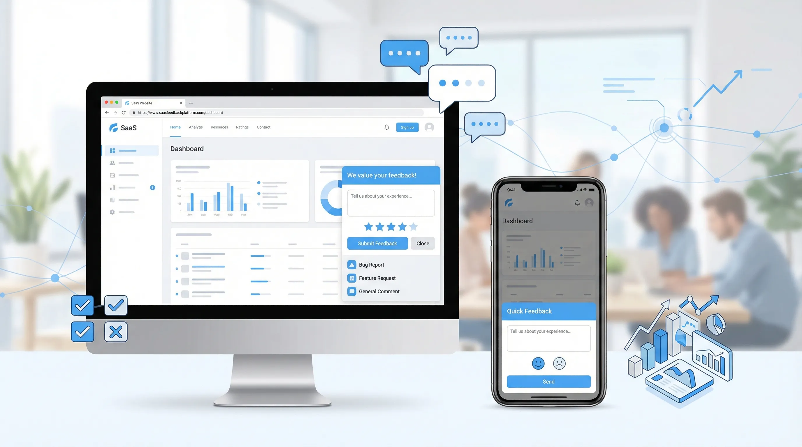
If you want one tool that covers the most common marketing-site feedback jobs, a lightweight on-site widget is often the fastest path.
Modalcast is designed for SaaS and websites that want to:
- Collect feedback with simple forms and microsurveys
- Share updates and announcements through on-site messages
- Capture leads with low-friction on-site forms
- Promote offers using popups without adding heavy complexity
Because it is a single widget you install on your site, it can work well as the “front door” for feedback and engagement, especially when paired with whatever system you already use to track issues and roadmap decisions.
If you want to see practical guidance on implementing feedback prompts quickly, Modalcast also has a walkthrough on shipping a feedback tool fast: Ship a Feedback Website Tool in 15 Minutes.
Implementation plan: launch in a week, learn in two
Avoid big “feedback programs” at the start. Ship one prompt, learn, then expand.
| Timeframe | What to do | Output |
|---|---|---|
| Day 1 | Pick one decision (pricing drop-off, homepage clarity, docs friction) | One clear success metric and one prompt |
| Days 2 to 3 | Install widget, set targeting, add frequency cap, QA on mobile | Safe, production-ready setup |
| Days 4 to 7 | Run the prompt, review responses daily, tag themes | A short list of actionable themes |
| Week 2 | Ship one site change based on top theme, rerun prompt | Proof that feedback leads to improvement |
A good early metric is not “response rate.” It is “did we ship a change we are confident improves conversion or user success?”
Frequently Asked Questions
What is website feedback software? Website feedback software helps you collect and manage feedback directly on your site, for example via a feedback widget, triggered microsurveys, or on-page forms.
What should SaaS teams prioritize when choosing website feedback software? Prioritize targeting and triggers, frequency capping, speed to launch, data export or integrations, performance impact, and accessibility.
Are microsurveys better than a feedback button? They solve different problems. A feedback button is good for always-on input, while microsurveys are better for diagnosing specific drop-off points with targeted questions.
Can feedback widgets hurt conversions? Yes, if they are intrusive, over-shown, or poorly timed. Use intent-based triggers, exclude sensitive pages, and apply frequency caps.
Should feedback live on the marketing site or inside the app? Both can be useful. Marketing-site feedback is best for messaging and conversion friction, while in-app feedback is best for activation and product usability. Many SaaS teams run both with different prompts.
Try a lightweight approach first
If your goal is to improve engagement and conversions without adding a complex toolchain, start with a single on-site widget and one targeted prompt.
Modalcast is built for that workflow: collect feedback, share updates, capture leads, and promote offers from one simple widget. Learn more at Modalcast.
