Customer Feedback Widget for SaaS: Questions to Ask by Page
A customer feedback widget for SaaS works best when it behaves like a good PM or marketer: it asks one relevant question, at the moment a user is already thinki
A customer feedback widget for SaaS works best when it behaves like a good PM or marketer: it asks one relevant question, at the moment a user is already thinking about the answer.
The mistake most teams make is running the same “How was your experience?” survey on every page. You get polite responses, low volume, and almost no decision-making signal.
This guide gives you page-specific questions you can deploy with a feedback widget, plus what each question is trying to decide, when to trigger it, and what to do with the answers.
The page-based approach: ask questions that map to intent
Every page has a “job” in the journey. Your feedback prompt should match that job.
Use this quick framing before you write anything:
- What is the visitor trying to do on this page? (Compare plans, evaluate trust, learn a workflow, fix an error.)
- What decision are we trying to make with the data? (Change pricing copy, add an integration, rewrite onboarding step 2.)
- What will we do if we hear A vs B? If you cannot name an action, do not ship the question.
- Can a user answer in under 10 seconds? If not, shorten it.
A useful default is: one closed-choice question (radio buttons) plus one optional open text follow-up that only appears after they answer.
The “Questions to Ask by Page” cheat sheet
This table is a starting point you can adapt. Keep the language close to what users already think on that page.
| Page type | Primary decision you want to make | High-signal question | Best answer format | Best moment to ask |
|---|---|---|---|---|
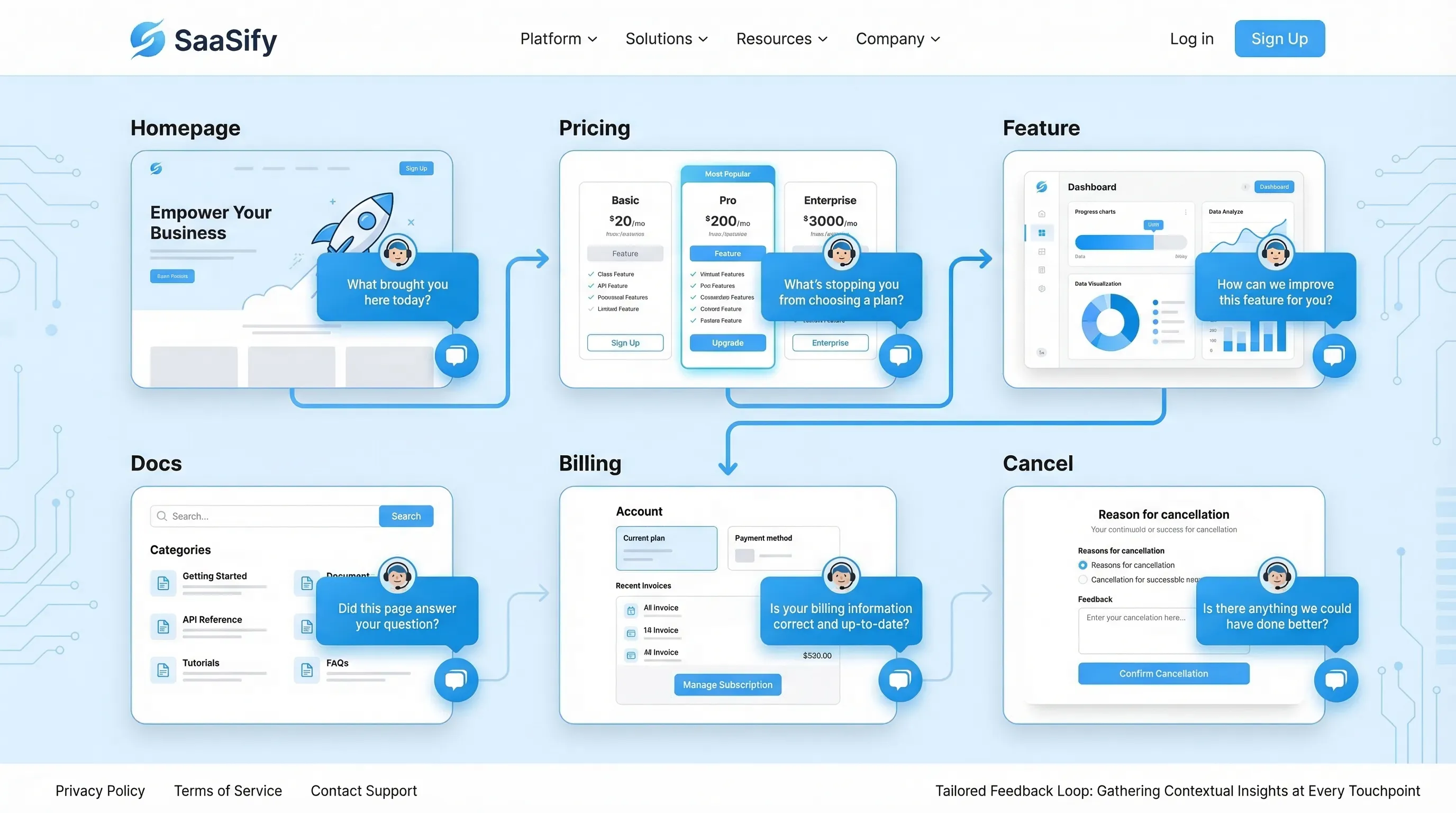
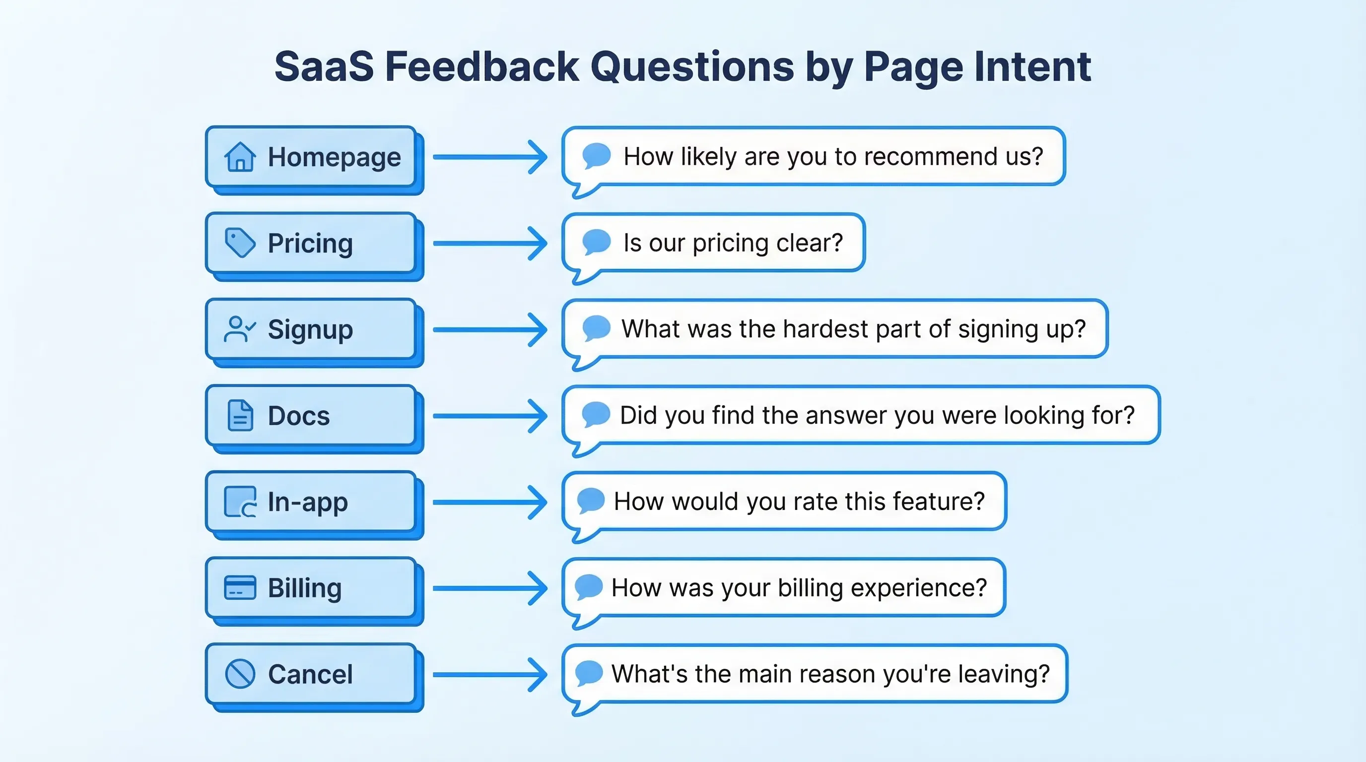
| Homepage | Is the value prop clear for the right ICP? | “What brought you here today?” | Multiple choice + “Other” | 15 to 30 seconds after arrival, or after 50% scroll |
| Pricing | What is blocking purchase? | “What’s stopping you from choosing a plan today?” | Multiple choice + optional text | After viewing 2+ plans, or exit-intent on pricing |
| Feature / Use case | Are we matching real use cases? | “Which use case best matches what you need?” | Multiple choice | After 60% scroll, or after clicking a CTA |
| Integrations | Which integration should we build next? | “Which tool do you need this to work with?” | Searchable list + text | After spending 20+ seconds on integrations |
| Security / Trust | What proof is missing? | “What would you need to see to feel confident?” | Multiple choice + text | After reading 50% of the page |
| Signup | What caused signup hesitation? | “What nearly stopped you from signing up?” | Multiple choice | On form abandon, or after successful signup |
| Onboarding | Where are users getting stuck? | “What’s the biggest blocker right now?” | Multiple choice + text | After inactivity, or after an error state |
| Docs / Help | Is the content solving the problem? | “Did this page answer your question?” | Yes/No + text | After 20+ seconds on page, or after copy event |
| In-app upgrade/paywall | Is the paywall aligned with value? | “What would make this upgrade worth it?” | Multiple choice + text | When user hits paywall for second time |
| Billing | Are invoices and pricing predictable? | “Was anything about billing unclear?” | Yes/No + text | After invoice view or plan change |
| Cancel / Downgrade | What churn reason is real? | “What’s the main reason you’re leaving?” | Multiple choice + required text when “Other” | On cancel flow step, before final confirmation |
Below are page-by-page question sets with concrete examples and what to do with the responses.
Homepage: qualify intent and messaging clarity
Your homepage feedback should answer one thing: are the right people recognizing themselves, quickly?
Questions to ask
Good options (pick one):
- “What brought you here today?” (Evaluating tools, comparing vendors, looking for a specific feature, just browsing)
- “What’s the #1 problem you’re trying to solve?” (Short list that matches your positioning)
- “How did you hear about us?” (Useful if you are still finding channels that bring qualified traffic)
How to act on it
- If “just browsing” dominates, your acquisition targeting might be broad, or your hero section might be too generic.
- If users pick a use case you do not support, tighten copy and navigation, and consider a “Not sure? Start here” path.
- Route “comparing vendors” to a lightweight follow-up offering a comparison page, a short demo, or proof points.
Pricing page: capture objections without tanking conversions
Pricing is where a customer feedback widget for SaaS can produce the highest leverage insights, but it is also easy to get intrusive.
Questions to ask
Choose one primary question, then one conditional follow-up.
Primary (multiple choice):
- “What’s stopping you from choosing a plan today?”
Suggested options:
- Need to understand if it works for my use case
- Price is higher than expected
- Missing a feature
- Need security/legal info
- Need to see it in action (demo)
- I’m just comparing
Follow-up (only if relevant):
- If “price” is selected: “What price would feel fair for your use case?” (open text)
- If “missing feature” is selected: “What’s the one feature you need?” (open text)
- If “security/legal” is selected: “Which requirement are you checking?” (SOC 2, DPA, SSO, data residency, other)
When to trigger
Avoid showing a popup immediately. Use intent cues:
- After the user toggles monthly/annual, or opens plan details
- After 60 to 90 seconds on pricing
- Exit-intent on desktop (use sparingly)
For deeper timing guidance, your team may want a dedicated timing policy similar to the guardrails in a “timing rules” playbook.
How to act on it
- “Missing feature” responses should create a tagged backlog feed (not a giant spreadsheet) with counts by plan segment.
- “Need security” should route to sales or a trust-content owner. Often the fix is a better security page IA, not a new feature.
- “Just comparing” can trigger an offer that is not a discount, for example a short “How teams use us” page, or a 2-minute product tour.
Feature and use-case pages: verify relevance and reduce misalignment
Feature pages often have decent traffic but low conversion because they attract mismatched jobs-to-be-done.
Questions to ask
- “Which use case best matches what you need?” (Provide 4 to 6 use cases, plus “Other”)
- “What would you expect this feature to do?” (Open text, but only show it to high-intent visitors)
- “What’s missing from this page?” (Examples, pricing, technical details, case study, security details)
How to act on it
- If users repeatedly pick “Other,” your use-case taxonomy is wrong, or you need a new page.
- If “technical details” is a common request, add a short section that answers integration complexity, data flow, and constraints.
Integrations page: collect roadmap signal you can trust
Integration requests are noisy unless you capture context.
Questions to ask
- “Which tool do you need this to work with?”
- Follow-up: “How would you use the integration?” (Sync events, send data, trigger automations, export reports)
How to act on it
Create a simple prioritization rule so the data becomes a decision:
- Combine request count with account value (or segment) and deal impact (if you track it)
- Look for clusters tied to a specific ICP
If you do not have identity on anonymous visitors, you can still ask a lightweight qualifier like “Is this for a company or a personal project?” to separate enterprise workflows from hobby traffic.
Security, privacy, and compliance pages: find the missing proof
These pages are rarely about “learning,” they are about risk reduction.
Questions to ask
- “What would you need to see to feel confident?” (SOC 2, pen test summary, DPA, sub-processors, SSO, data retention, other)
- “What’s your biggest concern?” (Data access, uptime, permissions, audit trails)
How to act on it
- If “DPA/sub-processors” comes up often, ship a clearer privacy hub and link it from pricing and signup.
- If “SSO” shows up, it may be a packaging problem, not a product gap. Capture how many respondents say it is a deal-breaker.
For ethical and regulatory alignment, avoid manipulative patterns (for example hiding close buttons or forcing email capture) and keep consent explicit.
Signup and trial start: pinpoint hesitation and expectation gaps
Signup feedback should reduce friction and improve activation quality.
Questions to ask
- On abandon intent: “What stopped you from signing up?” (Too much info required, not ready, pricing unclear, need to verify fit)
- Post-success: “What are you hoping to accomplish first?” (Multiple choice aligned to onboarding routes)
How to act on it
- If “too much info required” is common, run a test with fewer fields or smarter defaults.
- If users’ “first goal” does not match your onboarding path, route them differently and measure time-to-first-value.
Onboarding and in-app milestones: turn confusion into a fix list
In-product questions should be tied to a hypothesis, not general sentiment.
High-leverage moments to ask
- After a user completes a meaningful step (first import, first publish, first teammate invite)
- After repeated errors or retries
- After inactivity on a step-based flow
Questions to ask
- “What’s the biggest blocker right now?” (Could not find feature, confusing step, missing data, permission issue, not sure what to do next)
- “What did you expect to happen?” (Open text, only after an error)
- “How confident do you feel about the next step?” (1 to 5 scale)
How to act on it
- Route “permission issue” to an onboarding engineer or docs owner, these are often solvable with clearer UI copy.
- Track blockers by onboarding step. The output should be a ranked list of fixes, not a summary deck.
Docs and help center: measure usefulness, then capture the gap
Docs feedback is one of the cleanest signals you can get because user intent is explicit.
Questions to ask
- “Did this page answer your question?” (Yes/No)
- If “No”: “What were you trying to do?” (Open text)
How to act on it
- Categorize “trying to do” responses into tasks. You will quickly find missing how-tos.
- If you can, capture the page URL automatically so fixes are targeted.
If you want to go deeper, pair this with a lightweight visual feedback flow in design-heavy docs or UI troubleshooting guides.
Upgrade prompts and paywalls: learn what “value” means to the user
When a user hits an upgrade prompt, they are telling you they have intent, but your packaging might not match their mental model.
Questions to ask
- “What would make this upgrade worth it?” (Unlock feature X, higher limits, compliance, collaboration, support)
- “Which plan are you considering?” (If you have multiple tiers)
How to act on it
- If “higher limits” dominates, experiment with limit messaging and upgrade nudges earlier.
- If “support” dominates, consider positioning, not just pricing. Users may be buying certainty.
Billing and plan changes: catch confusion before it becomes churn
Billing issues often show up later as low NPS or cancellation reasons, so intercept them where they happen.
Questions to ask
- “Was anything about billing unclear?” (Yes/No)
- If “Yes”: “What was unclear?” (Invoice line items, proration, renewal timing, taxes, plan limits)
How to act on it
- If proration confusion is common, add an inline explainer near the plan change CTA.
- If taxes and invoices are a frequent issue, create a billing FAQ page (separate from this article) and link it contextually.
Cancellation and downgrade flows: diagnose, then offer the right save
Cancellation prompts should be short and respectful. The goal is to learn and, sometimes, recover.
Questions to ask
- “What’s the main reason you’re leaving?”
Suggested options:
- Too expensive
- Missing a feature
- Not using it enough
- Switching to another tool
- Technical issues
- Support experience
- Other
Optional follow-up based on selection:
- If “switching”: “Which tool are you switching to?”
- If “missing a feature”: “Which feature?”
- If “technical issues”: “What broke?”
How to act on it
- Treat churn reasons as product signals only when you also capture context (plan, tenure, usage). Otherwise you will optimize for the loudest edge cases.
- If you do run save offers, keep them aligned with the reason. “Not using it enough” might call for pause options or onboarding help, not a discount.
For broader patterns, it helps to map cancellation reasons to specific retention plays, and measure them with holdouts so you know what is incremental.
Implementation notes: how to run this without creating noise
The difference between “insight” and “spam” is usually operations.
Guardrails that keep your widget conversion-safe
- Frequency caps: set a global budget per user (especially on marketing pages).
- Sampling: if traffic is high, show prompts to a subset and keep UX clean.
- Exclusions: never interrupt checkout, payment, or critical form entry.
- One job per prompt: do not combine feedback collection with lead capture in the same interaction unless the value exchange is explicit.
A lightweight workflow that actually ships changes
- Route responses by theme (pricing, onboarding, docs) to a clear owner.
- Review on a fixed cadence (weekly is enough for most SaaS teams).
- Close the loop by updating copy, docs, or flows, then measure conversion and activation deltas.
If you are using a single on-site widget to run surveys, forms, and update messages, you can keep this simple operationally: one install, multiple targeted prompts.
How Modalcast fits (without adding complexity)
Modalcast is designed for the exact pattern this article recommends: small, targeted questions triggered by page context, plus the ability to also share updates or capture leads through the same lightweight widget.
If you want to implement these page-specific questions quickly, start with one page (usually pricing or docs), ship one prompt, enforce frequency caps, and iterate. You can also borrow existing question formats from Modalcast’s resources like their guide to feedback widgets and their microsurvey setup walkthrough.
The main goal is not “collect more feedback.” It is collect the specific feedback that makes the next product, marketing, or onboarding decision easier.
