Visual Feedback Web Design: Faster Reviews Without Long Threads
Text feedback is cheap to collect and expensive to interpret. One vague Slack message like “the layout feels off” can turn into 20 replies, three screenshots, a

Text feedback is cheap to collect and expensive to interpret. One vague Slack message like “the layout feels off” can turn into 20 replies, three screenshots, and a meeting that should not exist.
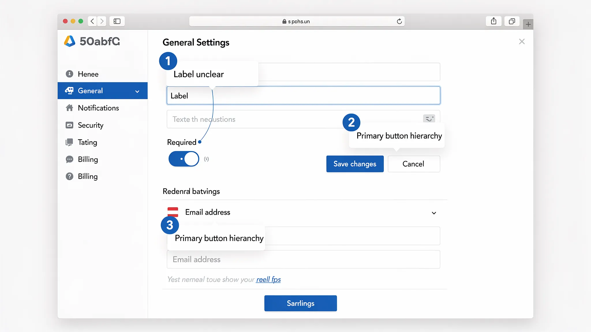
Visual feedback in web design fixes this by anchoring comments to the interface itself. Instead of debating which “button” someone meant, you get a pinned note on the exact element, with the right context (page state, viewport, expectation).
For SaaS teams shipping weekly, that difference shows up as faster reviews, fewer rework loops, and less coordination overhead.
What “visual feedback” means (and what it is not)
Visual feedback is any feedback that references the UI directly using annotations or captured context, for example:
- A screenshot with pins, arrows, and short notes
- Comments attached to a Figma frame or prototype
- A marked-up staging URL with element-level comments
- A bug report that includes a screen capture and “expected vs actual”
It is not “make it prettier” feedback or endless taste debates. Done well, visual feedback is structured, specific, and tied to a decision.
Why long feedback threads happen (and how visual feedback prevents them)
Most review threads spiral for the same reasons:
1) Ambiguity about where the issue is
People use different words for the same element (“plan card,” “pricing tile,” “box”). The thread becomes a scavenger hunt.
2) Missing state and context
A comment like “the form is confusing” is meaningless without context:
- Which step?
- Mobile or desktop?
- Empty state or error state?
- First-time user or returning?
3) Feedback blends multiple issues into one message
One message often bundles hierarchy, copy, spacing, and behavior. It is hard to act on, and harder to verify.
4) Decisions are made off-platform
Someone “approves” in Slack, another person changes something in Figma, a third person ships a different variant. The thread becomes an unreliable source of truth.
Visual feedback reduces back-and-forth by making the first message actionable.
When visual feedback is the best format (quick decision guide)
Not every comment needs a screenshot. Use visual feedback when the cost of misunderstanding is high.
| Scenario | Text-only feedback risk | Visual feedback payoff |
|---|---|---|
| UI polish, spacing, hierarchy | High (subjective terms, hard to locate) | Very high (pins + comparison) |
| Copy changes | Medium (still needs location) | Medium (pin + proposed copy) |
| Interaction bugs | High (state-dependent) | Very high (capture state + expected/actual) |
| Analytics/event naming | Medium | Low to medium |
| Backend logic issues | Low | Low |
If someone could reasonably ask “which part?” then it should be visual.
A lightweight visual feedback workflow for SaaS teams
You do not need a heavy process. You need consistent inputs.
Step 1: Define the review surface
Pick one:
- Figma frame or prototype
- Staging URL
- Production URL (for small copy/layout issues)
Avoid mixing surfaces in one review cycle. It makes verification messy.
Step 2: Capture the minimum context (every time)
Make these fields non-negotiable in reviews:
- Page/flow name (and link)
- Device and viewport (mobile, 1440px desktop, etc.)
- User state (logged out, trial user, admin)
- Expected outcome (what “good” looks like)
This is the difference between “feedback” and “a clue.”
Step 3: One issue per pin (or per comment)
Enforce a simple rule: one pin equals one problem and one decision.
Bad: “This section is confusing and the CTA is weak and spacing is weird.”
Good: “Pin #2: CTA label should match the intent of this step. Proposed: ‘Start free trial’ instead of ‘Submit’.”
Step 4: Add a decision tag
Give each comment a tag so it is triageable:
- Blocker (must change before ship)
- Suggestion (nice-to-have)
- Question (needs clarification)
This prevents “everything is urgent” reviews.
Step 5: Convert accepted feedback into trackable work
Once a comment is accepted, it should become one of:
- A ticket (Linear, Jira, GitHub)
- A design task (Figma task or internal checklist)
Do not leave “approved changes” living only in chat.
Step 6: Close the loop with proof
When you ship or update the design, reply with:
- A link to the updated frame/PR
- A before/after screenshot (if helpful)
- A short note: “Fixed in v1.8.2, matches accepted copy from pin #2”
That single habit reduces re-opened threads dramatically.
The annotation patterns that make reviews fast (and keep them objective)
Use “expected vs actual” for anything behavioral
For flows, forms, and onboarding, this template prevents debate:
- Actual: what happens now
- Expected: what should happen
- Why it matters: user impact (confusion, drop-off risk, accessibility)
Anchor feedback to goals, not preferences
Instead of “this feels crowded,” tie it to an outcome:
- “The plan comparison is hard to scan, users may miss the recommended plan.”
Include acceptance criteria for key changes
If you are commenting on something that could be implemented multiple ways, add a testable requirement:
- “On mobile, the pricing table should collapse to one plan per row, no horizontal scroll.”
Beware of “pixel-perfect” loops
If a review becomes iterative micro-adjustments, define an explicit stopping condition:
- “One more pass after typography updates, then lock for this release.”
Tooling: where visual feedback fits in a typical SaaS stack
You can support fast visual feedback at three layers.
1) Design-stage feedback (pre-code)
Best for concept validation and UI structure.
- Figma comments and tasks are often enough for internal reviews.
2) Staging and production feedback (in browser)
Best for layout issues, real data states, and “it looks different in code.”
Teams typically use website annotation tools or bug reporting tools that capture context (URL, viewport, console logs).
3) Issue tracking and decision history
Whatever tool you use, make sure accepted feedback ends up in one place your team trusts (Linear/Jira/GitHub).
A useful mental model is: annotate where the problem is, then track where the work happens.
Bringing visual feedback to the live website (without heavy engineering)
Internal tools solve internal review. The real leverage for SaaS is getting clearer feedback from actual users while they are on the page.
That is where an on-site widget can help: it creates a consistent entry point for users to report friction, and it can route feedback to the right team without asking users to open email, find support, or write a novel.
ModalCast, for example, is a lightweight on-site engagement and feedback widget that can collect feedback and capture leads through on-site messages and popups. Used for visual feedback workflows, the key is not “more feedback,” it is better inputs at the moment of confusion.
Practical pattern: ask for a “linkable artifact,” not a long explanation
If you cannot reliably capture annotated screenshots inside your feedback flow, you can still make visual feedback work by prompting users to share a link to what they created.
For example, your widget prompt can request:
- “What were you trying to do?”
- “Where did you get stuck?”
- “If you can, add a screenshot (or a link to one) and point to the element.”
This pairs well with teams that already use screenshot tools, Loom, or annotation apps.
Three real-world SaaS use cases (with copy you can steal)
1) Pricing page review, capture objections tied to sections
Trigger a small prompt on pricing after time-on-page.
Example prompt copy:
- “Quick question: what is stopping you from choosing a plan today?”
- “If something is unclear, paste a screenshot link and tell us what you expected to see.”
Why it works: pricing feedback is often about specific rows, limits, or footnotes. Visual context prevents misinterpretation.
2) Onboarding friction, capture the broken step
Trigger after a failed attempt (or after repeated clicks on the same element).
Example prompt copy:
- “Looks like this step might be blocking you. What happened?”
- “Expected vs actual (one sentence each) helps us fix it faster.”
Why it works: onboarding issues are stateful. Capturing the moment reduces “cannot reproduce.”
3) Docs and integration pages, collect “this snippet failed” reports
Trigger on docs pages or after scrolling past an install section.
Example prompt copy:
- “Did this guide work for you?” (Yes/No)
- If No: “What environment are you in (language/framework) and where did it fail? Screenshot link welcome.”
Why it works: docs feedback is notoriously hard to triage without context.
Guardrails: keep visual feedback helpful (and safe)
Visual feedback can backfire if it becomes noisy or collects sensitive data.
Avoid collecting sensitive information in screenshots
If users might capture personal data, be explicit:
- “Please do not include passwords, API keys, or personal data in screenshots.”
If your product handles regulated data, consider directing users to a safer support channel for account-specific issues.
Do not interrupt high-intent moments
Even a well-designed prompt can hurt conversions if it appears at the wrong time. Use visual feedback requests when:
- The user is stuck
- The user just completed an action (post-success micro-moment)
- The user is leaving (as a last-chance “what was missing?”)
Keep it short
If your visual feedback prompt needs eight fields, you have rebuilt a ticketing system. Keep it to 2 to 4 inputs and let follow-up happen asynchronously.
How to tell if visual feedback is actually speeding things up
“Feels faster” is not a metric. Track cycle-time indicators.
| Metric | What it tells you | How to measure simply |
|---|---|---|
| Time from feedback to first action | How quickly the team can triage | Timestamp feedback received vs ticket created |
| Review loops per change | Clarity of feedback and alignment | Count design iterations or PR revisions |
| Reopened issues | Whether fixes match expectations | Track reopen rate in your tracker |
| “Need more info” replies | Quality of initial report | Count follow-up questions per report |
| Conversion impact (for marketing pages) | Whether feedback-driven fixes matter | A/B test or monitor pre/post trend with caution |
A practical goal is to reduce “need more info” responses first. That is the clearest signal that visual feedback is doing its job.
A simple rollout plan you can run this week
Day 1: Pick one surface
Choose one page or flow with frequent debate, for example pricing, signup, onboarding step 2.
Day 2: Define your “minimum context” fields
Decide what you must capture every time (URL, device, expected vs actual). Put it into your feedback prompt template.
Day 3: Add a visual-friendly prompt
Deploy a small on-site prompt (or internal review request) that encourages a screenshot link and a single pinned issue.
Day 4: Create a triage rule
Decide who reviews incoming feedback and how it becomes work. If it cannot become a ticket in 2 minutes, the input format needs tightening.
Day 5: Measure and adjust
Look at 20 submissions. If half require follow-up questions, your prompt is missing context. If the notes are too long, reduce fields and ask for “one issue only.”
If you want fewer threads, optimize the first message
Visual feedback web design is not about adding tools, it is about raising the quality of the initial report so decisions happen faster.
If you already use ModalCast to collect on-site feedback, you can apply the same principle immediately: adjust your prompts so users provide context, keep it one issue per submission, and encourage a visual reference (screenshot or annotated link). You will spend less time interpreting and more time shipping.
Learn more about the widget at ModalCast and use it to capture clearer feedback right where confusion happens.
