Smarter Form Defaults Increase Submissions
Most teams try to increase form submissions by changing button copy or removing fields. Those help, but there’s a quieter lever that often unlocks surprisingly
Most teams try to increase form submissions by changing button copy or removing fields. Those help, but there’s a quieter lever that often unlocks surprisingly large gains: smarter form defaults.
Defaults decide what happens when the user does nothing. And on the web, “doing nothing” is common, especially on mobile, during a trial signup, or when someone is quickly comparing options on your pricing page.
When your defaults reduce typing and decision-making, submissions go up. When defaults guess wrong, they create friction, mistrust, and abandoned forms. This article breaks down which defaults are worth using, how to choose them safely, and how to test them like a SaaS team.
What “form defaults” really include (more than prefilled text)
When people hear “defaults,” they usually think about a prefilled value (like country = United States). In practice, defaults show up in a few ways:
- Preselected options (radio buttons, dropdowns, multi-select pills)
- Prefilled inputs (name, email, company)
- Suggested values (typeahead that proposes a value but doesn’t force it)
- Hidden fields (your app sets the value without showing a question)
- Default states (expanded vs collapsed sections, optional fields tucked away)
From a UX standpoint, the goal is the same: minimize effort without stealing control.
Why smarter defaults increase submissions
Smarter defaults work because they reduce three common conversion killers:
1) Typing cost (especially on mobile)
Every character typed on a phone increases drop-off. Defaults reduce raw keystrokes and reduce “mode switching” (opening a dropdown, searching, correcting capitalization, and so on).
2) Decision fatigue
Even a simple dropdown like “Company size” forces a user to stop, interpret ranges, and decide where they fit. Preselecting a reasonable option (or replacing the field entirely with a smarter pattern) keeps momentum.
Nielsen Norman Group has long documented how defaults shape behavior and reduce interaction cost when they match user intent, but can backfire when they feel presumptive or hard to change. Their overview is a good baseline: Defaults in Interface Design.
3) Error rates
A wrong input type, missing autocomplete, or a default that creates ambiguity leads to validation errors and retries. Baymard Institute’s checkout research consistently highlights form friction as a key driver of abandonment and emphasizes reducing unnecessary interaction and errors in form fields: Checkout usability research.
The “safe default” rule: only default what you can justify
A practical rule for SaaS forms:
Default only when (1) you have strong evidence it’s correct for this user, and (2) changing it is obvious and low-effort.
If either condition fails, switch to a suggestion pattern (propose, don’t impose), or remove the field.
Here’s a decision table you can use in planning.
| Default type | Best for | Risk level | Safer alternative |
|---|---|---|---|
| Hidden field (auto-set) | Context you can reliably infer (page, campaign, app state) | Low if transparent internally | Log it and show it later in settings or confirmation |
| Prefilled text input | Known user data (logged-in profile, prior step) | Medium | Use typeahead suggestion with one-tap accept |
| Preselected dropdown/radio | High-certainty choices (country from locale, timezone) | Medium | Default to “Select…” if confidence is low |
| Prechecked consent/marketing opt-in | Almost never | High (trust + compliance) | Unchecked with clear consent language |
Where good defaults come from (with SaaS examples)
Smarter defaults are not “guessing.” They are using available context.
1) Browser and device hints (low friction, usually acceptable)
Common sources:
- Locale and language for country formatting and translated labels
- Timezone for scheduling and usage summaries
- Keyboard type via HTML input types (
email,tel,numeric) - Autocomplete via
autocompleteattributes (for exampleemail,name,organization)
Even if you do nothing else, shipping correct autocomplete is one of the highest ROI form improvements. The spec is here: HTML autocomplete attribute.
2) Page and product context (often the best default source)
If someone clicks “Request SOC 2 docs,” you already know their intent is security evaluation. If they’re on an integration landing page, you know the likely job to be done.
Examples:
- On
/pricing, default the form goal to talk to sales (not “join newsletter”) - On
/integrations/slack, default the “Use case” suggestions toward notifications, support, and alerts - On onboarding step “Invite teammates,” default the next action to send invites rather than showing optional profile enrichment first
This can also be captured in hidden fields (for internal routing) rather than forcing the user to label themselves.
3) Known user data (best for in-app forms)
In-product forms have a big advantage: you often already know the user’s name, email, plan, and workspace.
Good defaults here are straightforward:
- Prefill name and email
- Default workspace if they belong to multiple
- Default plan in support forms (so the user doesn’t pick it)
If you default from stored data, ensure the field is still editable when it matters (for example, billing email vs login email).
4) Email domain inference (powerful, but treat as “suggestion”)
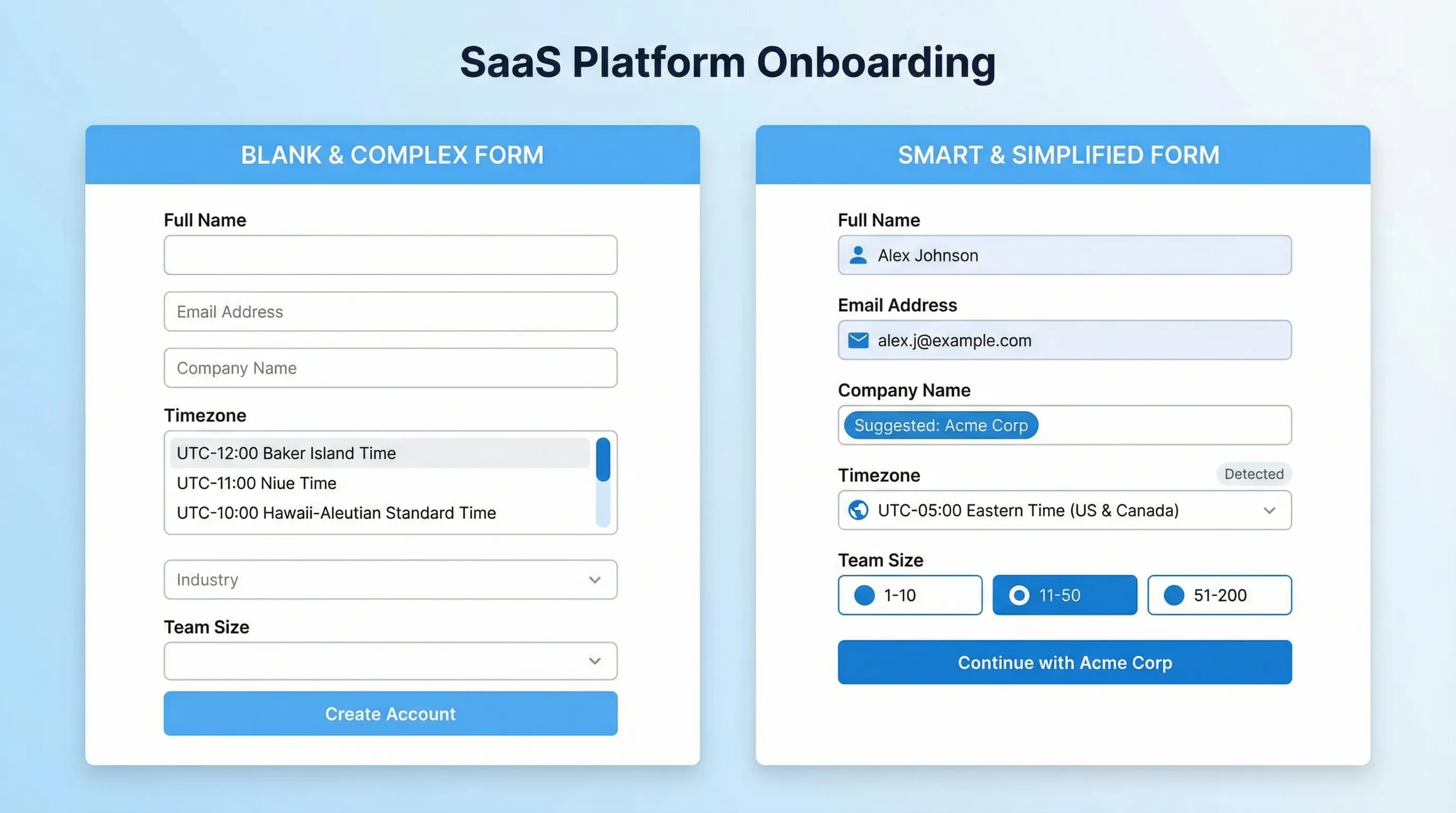
Common B2B pattern: infer company name from @company.com.
This works well as a suggestion, not as a locked default, because:
- Many signups come from Gmail/outlook
- Some companies use a parent brand domain that doesn’t match the product brand
- Agencies and consultants sign up with client emails
A safer approach is:
- Show Company as an optional field
- When the user types an email, suggest a company name chip like “Use ‘Acme’?”
5) Campaign parameters and ad routing (great for lead quality)
UTMs, ad group IDs, and referral paths are perfect candidates for hidden fields. They help you route leads and measure ROI without adding user friction.
Examples:
utm_campaign=security-checklistroutes to a security-focused nurturesource=g2flags high-intent visitors for faster follow-up
The key is to keep it internal. Don’t make the user choose “Where did you hear about us?” unless you truly need it and will act on it.
Field-by-field: defaults that typically increase submissions for SaaS
The most useful way to apply defaults is to look at your highest-impact forms: demo request, trial signup, waitlist, and in-app feedback.
Demo request forms
Goal: speed, correct routing, and higher-quality submissions.
Defaults that usually help:
- Reason for reaching out: default based on page intent (pricing vs security vs integrations)
- Team size: default to blank unless you have strong evidence, or provide common presets as quick-pick buttons (for example 1-10, 11-50, 51-200)
- Country: default using locale, but keep it easily changeable
Defaults to avoid:
- Phone number required (better as optional unless your sales motion depends on it)
- Prechecked marketing consent (risk and trust issue)
Trial signup forms
Goal: minimize steps to first session.
Defaults that usually help:
- Workspace name: suggest from company or product, but editable
- Timezone: default accurately for scheduling and summaries
- Onboarding path: default the checklist based on how they arrived (for example, “From integrations page” shows integration-first checklist)
Waitlist forms
Goal: capture the email with minimal friction, collect enrichment later.
Defaults that usually help:
- Email only initially
- Use case as a second step, optional, with smart suggestions based on landing page
If you need segmentation, consider progressive profiling (ask later, after trust is built) instead of adding more required fields.
Feedback and support forms
Goal: reduce back-and-forth and collect actionable context.
Defaults that usually help:
- Page or feature context: auto-captured (URL, screen, feature area)
- Account plan / workspace: auto-captured
- Category: offer a default based on where they launched the widget (for example, launching from billing page suggests “Billing”)
This is a big reason teams use a feedback widget instead of a generic form page: the widget can be triggered at the moment of friction and capture context without extra user effort.
The most common default mistakes (and how to avoid them)
Mistake 1: Defaults that feel like assumptions
If you default “Role: CEO” because the page is “Start a free trial,” you’re telling the user you think you know them, and it’s often wrong.
Fix: default with context, not with stereotypes. Use suggestions and quick-picks instead of forced values.
Mistake 2: Defaults that are hard to change
A default only reduces friction if it is clearly editable. If the dropdown is tiny, the contrast is low, or the user has to open a long list to fix your guess, your “default” becomes a tax.
Fix: make “change” obvious, keep lists short, and prefer typeahead for long option sets.
Mistake 3: Defaulting sensitive or compliance-related choices
Prechecking consent boxes is not just a conversion trade-off, it can become a compliance and trust problem depending on your market.
Fix: keep consent explicit, opt-in, and clearly worded. If you do SMS capture or marketing opt-in, use transparent language and store proof of consent.
Mistake 4: Defaults that bias your data
If you default “How did you hear about us?” to “Google,” you will get cleaner form completion and worse attribution data.
Fix: capture attribution with UTMs and referrers in hidden fields, not user self-report.
How to test smarter defaults without wrecking lead quality
A default that increases submissions can still reduce revenue if it lowers lead quality or misroutes requests. Test with both conversion and downstream outcomes.
Metrics to track (minimum)
- Form completion rate (submits / form views)
- Time to complete (median, not average)
- Field-level drop-off (where users abandon)
- Error rate (validation errors per view)
- Downstream quality (SQL rate, activation rate, churn rate, depending on the form)
A simple experiment approach
- Start with one field that creates friction (often team size, role, phone, or long dropdowns)
- Create one variant where you replace a forced choice with a smart default or suggestion
- Run an A/B test or a time-boxed rollout with a holdout segment
- Review both the conversion lift and lead routing accuracy
If you do not have formal experimentation, a lightweight approach still works: ship the change to 50 percent of traffic and compare week-over-week cohorts, then sanity check for seasonality.
Implementation checklist: shipping smarter defaults in a week
Audit what you’re defaulting today
Look for:
- Fields with placeholder text that looks like a default (but isn’t)
- Dropdowns that start with a random value instead of “Select…”
- Optional fields that are visually indistinguishable from required ones
Identify your “high-confidence” default sources
Common high-confidence sources:
- Logged-in profile data
- Current page or in-app location
- Timezone and locale
- Campaign parameters
Decide per field: default, suggest, or remove
A practical guideline:
- If it’s required but inferable, remove the question and capture it internally
- If it’s helpful but uncertain, suggest
- If it’s neither, delete
QA edge cases
Test:
- Mobile keyboards and autofill behavior
- International addresses and phone formats
- Users with multiple workspaces
- Users arriving from partner domains and forwarded links
How ModalCast fits this workflow
If you’re iterating on lead capture, feedback forms, or in-product prompts, a lightweight widget approach can make default testing faster because you can place a form where intent is highest and adjust the experience without rebuilding your app flow.
ModalCast is designed for on-site engagement and feedback, including forms, surveys, and messages. In the context of smarter defaults, teams commonly use a widget to:
- Launch forms from high-intent pages (pricing, integrations, docs) so context becomes your default
- Keep the visible form short, while capturing page context for routing
- Add a quick microsurvey after submission to validate assumptions (for example, “What were you trying to do today?”)
If you want to start small, pick one form and change one default this week. The biggest wins usually come from removing a decision, not redesigning the entire form.
The takeaway
Smarter form defaults increase submissions when they reduce typing, reduce decisions, and reduce errors. The best defaults are grounded in real context (page intent, known user data, device hints) and remain easy to override.
Treat defaults as a product decision, not a styling choice. Add guardrails, test field by field, and measure downstream quality alongside conversion. That’s how you get more submissions without turning your pipeline into noise.
