Best Visual Feedback Tool for Websites: Features That Matter
Website feedback is only useful when it’s actionable. The fastest way to make feedback actionable is to capture context (what the user saw, what they were tryin
Website feedback is only useful when it’s actionable. The fastest way to make feedback actionable is to capture context (what the user saw, what they were trying to do, and where they got stuck) at the moment the friction happened.
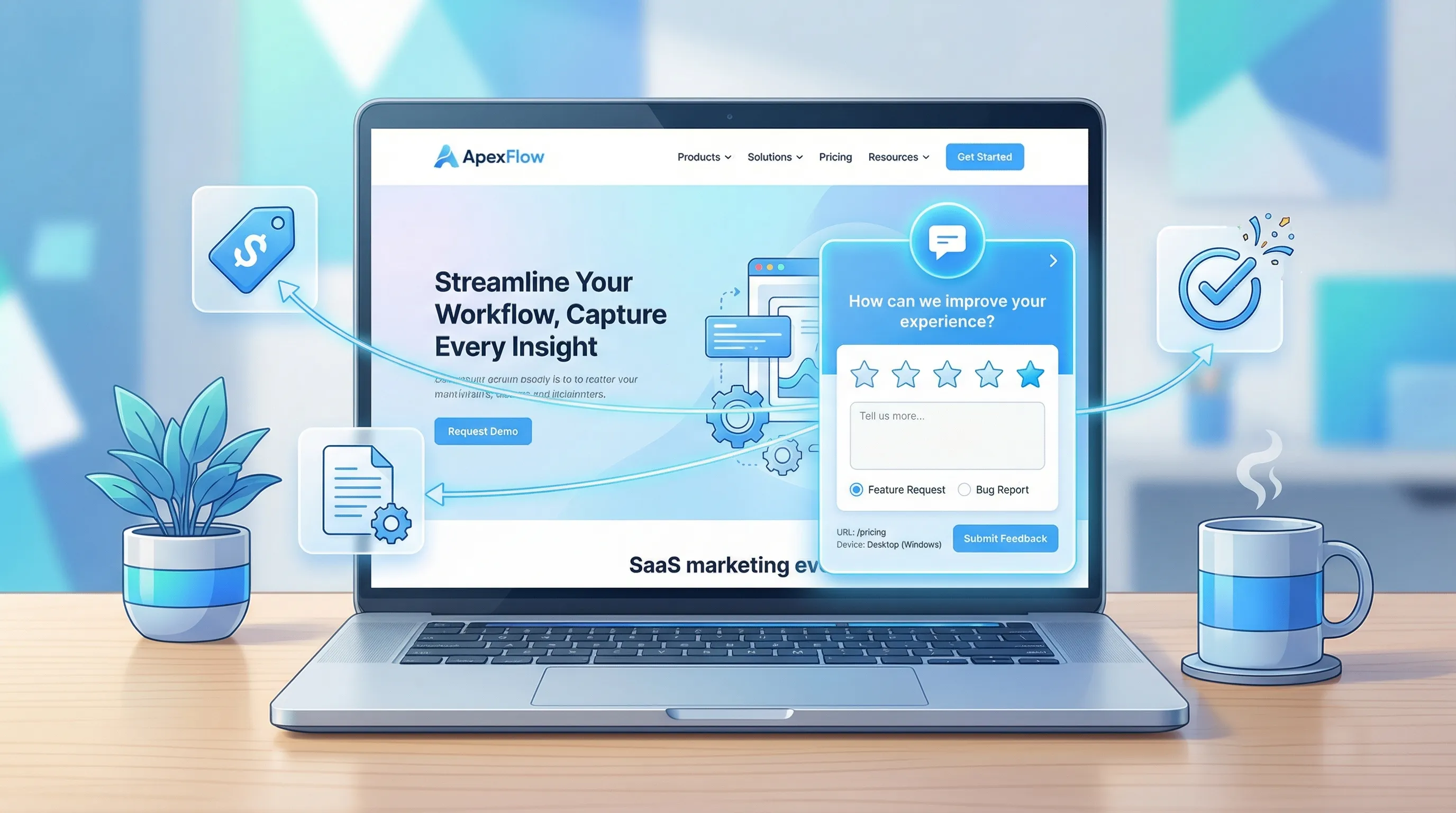
That’s the job of a visual feedback tool for websites: it turns vague comments like “pricing is confusing” into specific, decision-ready input like “On /pricing, I couldn’t tell whether SSO is included in Pro or Enterprise (I’m evaluating for 50 seats).”
Below is a SaaS-focused breakdown of the features that actually matter when you’re choosing a visual feedback tool, plus practical examples of how teams use them to improve conversion, activation, and retention.
What “visual feedback” should mean for a website (in practice)
When SaaS teams search for “visual feedback,” they usually want one of these outcomes:
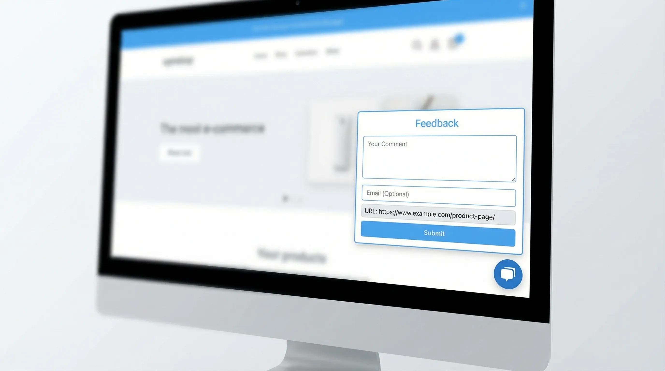
- In-context feedback: the user leaves feedback while they’re looking at the page (instead of in a generic survey email).
- Precise location: the feedback is tied to a page, flow step, or even a specific UI element.
- Low friction: the user can respond quickly, without a long form or a support ticket.
Some tools interpret “visual” as screenshot annotation (users mark up a screenshot). Others interpret it as on-page widgets and microsurveys that are visually embedded in the experience. For most SaaS marketing sites and PLG funnels, the second category tends to ship faster and gets you higher volume, because it requires less effort from the visitor.
A strong choice is the tool that best matches your feedback goal:
- If your goal is UX/UI bug reports, screenshot annotation can be great.
- If your goal is conversion and clarity feedback (pricing, positioning, onboarding), on-page widgets and triggered microsurveys usually win.
The core features that matter (and why)
1) Context capture (URL, page state, and “what was happening”)
The difference between “nice feedback” and “usable feedback” is context. At minimum, your tool should attach:
- Page URL (and ideally path + query parameters you care about)
- Referrer or campaign context (UTMs, where allowed)
- Timestamp and device type (mobile vs desktop)
If you also operate an app, consider whether you can pass additional context (plan, role, lifecycle stage) so feedback is immediately segmentable.
Why it matters: Without context, your team spends time chasing follow-ups (“Which page?” “Which plan?” “What were you trying to do?”). With context, you can prioritize fixes and run experiments quickly.
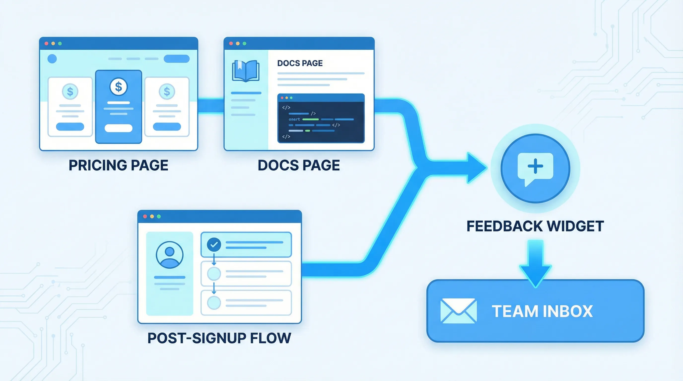
2) Targeting and triggers (the difference between noise and signal)
A visual feedback tool should let you ask the right question at the right moment. For SaaS, the highest-signal moments are usually intent-heavy:
- Pricing page dwell time
- Exit intent from checkout or signup
- Post-action moments (after signup, after upgrading, after completing onboarding)
- Docs pages after scroll depth or long time-on-page
If every visitor sees the same prompt, you’ll either annoy people or collect generic responses.
What to look for: trigger rules that are specific enough to match intent, but simple enough that you’ll actually use them.
3) Flexible “units” of feedback (not just one survey type)
Most teams need multiple formats because feedback jobs differ:
- One-click polls for fast directional signal
- Short forms for structured input (feature requests, cancellation reasons)
- Open text for qualitative insights
- Lead capture when the “feedback” is actually buying intent (“Talk to sales about security”)
The best tools support multiple formats in one place so you don’t end up stitching together three vendors for surveys, forms, and announcements.
4) Friction control: frequency caps, suppression, and sampling
High-performing teams treat feedback prompts like product UI: they’re helpful when used intentionally, and harmful when spammy.
You want controls like:
- Frequency capping (per user, per session, per day)
- Excluding critical pages (checkout, login, support flows)
- Sampling (only show to a percentage of traffic)
Why it matters: “Always on” feedback can reduce conversions and trust. Guardrails keep feedback collection sustainable.
For guidance on respecting users and avoiding manipulative UX, the FTC has published recommendations and enforcement context around deceptive design patterns (often called “dark patterns”) on its site: FTC consumer protection guidance.
5) Performance and Core Web Vitals safety
Feedback widgets are easy to add and easy to regret if they slow down your site.
What to evaluate:
- Does it load asynchronously?
- Can you limit loading to specific pages?
- Is it lightweight enough to avoid harming perceived performance?
Why it matters: If your visual feedback tool costs you conversion due to slower pages, it defeats the point.
6) Accessibility and UX basics (close behavior, keyboard, contrast)
If your widget is a modal, popup, slide-in, or floating button, it needs to be usable for everyone.
Minimum expectations:
- Keyboard navigation and visible focus states
- Clear close affordance
- Reasonable contrast
- Non-intrusive mobile behavior
If you want a reference point for accessibility expectations, the W3C Web Content Accessibility Guidelines (WCAG) are the most commonly cited standard.
7) Workflow: where feedback goes (and how it becomes a decision)
Collecting feedback is easy. Routing it into an actual decision loop is the hard part.
A visual feedback tool is more valuable when it supports:
- Notifications (so feedback is seen quickly)
- Export or integrations (so feedback can be tagged, triaged, and assigned)
- A simple way to segment (page, campaign, user type)
Even if you start without deep integrations, make sure there’s a clear path from “response” to “action.”
A practical feature checklist (for SaaS teams)
Use this table to sanity-check tools during evaluation. It’s intentionally biased toward what improves speed-to-learning and reduces analysis overhead.
| Feature | Why it matters for SaaS websites | What “good” looks like |
|---|---|---|
| Context capture | Turns comments into actionable fixes | URL, device, referrer/UTM support, optional custom fields |
| Targeting and triggers | Higher signal, less annoyance | Page rules, behavior triggers (time, scroll), event or element triggers |
| Multiple feedback formats | Match the prompt to the job | Polls, forms, microsurveys, lead capture in one system |
| Frequency caps and suppression | Protect conversion and trust | Per-user caps, cooldowns, exclusions, sampling |
| Performance | Avoid conversion loss | Async load, page-level enablement, minimal payload |
| Accessibility | Avoid broken UX and risk | Keyboard support, clear close, mobile-safe behavior |
| Analytics | Learn what’s working | Views, submits, response rate, segment breakdown |
| Routing/workflow | Feedback becomes action | Email/Slack/webhook or export options, tagging conventions |
Real-world SaaS use cases (with concrete examples)
Use case 1: Pricing page objections that block conversion
Goal: Understand what stops qualified visitors from starting a trial or booking a demo.
What to deploy: A two-step microsurvey triggered after pricing-page intent (for example, 30 to 60 seconds on page).
Example prompt:
- Question 1 (single select): “What’s the main thing you’re unsure about?”
- Options: “Which plan I need”, “Total cost”, “Security/compliance”, “Integration fit”, “Need internal approval”, “Other”
- Question 2 (conditional open text): “What info would help you decide?”
What you do with the data:
- If “Security/compliance” is high, ship a security overview link and add an in-widget CTA (“Get the security pack”).
- If “Total cost” is high, improve pricing clarity and add a calculator or an annual toggle explanation.
- If “Integration fit” is high, add “Works with X” proof near the CTA.
This is “visual” feedback because it is tied to the exact page and moment of evaluation, not a generic quarterly NPS response.
Use case 2: Docs feedback that reduces support load
Goal: Find documentation pages that create tickets.
What to deploy: A small widget prompt on docs pages only.
Example prompt:
- “Did this page help you?” (Yes/No)
- If No: “What was missing?” (short text)
What you do with the data:
- Tag responses by doc URL.
- Fix the top 5 pages by negative feedback volume.
- Add a “most common confusion” snippet to those pages.
This works especially well when the widget is always available but not intrusive.
Use case 3: Post-signup intent capture to improve activation
Goal: Route new users to the right setup path.
What to deploy: A short post-signup survey that appears after account creation or first login.
Example prompt:
- “What are you trying to do first?”
- Options aligned to your product’s jobs-to-be-done
What you do with the data:
- Personalize onboarding content (even manually at first).
- Prioritize onboarding fixes by the dominant intent paths.
This is where “visual feedback” becomes a growth lever: it doesn’t just measure satisfaction, it guides the experience.
Use case 4: Passive bug report intake without a full support flow
Goal: Let users report issues while they’re frustrated, without forcing them into email.
What to deploy: A floating feedback button (or unobtrusive tab) that opens a short form.
Form fields to keep:
- “What happened?”
- “What did you expect?”
- Optional email (only if they want follow-up)
Tip: Ask for the minimum needed to reproduce. If your process demands logs, session replays, and long templates, you will get fewer reports.
What to avoid (these “features” often backfire)
“More question types” without better targeting
A tool can have 20 survey widgets and still collect low-quality responses if it can’t target properly. Prioritize triggers and suppression over novelty.
Intrusive popups that train users to close everything
If your first experience is a modal that blocks the page, users learn “close this,” and your later prompts get ignored.
If you use popups at all, keep them intent-gated, capped, and clearly dismissible.
Analytics that stop at “submissions”
Submission counts can be vanity metrics. You want at least:
- Response rate by page
- Response rate by segment (new vs returning, pricing vs docs)
- A way to export for tagging and theme analysis
A simple scorecard to choose the best visual feedback tool for your website
If you’re comparing multiple tools, score them against your real constraints: speed, UX safety, and ability to drive decisions.
| Category | Weight (typical SaaS) | How to evaluate quickly |
|---|---|---|
| Targeting and triggers | High | Can you target pricing/docs/onboarding differently in minutes? |
| Frequency caps and UX controls | High | Can you prevent repeat prompts and exclude key flows? |
| Context capture | High | Does each response include page and segment data? |
| Performance | Medium to High | Does it load fast and avoid site-wide bloat? |
| Formats (polls, forms, announcements) | Medium | Does it cover your top 2 to 3 use cases without extra vendors? |
| Workflow and routing | Medium | Can the right team see and act on responses? |
| Accessibility | Medium | Keyboard, focus, close behavior, mobile usability |
| Time-to-launch | High | Can a PM or marketer ship without engineering? |
If a tool scores well but requires heavy engineering to maintain, it will quietly die after week two.
Where ModalCast fits (if you want a lightweight, on-site approach)
ModalCast is positioned as a lightweight engagement and feedback widget for SaaS and websites. If your definition of “visual feedback” is in-context website feedback, microsurveys, lead capture, and on-site updates (rather than full screenshot annotation workflows), a single widget approach is often the simplest way to get live quickly.
Common ways teams use a widget like ModalCast in practice:
- Collect pricing objections with a short microsurvey
- Add a persistent feedback entry point (floating button/tab)
- Capture leads with minimal friction (when visitors show intent)
- Share product updates or offers without rebuilding pages
If you want to explore that route, you can see the product at ModalCast and evaluate it against the scorecard above.
A practical rollout plan (so your tool choice actually pays off)
To avoid “we installed it but learned nothing,” run a tight rollout:
Week 1: Ship one high-intent prompt
Pick one:
- Pricing page objection survey
- Post-signup intent survey
- Docs helpfulness poll
Keep it short, cap it, and attach context.
Week 2: Turn responses into one decision
Examples of “real” decisions:
- Rewrite the pricing FAQ header based on top confusion themes
- Add one missing integration mention to the pricing page
- Fix one broken onboarding step that correlates with negative responses
Then measure: did conversion, activation, or support volume move (even directionally)?
Bottom line
The best visual feedback tool for websites is the one that reliably captures in-the-moment context without harming UX or performance, and routes feedback into decisions your team can ship.
Prioritize targeting, context, frequency caps, and workflow over flashy templates. Ship one prompt, learn fast, and expand only after you’ve proven signal quality.
