Website Feedback Tool: 2025 Buyer’s Guide for SaaS Teams
SaaS teams rely on real user input to steer roadmaps, reduce churn, and lift conversion rates. The right website feedback tool helps you capture those insights at the moment of truth, without tanking performance or annoying visitors.

SaaS teams rely on real user input to steer roadmaps, reduce churn, and lift conversion rates. The right website feedback tool helps you capture those insights at the moment of truth, without tanking performance or annoying visitors. This 2025 buyer’s guide gives you a practical framework to choose a tool that fits your stack, your speed, and your stage.
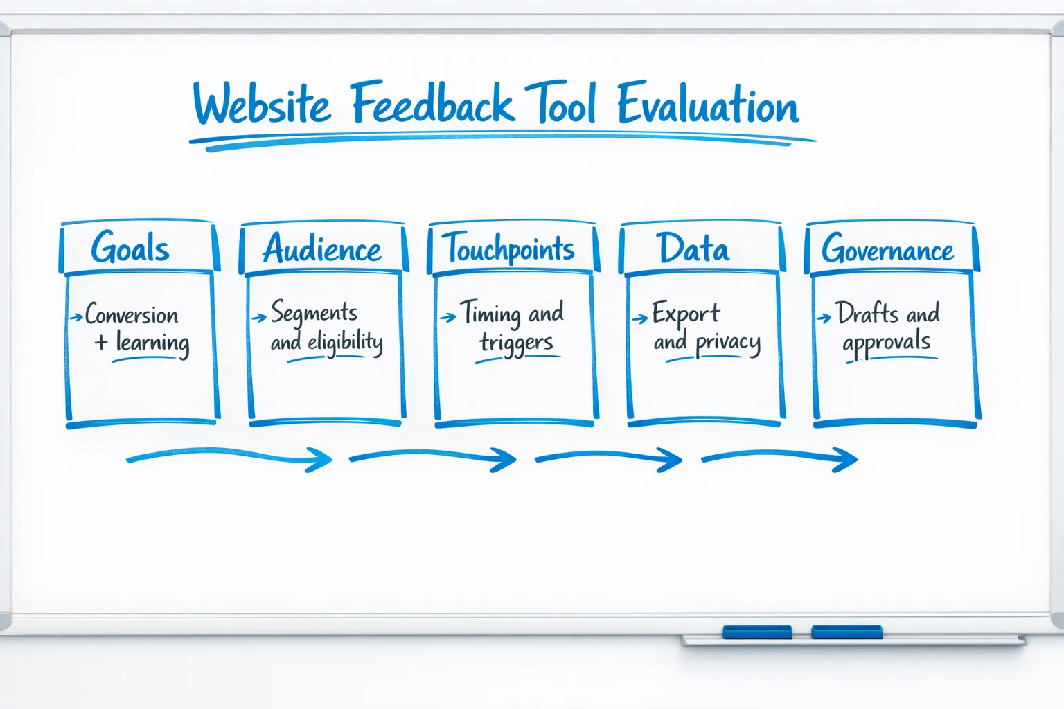
Start with outcomes, not features
Before reviewing vendors, define what success looks like. For most SaaS teams, the outcomes fall into a few buckets:
- Reduce friction in key journeys, for example onboarding, pricing, checkout, or upgrade.
- Prioritize roadmap with evidence, validate feature ideas and measure adoption pain.
- Improve support deflection, find gaps in docs and in-product guidance.
- Protect conversion while learning, collect feedback without increasing bounce or drop-off.
Translate outcomes into a short list of use cases you will test in a trial. Examples: a 2‑question microsurvey on the pricing page, an exit-intent prompt on cancel pages, a post-setup in-app poll, or a passive “Give feedback” button across docs.
Evaluation criteria that matter in 2025
When you compare tools, focus on how they impact visitor experience, team velocity, and data quality. The table below summarizes what to look for.
| Area | Why it matters | What to check | Red flags |
|---|---|---|---|
| Collection UX | Keeps conversion and UX intact | Passive tabs, slide-ins, page-anchored prompts, mobile behavior, frequency caps, page-level exclusions | Full-screen interstitials by default, no mobile-specific controls |
| Targeting and triggers | Relevance drives response rate | URL rules, time on page, scroll depth, exit intent, referral or UTM, returning vs new visitors | One-size-fits-all prompts, no rule testing or preview |
| Survey and form options | Fit the question to the moment | Single-select, rating scales, short text, email capture, thank-you routing | Long forms only, no in-line validation |
| Analytics and insight | Close the loop quickly | Basic metrics, response export, trend breakdowns, page or segment comparisons | Only vanity metrics, no export |
| Workflow and governance | Helps you ship safely | Drafts, scheduling, simple approvals, version history | Everything publishes live, no drafts |
| Performance | Protects Core Web Vitals | Async script, CDN delivery, minimal payload, lazy loading | Large bundles, render-blocking scripts |
| Privacy and compliance | Reduces risk | Consent respect, data retention controls, easy deletion, DSR support | Forced tracking, unclear data storage |
| Accessibility and localization | Inclusivity and reach | Keyboard navigation, labels, ARIA roles, text scaling, right-to-left support | Unlabeled controls, fixed text |
| Integration path | Keeps data useful | CSV export, webhook or API options, simple connections to your stack | Closed ecosystem, paywalls for basic export |
Two quick checkpoints you can verify in under an hour:
- Open the browser Performance panel while loading the widget on a test page. Ensure the script is async, cached, and small enough not to move your LCP. See Google’s guidance on Largest Contentful Paint.
- Navigate prompts with only a keyboard and a screen reader. Cross-check with W3C’s WCAG overview.
Build vs buy for a website feedback tool
Building gives you full control, but the hidden work piles up fast: UI components, targeting and triggers, analytics, approvals, translation, accessibility, performance, privacy, and ongoing iteration. Buy if most of the below are true:
- You need to iterate weekly, not quarterly.
- You want non-engineers to own feedback operations safely.
- You need guardrails for performance, privacy, and accessibility out of the box.
- You value faster learning over bespoke UI.
Consider building if you already have a strong in-house experimentation platform, a design system with accessible overlays, and spare engineering capacity to maintain it.
Pricing and TCO in 2025
Expect pricing to scale with traffic volume, number of live prompts, or features like advanced targeting and integrations. Total cost of ownership usually includes:
- License, monthly or annual.
- Implementation time, adding the script, configuring triggers, basic styling.
- Maintenance, content and copy updates, QA for new pages, accessibility and performance checks.
Choose the simplest plan that allows your team to learn quickly, export data, and avoid blockers like hard prompt limits.
A 14‑day proof‑of‑concept plan
Your trial or pilot should prove two things: you can learn something meaningful, and you can do it without hurting conversion.
- Define success and baseline
- Success metrics, for example submission rate, completion time, conversion impact on exposed visitors, qualitative themes.
- Baselines, record current conversion on the target pages and current support volume for related topics.
- Implement two high-signal use cases
- Pricing page intent probe, for example “What did you come here to do?” followed by a single-select.
- Exit-save on cancel or downgrade, capture the top reason in a one-tap survey.
- Add guardrails
- Frequency caps, one prompt per user every 48 hours, and exclude paid checkout.
- Mobile-first QA, verify tap targets and focus order.
- Ship, measure, and decide
- Compare exposed vs holdout for conversion and time on page.
- Synthesize top 3 insights and 2 decisions you would make from them.
Real-world SaaS use cases to validate during your trial
Focus on short, contextual prompts that fit the moment. Here are patterns you can ship in a day:
- Pricing page intent: Ask a single question about intent, then route readers to the right resource.
- Onboarding blocker: Trigger a one-question poll if setup exceeds a reasonable time window.
- Feature validation: After users try a new feature twice, ask for a 3-point ease rating with an optional comment.
- Documentation gap: On doc pages with high bounce, show a two-choice “Did this answer your question?” and capture the missing topic in free text.
- Exit intent on cancel: Capture the primary reason, then link to a right-fit alternative or offer a “tell us more” channel.
- Post-support CSAT: After a help article view plus time on page, ask a quick satisfaction rating.
If you want more detail on protecting conversion while you collect input, see our practical guide on collecting feedback without killing conversions.
Avoid these common anti-patterns
A few patterns consistently reduce conversion and data quality:
- Interrupting primary tasks with long forms, keep interactions under 10 seconds where possible.
- Showing the same prompt on every page, use eligibility and recency controls.
- Asking leading questions, neutral wording increases signal.
- Ignoring holdouts, always keep a percentage of traffic unexposed to measure impact.
- Overlooking mobile, many overlays behave very differently on smaller screens.
- Skipping accessibility, unlabeled controls and poor focus order exclude users, see WCAG.
For additional form design tips that raise completion rates, review our guidance on high-converting forms.
Compliance, privacy, and ethics checklist
Feedback often includes free-text and contact details, so treat it with care.
- Consent and lawful basis, align to your privacy policy and user expectations. Reference the EU’s GDPR, Regulation (EU) 2016/679, and California’s CCPA/CPRA.
- Data minimization, collect only what you need for the decision at hand.
- Retention and deletion, set sensible retention windows and honor deletion requests.
- Sensitive data handling, avoid asking for health, financial, or other special category data unless legally justified.
- Accessibility, verify prompts meet WCAG basics and support keyboard-only users.
A lightweight scorecard you can copy
Weight what matters for your team, then score vendors during your trial.
| Criteria | Weight | Vendor A | Vendor B |
|---|---|---|---|
| Collection UX and mobile behavior | 0.20 | ||
| Targeting and triggers | 0.15 | ||
| Analytics and export | 0.15 | ||
| Privacy and compliance controls | 0.15 | ||
| Performance impact | 0.10 | ||
| Workflow, drafts, and approvals | 0.10 | ||
| Integration path | 0.10 | ||
| Support and documentation quality | 0.05 |
Tips when scoring:
- Test on your highest-traffic template and your most fragile page, usually pricing or checkout.
- Validate at least one use case on mobile first.
- Export data and run a quick synthesis to confirm you can move from raw responses to a decision in under a day.
Where Modalcast fits
If you want a simple, lightweight website feedback tool that also helps with updates and lead capture, Modalcast is designed for exactly that job. Teams use a single widget to:
- Collect user feedback with forms, ratings, polls, and microsurveys.
- Share product updates and promote offers with on-site messages and popups.
- Capture leads without heavy flows, while keeping control over timing and triggers.
Modalcast emphasizes easy setup, flexible targeting, drafts for safe editing, and practical analytics so you can learn quickly and act. If you are new to microsurveys, start with our guide on setting up microsurveys, or learn how a feedback stack can respect conversion in this playbook. For a primer on widget types and placement options, read what a feedback widget is and why you need one.
Final selection tips
A good website feedback tool does three things well in 2025: it asks short, relevant questions at the right time, it protects your performance and experience, and it makes it easy for your team to turn input into action. Keep your pilot narrow, verify guardrails on mobile, and choose the vendor that helps you learn faster with less risk.
If you are ready to try a lightweight, focused approach, you can start a quick pilot with Modalcast and ship your first prompts in minutes.
