Offer Walls vs Popups: Which Converts Better?
There is no universal winner between offer walls and popups. Each can outperform the other depending on the visitor’s intent, the complexity of your offer, and how respectfully you time the interaction.
There is no universal winner between offer walls and popups. Each can outperform the other depending on the visitor’s intent, the complexity of your offer, and how respectfully you time the interaction. This guide explains when each pattern converts better for SaaS and website teams, how to design them correctly, and a simple testing plan to get a definitive answer for your audience.
Quick definitions
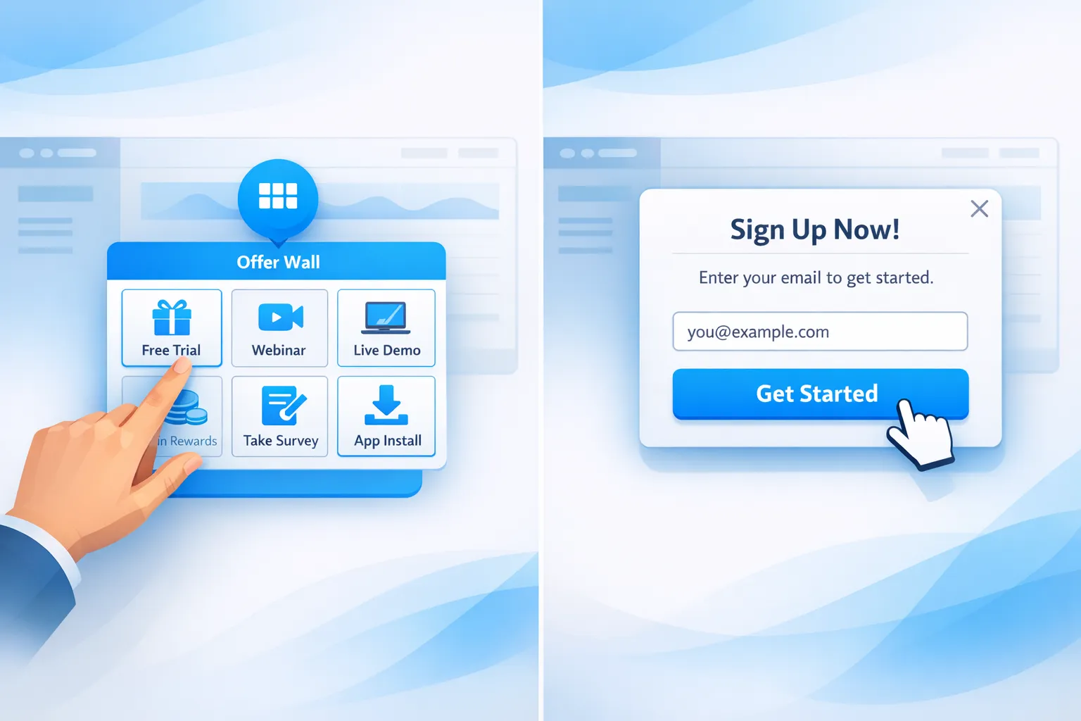
- Offer wall: A browsable hub that aggregates multiple offers or resources in one place, often opened by a floating action button or message center. Think “What’s new and featured,” with tiles for trials, webinars, templates, discounts, and product updates.
- Popup: A focused, single-message prompt that overlays the page or slides in. Commonly used for email capture, coupons, exit-save, or a one CTA push such as book a demo.
The conversion physics, attention versus intent
- Popups intercept attention. They are best at driving one clear, time-sensitive action when the value is obvious. Overuse or poor timing increases annoyance and can hurt conversion on mobile if they block content.
- Offer walls harness intent. They work when visitors want to browse options, compare value, or return later. They are lower friction and less interruptive, which often results in higher cumulative engagement across sessions.
For SaaS, that translates to a simple rule of thumb: use popups to make one great offer at the right moment, use an offer wall to merchandise many good offers without disruption.
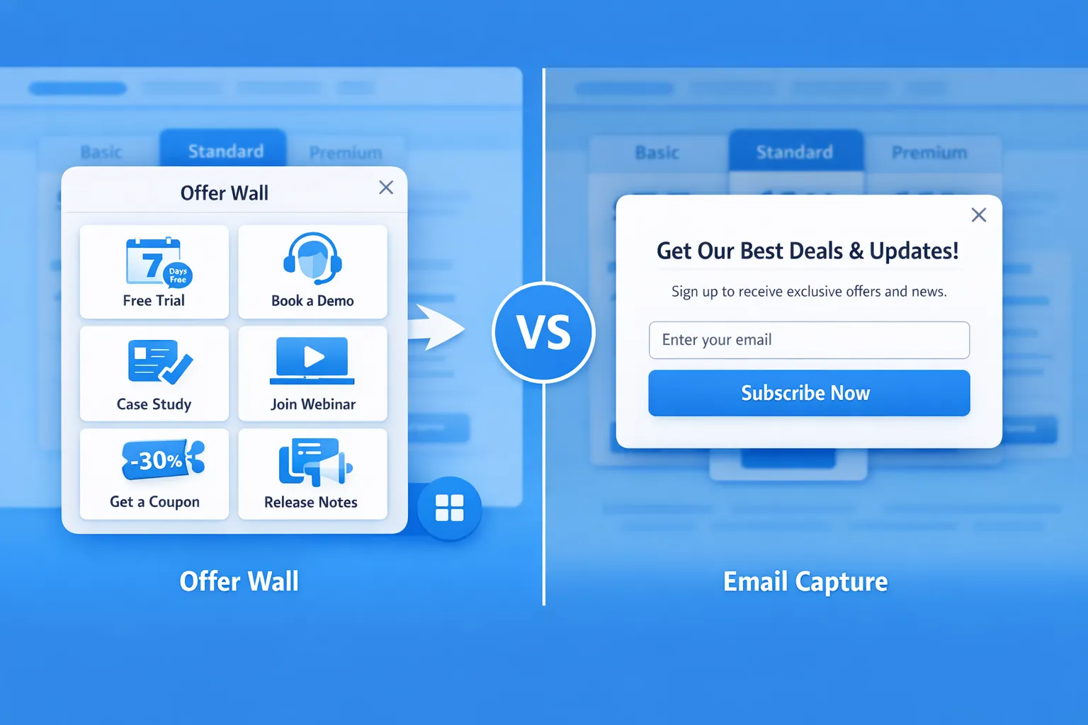
Offer walls vs popups, a practical comparison
| Attribute | Offer wall | Popup |
|---|---|---|
| Best for | Multiple offers, resources, and updates | One focused action or message |
| User control | High, user initiated | Low to medium, site initiated |
| Cognitive load | Higher, must curate choices | Low, one decision |
| Interruptiveness | Low | Medium to high if mistimed |
| SEO/mobile risk | Low, does not block content | Needs care on mobile to avoid intrusive interstitial patterns |
| Measurement | Tracks browsing depth, multi-offer value | Tracks direct opt-ins or clicks to one CTA |
| Typical placement | Floating action button, header link, in-app message center | Exit intent, scroll, time delay, inactivity, page change |
References for UX and mobile guidance: Google’s guidance on intrusive interstitials explains when overlays harm mobile experience, see Google Search Central. Nielsen Norman Group outlines when modal dialogs help or hurt usability.
- Google Search Central, Intrusive interstitials: https://developers.google.com/search/docs/appearance/intrusive-interstitials
- Nielsen Norman Group, Modal and nonmodal dialogs: https://www.nngroup.com/articles/modal-nonmodal-dialog/
- web.dev, Popup best practices: https://web.dev/popup-best-practices/
When popups convert better
Use a popup when the offer is singular, the value is immediate, and the trigger aligns with intent.
High-performing SaaS scenarios:
- Exit-save on pricing: If a visitor hovers toward the tab bar or back button on desktop, offer a 10 percent first month discount or a 15-minute demo scheduler. Keep a small close icon and do not block the price table on mobile.
- Post-engagement nudge: After a visitor reads 50 percent of a long-form guide or spends 45 seconds, prompt to get the template pack by email.
- In-product activation: After a user completes onboarding step 1 of 3, slide in a tip or checklist to reach time to first value, with a “Show me” CTA.
Popup design checklist for conversion and respect:
- One clear promise, one primary CTA, optional small secondary dismiss link.
- 1 input field when possible, correct input type and autocomplete, inline validation.
- Obvious close control, keyboard accessible, never trap focus.
- Trigger by behavior, not page load, for first-time mobile visitors.
When offer walls convert better
Use an offer wall when visitors may want different things and you do not know which one will resonate yet. Offer walls shine for discovery without interruption.
High-performing SaaS scenarios:
- Resource merchandising: Aggregate webinar replays, ROI calculators, case studies, and templates. Visitors self-select, you capture higher-quality leads by interest area.
- Ongoing promotions and updates: Keep current discounts, feature launches, changelog entries, and roadmaps in one place, so returning users can check what is new without being interrupted.
- Multi-segment audiences: If you serve founders, engineers, and marketers, an offer wall lets each persona choose content suited to their goals.
Offer wall design checklist:
- 3 to 6 featured tiles above the fold, each with a benefit-driven headline and one CTA.
- Pin one “Recommended” or “Start here” tile to reduce choice overload, see Iyengar and Lepper’s research on choice overload, When Choice is Demotivating.
- Group similar items and include subtle filters or tags such as webinar, template, discount.
- Remember state across sessions, recently viewed, new badge for fresh items.
Reference: Jam study PDF, Columbia University: https://www.columbia.edu/~ss957/When%20Choice%20Is%20Demotivating.pdf
The hybrid that often wins: nudge to wall
A simple pattern consistently works across SaaS sites:
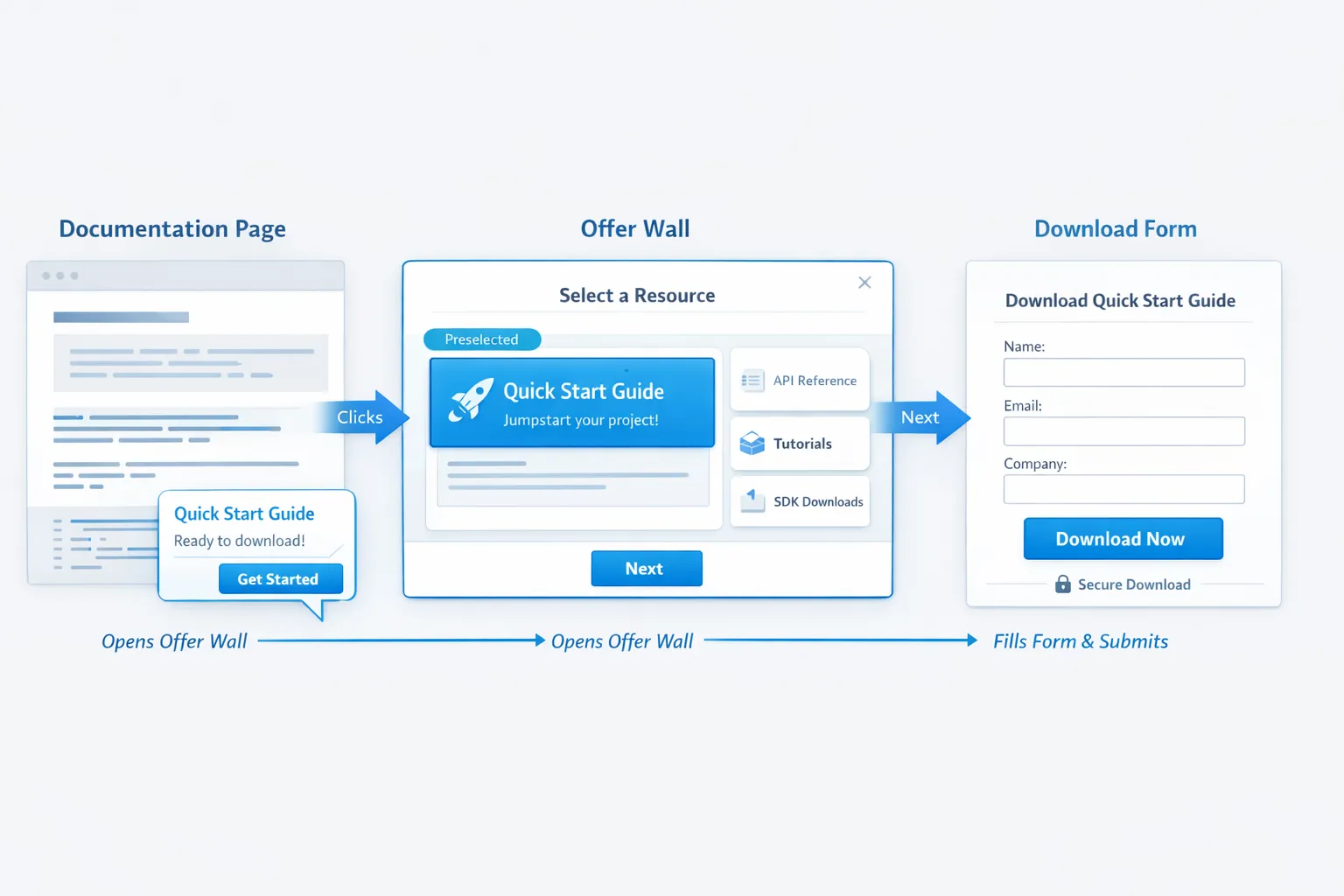
- Make your offer wall accessible at all times via a floating action button labeled Offers, Updates, or What’s new.
- Use lightweight popups as nudges to open the wall instead of forcing a commitment. Example: “2 new resources for faster onboarding, View now.” Clicking opens the wall with the relevant tile preselected.
- This compounds discovery while keeping interruptions low.
What to measure to decide which converts better
Do not judge by surface metrics alone. Lead volume can mislead if quality drops. Track both micro and macro conversions.
Key metrics:
- Exposure rate: Percent of sessions that saw the popup or opened the wall.
- Engagement: Popup click through rate, wall tiles viewed per open, open to click rate.
- Primary conversion: Email submitted, demo booked, trial started, coupon redeemed.
- Quality: Trial to paid rate for leads from each pattern, sales accepted rate, revenue per 1,000 sessions.
- User impact: Bounce rate change, time on page, scroll depth, support tickets about interruptions.
Experiment guardrails:
- Always run a holdout, at least 10 percent of traffic sees neither variant.
- Randomize by user identifier, not pageview, to avoid cross session contamination.
- Cap frequency, for example maximum 1 popup impression per user per day and do not show on first page load on mobile.
A simple 3 test plan you can run in 2 weeks
Test 1, pricing page
- Goal: More demo bookings.
- Variant A: Exit intent popup with 1 click “Book 15 min” using your scheduler. Variant B: Small slide-in nudge that opens the offer wall prefiltered to the Demo tile.
- Success measure: Incremental demo bookings per 1,000 sessions and show rate to booking ratio. Secondary, change in bounce rate.
Test 2, blog and resources
- Goal: Qualified email capture.
- Variant A: Time delay popup at 45 seconds offering a template pack. Variant B: Floating button that opens an offer wall with 4 tiles, templates default selected, plus a subtle slide-in nudge on scroll.
- Success measure: New subscribers who click a welcome email and visit product pages within 7 days.
Test 3, signed in users, onboarding
- Goal: Faster time to first value.
- Variant A: In-product popup after step 1 of setup, “Finish setup, import data.” Variant B: Offer wall as a message center with a “Setup checklist” tile and “What’s new” tile, announced via a tiny toast.
- Success measure: Percent of users completing setup within 24 hours and retention at day 7.
Common pitfalls to avoid
- First load popups on mobile: Violates Google guidance on intrusive interstitials and frustrates users. Use user-initiated or delayed triggers.
- Measuring only opt-in rate: Leads can double while pipeline does not move. Follow the lead to revenue.
- Offer walls with 12 tiles: Analysis paralysis. Curate hard, feature fewer items, rotate weekly.
- Gating help content: Do not block documentation or critical flows behind a popup.
Implementing both patterns with Modalcast
Modalcast is a lightweight engagement and feedback widget for SaaS and websites. You can ship both an offer wall and targeted popups from one feed, then measure outcomes in one place.
A practical setup:
- Create your offers as posts in Modalcast, for example demo, free trial, coupon, webinar, template, release notes. Use clear titles and a single CTA per post.
- Expose an always-on entry point. Enable the floating action button so visitors can open the widget anytime as an offer hub. Pin 3 to 6 key posts so they appear first.
- Add polite nudges. Configure time, scroll, or exit intent triggers to highlight one offer or to open the widget with a specific post in focus.
- Capture and route. Use Modalcast forms for email capture, feedback, and lead qualification. Connect submissions to your CRM or email platform.
- Segment by behavior. Show different posts or triggers based on page type, referrer, or returning visitor status.
- Measure and iterate. Track opens, clicks, and submissions in the Modalcast dashboard. Keep a holdout and compare down funnel outcomes in your analytics or CRM.
If you already use Modalcast for surveys or updates, turning that feed into an offer wall is typically a settings change plus a few well crafted posts.
Decision heuristic you can use today
- You have one clear action with immediate value, for example book a demo, claim a discount, finish setup, use a popup with respectful triggers.
- You have multiple strong but different offers, or you want a persistent place for updates and resources, use an offer wall.
- You want both reach and respect, run a hybrid, nudge to open the wall, then let visitors self select.
Bottom line
Popups often win for single, time sensitive CTAs when timed to intent. Offer walls often win for cumulative value, discovery, and ongoing engagement. The highest converting setup for most SaaS sites is a hybrid, a persistent offer wall with light, behavior based nudges.
If you want to test this without adding complexity, you can create both patterns from one Modalcast widget, then use the built in triggers and forms to compare performance and iterate. Start small, measure real business outcomes, and scale the variant that moves pipeline, not just opt ins.
